How-To based on Application Express (formerly HTML DB) version 1.5
After completing this How-To, you should be able to understand:
- How to layout a form in a single region
- How to layout multiple regions
- The different region and item attributes that affect form layout
You can control the display of a page in many ways. This "How-To" discusses some of the nuances behind laying out a page used for data input, otherwise known as a Form.
In Oracle HTML DB, information and form elements are presented on pages. Within a page, information is displayed within regions. Individual data points are displayed as items contained within regions. The look and feel of your page begins with the selection of the page template. This determines the overall look of the page and also determines the potential locations for regions.
The region template also impacts the look of your page by controlling the appearance of the region. The region template controls the look of the region, the size, determines whether there will be a border, a background color, and the fonts. A region template also determines the standard placement for any buttons placed in region positions. Item attributes affect the display of items on a page. For example, these attributes can impact where a label displays, how large an item will be, whether the item will display next to, or below, the previous item.
The discussion walks you through the process of defaulting a page and then customizing the layout. Following the discussion are tables that contain all the region and item level attributes that affect the look and feel of forms. Next are the specific instructions to follow to default the page within your own environment so that you can replicate this lesson and further refine the look and feel. Lastly is the DDL you can use to replicate the table used for this How-To.
Form Layout in a Single Region
To begin, create a page using the Form on Table or View Wizard. The following page was added to the demonstration application Sample Application that is included when a new workspace is provisioned. The page is based upon a new table name HT_EMP.Note that the table contains some basic employee details that will allow the demonstration of checkboxes, radio groups, select lists, textareas, and display only items.
Image 1 - Initial View of Page
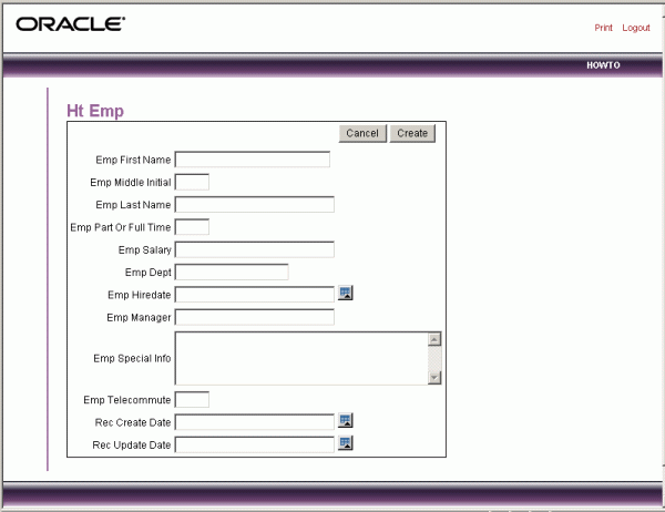
Notice that the page defaults with one item per row and labels displayed to the left of the items. The item labels default to the column names with initial capitalization and with the underscores (_) replaced with spaces. You can override this default behavior by configuring UI defaults for the table. For more information on UI defaults, see chapter 5, "Using SQL Workshop to Manage Database Objects" in the Oracle HTML DB User's Guide.
By default, the Primary Key column does not display. Oracle HTML DB expects that the primary key will be system generated and is therefore not displayed. Note that it is included in the page, but as a hidden item. Also notice that any items based on date columns default to include a date picker. In the previous image, note the icon to the right of Hiredate and the audit columns. Lastly, notice that the Emp Special Info item was created as a text area because of the size of the base column. This item type allows for wrapping, rather than scrolling, of input text. It is a better choice for large text items.
Changing Region Attributes
The first step is to change the region title. As shown in Image 2, you set the region title on the Region Definition page.
Image 2 - Initial View of Page
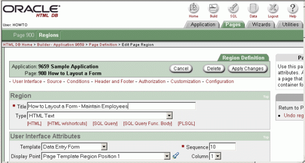
To change the region title and change other region level attributes:
- 1. Navigate to the Region Definition page.
- 2. Temporarily move the region by selecting Page Template Region Position 1 from the Display Point list. This moves the region to the left of the purple vertical bar on the page. The region display points are determined by the page level template which is an attribute of the page. If you do not select a page level template, Oracle HTML DB uses the default page level template defined in the Application Definition. You can view specific positions by selecting the flashlight icon to the right of the Display Point list.
Next, temporarily change the region template.
- 3.From the Template list, select Data Entry Form.
As shown in Image 3, note that the Data Entry Form template looks very different from the default template.
Image 3 - Page after Region Move and Template Change
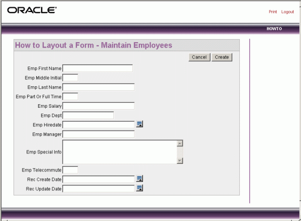
Next, change the region template and the display point back to their original values.
- 1. Navigate to the Region Definition page.
- 2. From the Template list, select Opal Region.
- 3. From the Display Point List, select Page Template Body (3).
Changing Basic Item Attributes
You can change multiple item labels at once using the Page Items display. To access the Page Items display, navigate to the Page Definition. Under Items, click View in the upper right corner. The Page Items display page appears. Item attribute changes you may want to consider include:
- Changing item labels to make them more understandable. To change item labels, edit the Prompt field.
- Placing more than one item in certain rows to group like items together. For example, you could group all items that make up an employee's name. From New Line (also abbreviated NL) select No. By changing NL to No, the item will not be placed on a new line.
- Changing the item width. Many items display better when they have a width that is less than the maximum. To change the item width, enter a new value in the Width field.
- Reordering the items. The initial order of items is based on the order of the columns in the table on which the region is based. You can reorder items by changing the sequence. You can reorder items by entering a new value in the Sequence field.
Image 4 demonstrates:
- Changed Labels (Prompt)
- Edited New Line attribute (NL)
- Changed item display Width (Width)
Image 4 - Editing Multiple Items
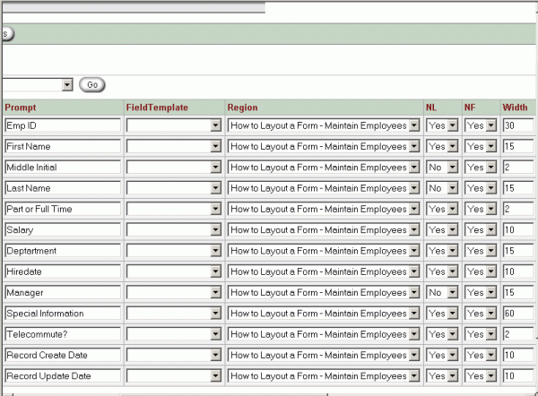
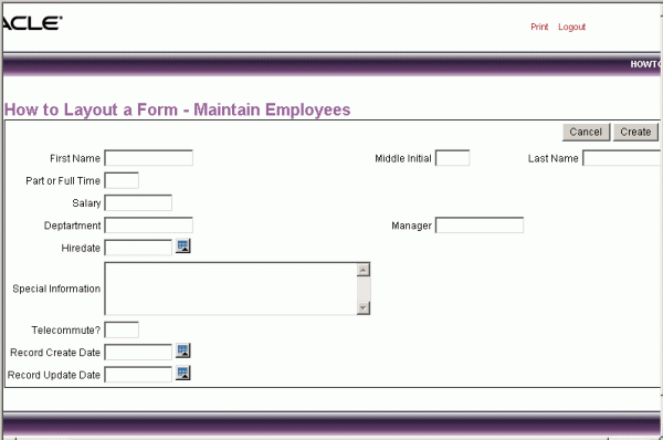
Image 5 demonstrates how these item attribute changes can impact your application. Note that in Image 5, the items display on the correct lines but some items are pushed far to the right. This display is a result of the width of the Special Information item. Oracle HTML DB lays out regions as tables and the width of any given column is set to the largest display width of the items in that column.
Image 5 - Page After Sequence, Label, New Line, and Width Changes
Fixing Item Alignment
There are several ways to fix item alignment.
- 1) For Middle Initial, Last Name and Manager items, set New Field to equal No. This would place these items directly after the items they follow, in the same column. This approach is best used for positioning embedded buttons next to items. Note that this setting can make text items appear squished.
- 2) Change the Column Span of the Special Information item. This would allow multiple items to display above and below it. To fix the display using Column Span, set the Column Span for the Special Information item to 5. This causes five columns (the First Name input, the Middle Initial label, the Middle Initial input, the Last Name label and the Last Name input) to display above the Special Information item. Be aware that using Column Span to fix the display of the name does not result in a consistent layout. The Manager item would still be in the same column as Middle Initial. Because the Manager item is larger than Middle Initial, Last Name would still be pushed too far to the right. To fix this, you could adjust the column span to allow the Manager item to display above Special Information (that is, set Column Span to 3).
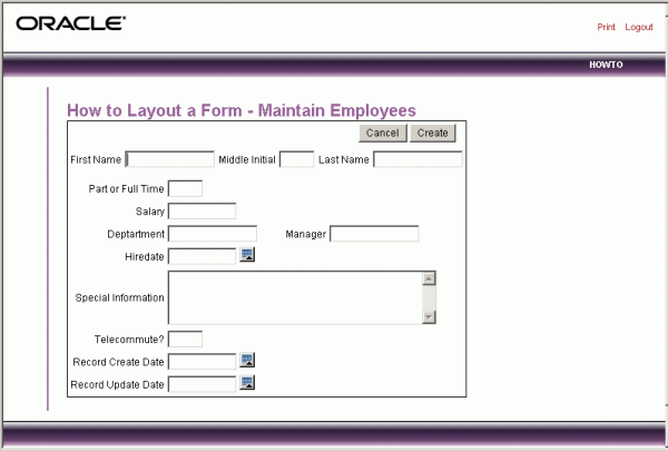
- 3) Use an item of type Stop and Start HTML Table. This item type allows the column width to be reset in the middle of a region. It forces the close of an HTML table using the tag and starts a new HTML table. Inserting a Stop and Start HTML Table item just after the Last Name item, results in an even layout. Note that a Stop and Start HTML Table item only displays its label. You can prevent the label from displaying by setting it to null. To do this, you simply remove the defaulted label. Image 6 displays the revised output after:
- Inserting a Stop and Start HTML Table item as sequence 4.5
- Changing the Column Span of Special Information to 3
Image 6 - Page After Span Fixes
Changing Label Placement
You can choose to display item labels either above, below, or to the left of each item. You can also specify to have the label display left, right, or center justified. For labels set to left, you can further specify the vertical alignment options of top, bottom or center. For the Special Information label, the best approach would be to position the label above the item.
To change label placement:
- 1) Navigate to the Page Item Definition page.
- 2) Scroll down to Label.
- 3) Make a selection from the Horizontal / Vertical Alignment list.
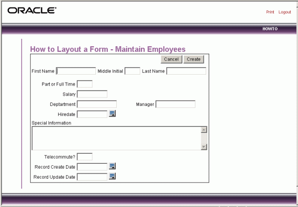
If you changed the Horizontal / Vertical Alignment of the Special Information label to Above and ran the the page, the Manager item would again display too far to the right. This is because the Special Information item is set to span only 3 columns. With the label displayed above, you will need to change the Column Span to 4 and make the item wider to better fill the space. Image 7 demonstrates what the page would look like you have changed it from 60characters wide to 90.
Image 7 - Page After Label Placement Change
Making Items Display-only and Adding New Region
There are two columns in the HT_EMP table that are for auditing. These are Record Create Date and Record Update Date. The value of these columns is set with triggers and they should not be updateable by users. This section describes how to make items display-only and then how to add them to their own region.
To make items display-only:
- 1) Navigate to the Page Item Definition page.
- 2) Under Display As, select Display as Text (saves state).
Next, create and then move the audit items out into their own region.
To create a new region:
- 1) Return to the Page Definition.
- 2)Under Regions, click Create.
- 3)Specify the region type as HTML and specify the title as Audit Information.
To move the items to another region:
- 1)Return to the Page Definition.
- 2)Under Items, click View to access the Page Items page.
- 3)Change the Region selection for the appropriate items.
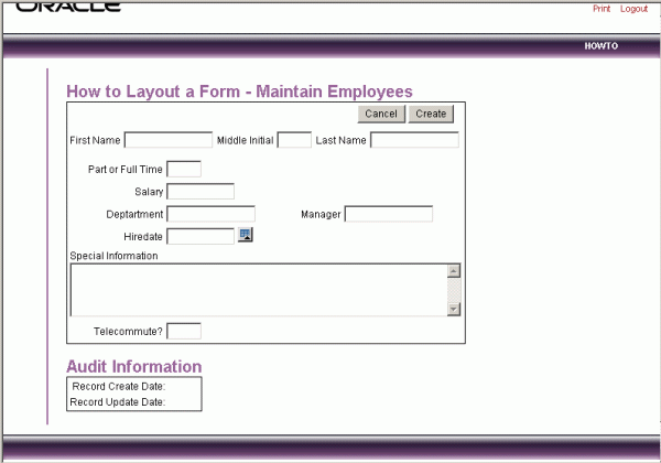
Note that you can optionally add a colon (:) at the end of the label to separate it from the value that will display. Image 8 demonstrates these changes.
Image 8 - Page After Adding Audit Region
Because all users may not wish to view the audit information, you can change the region template so that the audit information only displays when the user desires to see it. To accomplish this, change the region template for the Audit Information region to Hide / Show Region. This allows the user to click on a plus (+) sign to expand the contents of the region or click on a minus (-) sign to hide it. Image 9 demonstrates the contents hidden and Image 10 demonstrates the contents shown.
Image 9 - New 'Hide / Show' Region with Content Hidden

Image 10 - New 'Hide / Show' Region with Content Shown

Region Header and Footer
Regions can also have headers and footers. These typically contain text or html that displays at either the top or bottom of the region. The header and footer are accessed on the Region Definition page. Image 11 demonstrates the addition of a footer to the Audit Information region. The text of the footer is wrapped with the italic html tag and there is an imbedded a break. Without the manual break, the text would wrap depending on the allowable width of the region (which is defined in the region template).
Image 11 - Adding Footer to Audit Region
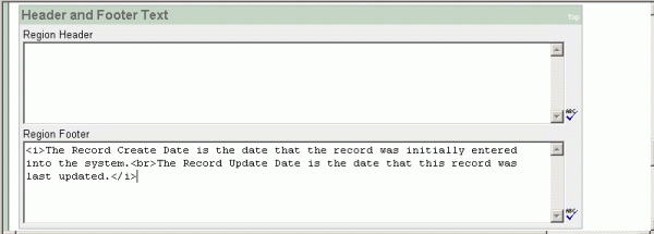
Image 12 demonstrates what the footer will look like.
Image 12 - Audit Region with new Footer

Conditional Display
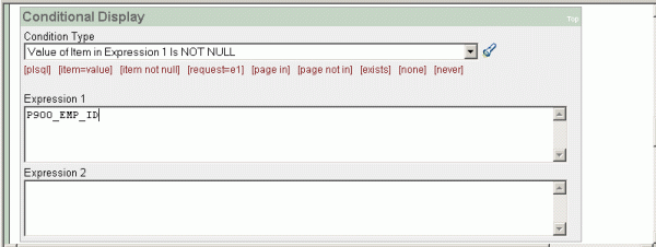
When the example page in this document is rendered, the expectation is that the user will enter a new record. If the user provides a valid Employee ID, the page will retrieve a record from the HT_EMP table and display it for update. It does this by using a before header process created when using the Form on a Table or View Wizard. The audit information is important for users while editing a record, but not while creating one. To have audit information only display when the user is editing a record, create a display condition for the Audit Information region so it only displays when the Employee ID is not null. The Employee ID is set by a trigger so it will only exist for records retrieved from the database. This Conditional Display can be accomplished by using a built-in condition that checks for the presence of a value for the item containing the Employee ID. The Conditional Display of a region is defined on the Region Definition page as shown in Image 13.
Image 13 - Setting Region Conditional Display
Adding Another Region for HTML Text
You have the option of diplaying regions in columns, rather than in rows. This section describes how to create another region to display "hint" text to the user.
To create a region to display hint text:
- 1) Navigate to the Page Definition.
- 2) Under Regions, click Create.
- 3) Specify the region type as HTML and enter a title (such as Hint).
- 4) Set it to display in Column 2.
- 5) Set the region template to Simple Bold Text Region.
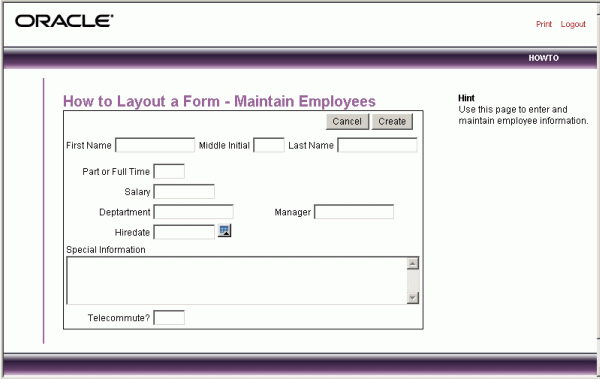
Image 14 demonstrates these changes. Note that this example includes manual breaks.
Image 14 - Page with Hint Region in 2nd Column
Changing Item Types
This section describes how to change item types to make data entry easier for the user. To change an item type, navigate to the Page Item Definition page and select another Display As option.
Radiogroup Because the Part or Full-time item only has 2 valid choices, it is a good candidate for either a Checkbox or a Radiogroup.
To change Part or Full-time to a radiogroup:
- 1) Navigate to the Page Item Definition page.
- 2) From Display As, select Radiogroup.
- 3) Remove the Label (it will be redundant).
- 4) Under List of Values, define the valid values. If the valid values are reusable within an application, create a Named List of Values. For this example, create a local List of Values at the item level. It will be a static list because the underlying column is governed by a check constraint. The List of values definition will be STATIC:Full-time;F,Part-time;P. This will display Full-time and Part-time but the value that will be inserted into the database will be either F or P.
Image 15 - Page with Part/Full-time changed to Radio Group Displayed in 1 Column
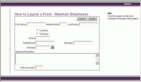
Notice that Full or Part-time is now a radiogroup and is stacked in one column. To have the choices display side by side, set the Columns to 2 under Lists of Values on the Item Definition page. You set this 2, because there are 2 valid values for this item. If there were more, and you wanted them all side by side, you would set the Columns to the number of valid values. Note that if you select to include displaying null as a value, remember to add one for that too. If you had 6 valid values and set Columns to 2, you would get two values side by side with 2 more sets below. Image 16 demonstrates the Radiogroup with the Columns set to 2.
Image 16 - Page with Part/Full-time Radio Group Displayed in 2 Columns
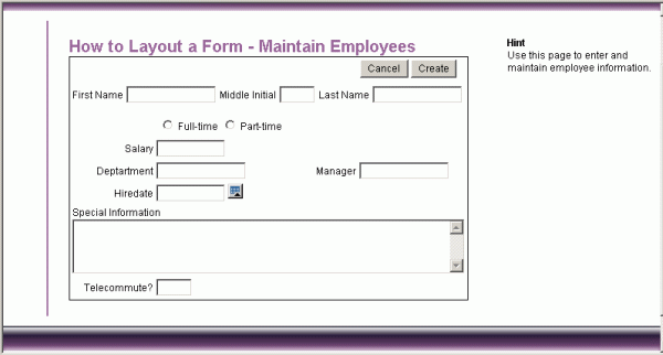
Select List In the DDL listed below, notice that the department is validated by a check constraint. This could be implemented as a Radiogroup, a Select List or a Popup LOV. Because users can filter Popup LOVs, this is a good choice when there are a lot of rows to select from. Given that there are only four choices for Department, a radio group would also be a good choice. However, because a Radiogroup would take up extra space on the page, consider implementing Department as a Select List.
To implement Department as a Select List:
- 1) Navigate to the Page Item Definition page.
- 2) From Display As, select Select List.
- 3) Under List of Values, define the valid values. Again, just for this example, create a static List of Values at the item level. In any real application, this LOV would be dynamic, based upon a department table. The List of values definition is STATIC:SALES,ACCOUNTING,MANUFACTURING,HR. The values in the check constraint are descriptive, therefore, there is no need to specify different values to display. This is the simple 'Select List'. The other Select List choices are for either redirecting the user to another page or URL based on the selection or submitting the current page which is used when other information needs to be retrieved based upon the selection in the Select List.
- 4) Under List of Values, set Display Null to Yes and set the Null display value to - No Assignment - This is necessary because the EMP_DEPT column can contain nulls. Whenever you have a column that can be null, and you implement it with a Select List, you need to make sure that you set the Display Null to Yes. If you don't, the item will be defaulted to the first item in the Select List. You do not need to provide a Null display value but it is a good practice. If there is no Null display value the first value in the list will just be a blank. Image 16 demonstrates the new Select List with the valid values selected.
Image 17 - Page with Department changed to Select List

Checkbox The column EMP_TELECOMMUTE is perfect for a checkbox. When you change the Display Type, you can also move it up on the page and place is next to the Full/Part-time Radiogroup.
To implement EMP_TELECOMMUTE as a checkbox:
- 1) Navigate to the Page Item Definition page.
- 2) From Display As, select Checkbox.
- 3) In Sequence, enter 5.5.
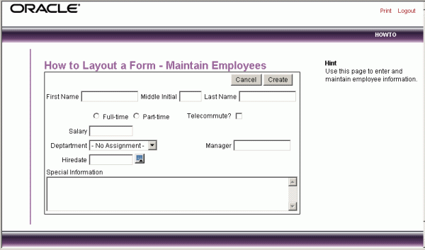
- 4) From Begin On New Line, select No. There are two ways to implement the List of Values for this item. First, you could set the List of values definition to STATIC:Telecommute?;Y and null out the label. This would display a checkbox that was followed by the text "Telecommute?." If a user checks it, the value passed to the database would be Y. To have the label precede the checkbox, set the List of values definition to STATIC:;Y. This displays the checkbox after the label but will not display a value associated with the checkbox. If the checkbox is checked, the value passed to the database will be Y. The latter implementation was used in Image 18.
Image 18 - Page with Telecommute changed to Checkbox
Label Templates
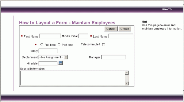
You can affect the look of the item label by using a label template. Sample Application includes two label templates, one for required items and one for optional items. They are used to identify which items on a form are mandatory. In Image 19, the Required Label template has been associated with each item whose base column is mandatory. As shown in Image 19, the Required Label template prepends a red asterisk (*) to the label. You may create your own label templates to control the look of labels using different fonts, borders, backgrounds, images, and so on.
Image 19 - Page with Required Label Label Template applied to First Name, Last Name, and Part/Full-time
Buttons
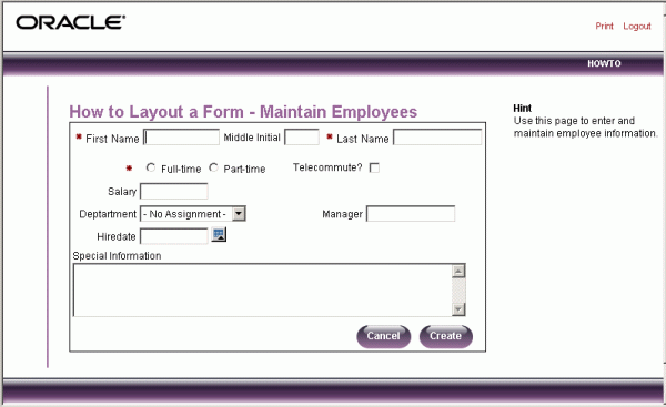
The wizard used to create the form also created some buttons. These buttons display conditionally based upon whether the page is being used to create a new record (P900_EMP_ID is null) or the page is being used to update an existing record. These buttons were created as HTML buttons and placed at the top of the region. You can also place buttons at the bottom of the region, to the left or right of the page title, above the region, below the region, or in any button position defined in the region template. Image 20 demonstrates the resulting page with all the buttons moved to the bottom of the region. Buttons can also have templates associated with them to refine how they look. Image 20 also demonstrates changing the Button Style to Template Based Button and setting the Button Template to Opal Slices. Alternatively, you can create images and use those as buttons.
Image 20 - Page with Templates applied to Buttons
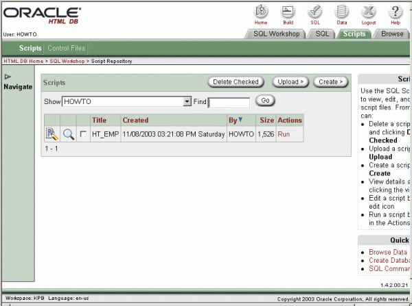
Buttons can also be created as items. This allows you to place them in the midst of items, rather than just in region positions. This is typically used when you want a button displayed just to the right of an item. Image 21 demonstrates this approach. Note the position of the Go button to the right of the Find field.
Image 21 - SQL Workshop Script Repository, the Go button is displayed among the items
Running the Page for Update
You can run the page and provide it with an Employee ID to retrieve. Typically, this would be done with a link from a report page but for this example, run the page and add ::::P900_EMP_ID:1 to the end of the url. This will make the url look something like
http://marvel.oracle.com/pls/otn/f?p=9659:900:1284393467360777225::::P900_EMP_ID:1
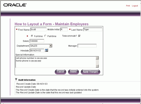
This will pass the value 1 to the item P9000_EMP_ID. In Image 22, Note that the Delete and Apply Changes buttons are displayed. The Create button had always been displayed before because the page was expecting a new record to be created. There is also a Record Create Date displayed but it is not obvious. It is display only, not updateable, which makes it look just like the label.
Image 22 - Page with Record Retrieved for Update
Making Data Bold
To make the information in the Audit Information region easier to read, you can make the labels or the data more pronounced. You can change the color, the font, or use bold. To make a label bold, you could create a new label template that would wrap the html tag for bold around the label and then associate that template with the items in the Audit Information region.
To make the data bold:
- 1) Navigate to the Page Item Definition page.
- 2) In HTML Form Element Attributes, type: class="fielddatabold" This references a class in the Cascading Style Sheet associated with this application.
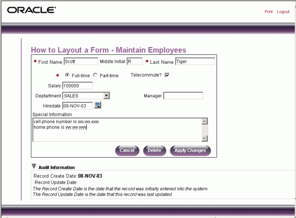
As shown in Image 23, notice that the date associated with Record Create Date is now bold.
Image 23 - Final Version of Page
There are more attributes that control the look and feel of a form. This How-To contained just one example form. Below are tables describing the attributes discussed in this document, along with others, that affect form layout. Also included are instructions for creating the DDL, and the default page used in this How-To and the DDL itself. After reading this How-To, you should be able to recreate all the changes described above and even make others.
Region and Item Attributes Affecting Look and Feel
Below is a summary of how specific region attributes affect form layout followed by how item attributes affect form layout.
Region Attributes
| Category | Attribute | Description |
|---|---|---|
| User Interface Attributes | Template | Determines the look of the region. Select from the region templates defined in the application. The templates can be viewed by clicking on the template name from the templates page under the Applications tab. |
| Sequence | Specifies the display order of the regions within the page. | |
| Display Point | Identifies where, within the page, the region will be displayed. The possible display points for a region are determined by the page level template. The page level template is a page attribute. If no page level template is selected, the default page level template, defined in the Application Definition is used. The specific positions can be seen by selecting the flashlight to the right of this item. | |
| Column | Specifies which column the region will be displayed in. If two regions are in the same display point, they can be placed next to each other by setting the second region to display in column 2. Many regions can display in each column and the display order of the regions within the region display point and column is controlled by the region display sequence number. | |
| Region HTML table cell attributes | This is for additional attributes to be used in the HTML table cells when regions are displayed in multiple columns. The attributes control the cells in the table used to lay out a regions in multiple columns. | |
| Conditional Display | Condition Type and Expressions | Conditions and appropriate expression(s) that determine whether the region will be displayed. |
| Header and Footer Text | Region Header | HTML text to be displayed at the top of the region. This is just before the #BODY# content. |
| Region Footer | HTML text to be displayed at the bottom of the region. This is just after the #BODY# content. |
Item Attributes
| Category | Attribute | Description |
|---|---|---|
| Displayed | Sequence | The order in which items are rendered within a region. |
| Region | The region the item will be displayed within. All items must be in a region. | |
| Begin On New Line | Determines whether this item will display on the same line as the previous item or whether it will display on the next line. | |
| Begin On New Field | Determines whether this item will display in the next column or in the same column as the previous item. | |
| ColSpan | Items are laid out in HTML tables. This defines the value to be used for the COLSPAN attribute of the table cell containing an item. | |
| RowSpan | Items are laid out in HTML tables. This defines the value to be used for the ROWSPAN attribute in the table cell that the item displays in. | |
| Label | Label | The label to be displayed along with the item. This can be left null. |
| Horizontal/Vertical Alignment | Labels can be displayed above, below or to the left of the item. This controls the placement and the horizontal and vertical alignment. | |
| Template | Select the label template. These are used to apply a consistent look and feel. | |
| HTML Table Cell Attributes | Any additional attributes for the cell containing this item's label (e.g. nowrap="nowrap"). | |
| Post Element Text | The text entered here will display immediately following the item. This can contain HTML, javascript or shortcuts. | |
| Element | Width | This is the display width of the item. |
| maxWidth | This is the maximum number of characters that the item can contain. When this is greater than the 'Width', the item will scroll to accept the additional characters. | |
| Height | This is the height of the item, expressed in lines, rather than pixels. This is used to change the height of text areas and multi-select lists. | |
| Horizontal/Vertical Alignment | This determines the alignment of the item. The default is left. | |
| HTML Table Cell Attributes | Select or enter additional attributes to be included in the cell with the item (e.g. bgcolor="yellow"). | |
| HTML Form Element Attributes | Select or enter additional attributes to be included in the form element HTML tag. You may include Javascript. | |
| Form Element Option Attributes | Select or enter additional attributes for the HTML table cell used to display each individual option in a radio group or set of check boxes. | |
| List of Values | Columns | For radiogroups and checkboxes. The number of columns to use to display the values defined in the List of Values. By default, all values will display in one column. |
| Conditional Display | Condition Type and Expressions | Conditions and appropriate expression(s) that determine whether the item will be displayed. |
| Read Only Display Settings | Read Only Condition Type | Conditions and appropriate expression(s) that determine whether the item will be displayed as Read-Only. This can be used to display certain items to a set of users as updateable and display that same set to others users as non-updateable. It can reduce the need to code duplicate interfaces for different users. |
Instructions for creating necessary object and the initial form
To create the HT_EMP table and associated objects:
- 1. Click the SQL icon in the upper right corner of Oracle HTML DB.
- 2.Select the Scripts tab.
- 3.Click Create.
- 4.Name the Script HT_EMP and click Next>.
- 5.Paste in the DDL from the next section.
- 6.Click Create Script.
- 7.Click Run in the row adjacent to your HT_EMP script.
- 8.Select Parse As to be the schema owner that was initially provisioned with your workspace.
- 9.Click Run Script.
This procedure creates a table with insert and update triggers, a sequence to populate the primary key and will inserts one row into the table.
To create the initial form:
- 1.Click the Build icon in the upper right corner of Oracle HTML DB.
- 2.Under Available Applications, select Sample Application,and click Go.
- 3.Select the Wizards tab.
- 4.Under the Forms Wizards, select Form on a Table of View.
- 5.Select the Schema owner used to create the table above.
- 6.Select the HT_EMP table.
- 7.Set the Page to 900 and the Page Name to How to Layout a Form. Keep the other defaults.
- 8.Accept Do not use tabs for the new page.
- 9.Accept the defaulted Primary Key of EMP_ID (the wizard reads the PK from the database definition).
- 10.Accept all the columns selected to include.
- 11.Accept all the defaults for processing options.
- 12.Set all branching to the page you are creating (this page is just for demonstration, the branching is not important).
- 13.Click Edit to edit the page.
- 14.Click on P900_REC_CREATE_DATE not null validation and then click Delete to delete it. (There is a trigger that populates this mandatory column. It will not be populated by the interface so you cannot have the validation.)
Now you have page 900 and can proceed with recreating this How-To.
DDL for HT_EMP
The following is the code to replicate the table used in the example.
create table ht_emp (
   emp_id                 number       primary key,
   emp_first_name         varchar2(30) not null,
   emp_middle_initial     varchar2(1),
   emp_last_name          varchar2(45) not null,
   emp_part_or_full_time  varchar2(1)  not null check (emp_part_or_full_time in ('P','F')),
   emp_salary             number,
   emp_dept               varchar2(20) check (emp_dept in ('SALES','ACCOUNTING',
                                                           'MANUFACTURING','HR')),
   emp_hiredate           date,
   emp_manager            number       references ht_emp,
   emp_special_info       varchar2(2000),
   emp_telecommute        varchar2(1) check (emp_telecommute in ('Y')),
   rec_create_date        date         not null,
   rec_update_date        date)
/

insert into ht_emp
   (emp_id, emp_first_name, emp_middle_initial, emp_last_name, emp_part_or_full_time,
    emp_salary, emp_dept, emp_hiredate, emp_manager, emp_special_info, emp_telecommute,
    rec_create_date)
values
   (1,'Scott','R','Tiger','F',
    100000,'SALES',sysdate,null,'cell phone number is xxx.xxx.xxxx
home phone is yyy.yyy.yyyy','Y',
    sysdate)
/

create sequence ht_emp_seq
   start with 2
/

create or replace trigger bi_ht_emp
      before insert on ht_emp
      for each row
   begin
      select ht_emp_seq.nextval
        into :new.emp_id
        from dual;
      :new.rec_create_date := sysdate;
   end;
/

create or replace trigger bu_ht_emp
      before update on ht_emp
      for each row
   begin
      :new.rec_update_date := sysdate;
   end;
/
Discuss this how-to in the OTN HTML DB Discussion Forum