Before You Begin
Purpose
In this tutorial, you'll use Mobile Application Accelerator (MAX) to build a mobile app that leverages sample enterprise CRM (customer relationship management) data.
Time to Complete
Approximately 60 minutes.
Background
Oracle Mobile Application Accelerator (MAX) allows you to create and publish iOS and Android mobile apps without having to write a single line of code.
Scenario
In this tutorial, you're building a CRM (customer relationship management) app that connects your mobile sales force with the company data that they need to both develop sales opportunities and monitor them. This app delivers content using a service called CRM, which cross-references basic account information like company contacts against the opportunities in the CRM pipeline. Among other things, the service allows the app to display both numerical data, such as the number of opportunities for a sales region along with information about an opportunity, like its current stage within the sale cycle (Prospect, Appointment, Qualification, Presentation, Discussion, and Closing), the date that it was created, and the date on which the deal is expected to close. Using MAX, you can quickly incorporate this data into an entire application flow.
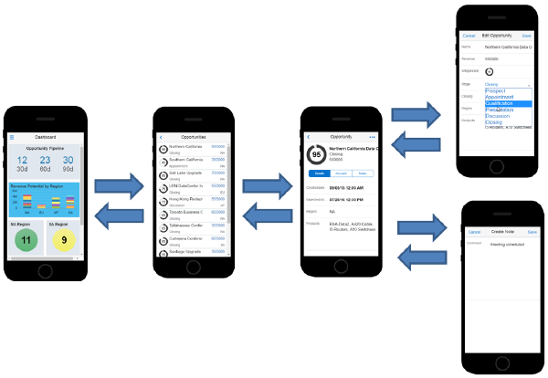
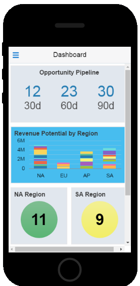
After users log in, the CRM app opens to a dashboard, whose metric counters, bar chart, and gauges provide a glimpse of the opportunities currently in play. It's also the entry point to more detailed information: tapping the metrics or gauges opens the first of a series of screens that not only describe the opportunities in increasing levels of detail, but also let users update an opportunity or create notes about an opportunity.
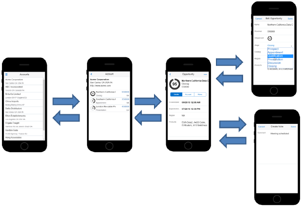
The CRM app provides users with collateral information about the opportunities through a screen flow that describes the accounts to which the opportunities belong.
What Do You Need?
-
The Oracle MAX App installed on your phone -- To run your mobile app on a phone, you need the Oracle MAX App. This is a free app that you can download from either the App Store or Google Play. To locate the app, search for "oracle mobile application accelerator".
View Image
Check with your administrator to be sure that you have the following:
-
MAX 16.3.3 or higher
-
A MAX user account and test user account
-
The CRM Service -- This service is the cornerstone of your app, so you won't get far in this tutorial without it. If you don't have it already, don't worry -- your administrator can set it up quickly by importing this package. Take a look at Importing a Package to find out how.
-
Logging In
Log into Oracle Cloud using your MAX user name and password.
If this is your first visit, you'll see the following page (with an introductory video).

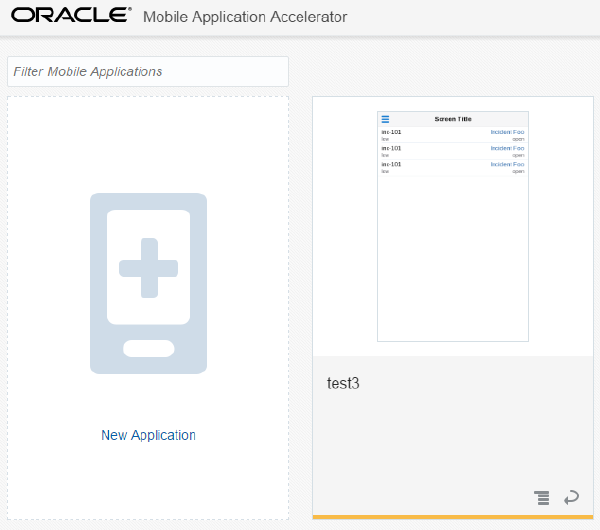
Otherwise, you'll see the Applications page:
Creating the Application
After you log in, you can start off by creating the landing page of your app. In this case, the first screen that your sales reps will see after they log in is a dashboard which gives them bird's-eye view of their opportunities in the sale pipeline.The dashboard's upper region tallies these opportunities by their projected close date: 30 days, 60 days, and 90 days. The lower part of the dashboard breaks down the opportunities by different sales territories: North America (NA), South America (SA), Asia-Pacific (AP), and Europe (EU). The graph in the middle of screen shows the potential revenue projected for these regions.
The Dashboard is also the access point to the rest of the application. Users click on the counters to view lists of opportunities. If users want to see opportunities grouped by sales region, they can click one of the gauges at the bottom of the page.
In this section, you'll learn how to assemble this dashboard using the ready-made screen templates and data visualization components.
-
Click New Application.
-
Give your app a name and then click Next.
View Image
Description of this image -
Next, choose Simple Screen as the screen template. Click Next.
View Image
Description of this image -
Enter
Dashboardas the screen title. Click Next.View Image
Description of this image -
Choose Dashboard as the content type. Click Next.
View Image
Description of this image -
Click Create.
View Image
Description of this image -
After you finish selecting the basic layout for the Dashboard, MAX opens the Designer, where you can complete the user interface, hook it up to the CRM service, test the app, and when you're ready, publish it to your app users.
View Image
Description of this image
On your first visit to MAX, you can watch a video that shows you around the Designer.
-
The Navbar -- Lets you access tools for creating screens, checking your overall screen flow, and accessing the services that provide data to your app. It also lets you open the Components Palette, which has UI components like lists, forms, and graphs.
-
The Preview -- Gives you an idea of how your app looks on a device while you're building it. You'll create your UI by dragging components from the Components Palette and dropping them into the Preview.
-
The breadcrumbs trail -- Tells you which component you're using. Use the breadcrumbs trail to select components.
-
The Properties Inspector -- Where you configure a component that you've selected in the Preview or in the breadcrumb trail. Using the Properties, Data, and Actions tabs of the Properties Inspector, you can define how you want a UI component to appear, display data, and respond to user gestures.
-
The build and test tools -- Tools that let you preview your mobile app within the Designer, test it on an actual device, and distribute it to users.
You'll use these throughout this tutorial.
Laying Out the Dashboard
Before you can add the components that display the opportunity counts to the dashboard, you need to do some landscaping with tiles first. These tiles ensure that the metrics, bar graph, and gauges display how (and where) you want them within the dashboard. After you create the basic structure of the landing page using the Dashboard template, MAX adds the first of these tiles for you. It's called Tile 1. In this section, you'll use the Properties Inspector to configure this tile, which forms the foundation for the three metrics in the top region of the dashboard. To format this tile to hold the metrics counters:
-
In the Preview, select the Tile component (Tile 1) to open the Properties Inspector for Tile 1.
View Image
Description of this image Use the Properties Inspector to set the tile's dimension and content layout:
-
In the Tile Dimensions section, select 2x1 to allow the counters to fill the width of the screen.
View Image
-
Because you want to keep the three metrics together when the dashboard is viewed in both landscape and portrait modes, choose the layout option that divides the tile into three segments (Layout 9) from the Content Layout menu.
View Image
-
Re-title Tile 1 as
Opportunity Pipelineand then center the title over the tile.View Image
-
Choose a color to set off the tile within the dashboard:
-
Click Background.
View Image
-
Open the Background Color menu and pick a light, neutral color, like gray.
View Image
The tile should look something like this:
View Image
-
-
-
Now that you've created top tile, you're ready to add visual elements to it using the ready-made UI widgets in the Components Palette.
View Image
The CRM service returns raw data for the number of opportunities that are projected to close within the next 30, 60, and 90 days, so you need a visual component that can be used as a simple counter. The Metric component, which displays a number and label, fits the bill.
-
First, drag a Metric component from the Components Palette into the left-most tile.
View Image
-
In the Properties Inspector for the Metric component, define the label as
30d(for 30 days).View Image
Description of this image -
Add two more Metrics components. Using the Properties Inspector, label them as
60dand90d. When you're finished, the Preview and Properties Inspector should look like this:View Image
Description of this image
-
-
Next, add the tile for the graph:
In the breadcrumbs trail, select Dashboard so that the Dashboard component is selected in the Preview and in the Properties Inspector.
View Image
-
In the Properties inspector, click Create New Tile.
-
Choose 2x1 as the tile dimensions.
View Image
- Name this tile Revenue Potential by Region.
-
Choose a light background color for the tile (like light blue). When you're done, the tile should look like this:
View Image
-
With the tile complete, you can add a Bar Graph:
Drag a Bar Chart component into the tile.
View Image
The Preview and Properties Inspector should look like this:
View Image
Description of this image -
This bar chart measures revenue by region, which can be expressed by a basic bar chart. But because each bar has an added dimension that segments each region by Opportunity ID (oid), choose Vertical Stacked bar chart.
View Image
-
To format the graph, click Legend and Titles and then do the following:
-
Remove the legend by choosing None.
View Image
-
Clear the bar chart's Title checkbox because you're going to use the title that you gave the tile instead.
View Image
The Preview should look like this:
View Image
-
-
Now, add the gauges that use a stop light color scheme that indicates when displayed number of opportunities meets minimum, medium, and maximum quotas. For now, you're going to add the tiles and visual components for these gauges. In Adding Data to the Dashboard, you'll add color-coded thresholds that allow the gauge to change color when the number of opportunities meet, or fall below, certain ranges.
-
In the breadcrumbs trail, select Dashboard so that the Dashboard component is selected in the Preview and in the Properties Inspector.
-
Click Create New Tile. The Properties inspector for the tile (Tile 1) appears.
-
In the Properties Inspector, rename Tile 1 as
NA Region. -
Pick a neutral background color for the tile, like gray.
View Image
-
To create the first gauge, drag the LED Gauge component from the Components Palette into the NA Region tile.
View Image
Tip: Use the Search field to locate a component in the Components Palette.
The LED Gauge component displays an integer like the Metric component does, but because it's a gauge, it can do something that the metrics counter can't: change from red to yellow to green when the integer returned by the CRM service meets, or falls below, certain thresholds.
After you drag the LED Gauge into the NA Region tile, the Preview should look like this:
View Image
-
Open the Properties Inspector for the Dashboard component by clicking the Dashboard in the breadcrumbs trail.
View Image
Add the remaining files as follows:
-
Click Create New Tile.
-
Click New Tile twice to create a total of three tiles.
View Image
-
Name the tiles
SA Region,AP Region, andEU Region.Tip: If you need to scroll down in the Preview, first click within the Preview itself and then use the track wheel of your mouse.
- Set background color the tiles. For example, pick gray so that they all match (and complement the Opportunity Pipeline tile as well).
-
Drag LED Gauge components into each of the tiles.
Tip: Do one of the following if you need to open the Component Palette:
-
Click Components in the left navbar.
View Image
-
Double-click the Add icon in the tile.
View Image
When you're done, the dashboard should look something like this in the Preview:
View Image
-
-
-
Adding Data to the Dashboard
Congratulations! You completed the UI for accessing the CRM data in the dashboard. But right now, your app isn't connected to the CRM Service, meaning that it's only displaying placeholder data. Never fear -- you can quickly wire your UI to data using the various business objects that belong to the CRM service. A business object describes the data returned by the service using real-world terms, so you can figure out how to get the data you need easily.
Each business object is broken down into a set of fields that describe the describe the different types of data that is available through the service. For example, the Opportunity business object (which you'll use throughout this tutorial) has fields that describe various aspects of an opportunity, such as "salesstage," which describes the sale cycle by returning values like Appointment, Qualification, and Closing. You'll use these fields to back your UI with data. In addition to Opportunity, the other business objects that you'll use in this tutorial are Statistics, which returns numeric data for the dashboard components, and Account, which includes fields that return information about a company, such as its name, address, web site, and geographic region.
First, first, add data to the Metric components:
In the Preview, select the 30d Metric component.
View Image
Description of this image -
Click Data.
View Image
-
Expand the menu in the Business Object field and then click Browse Service Catalog.
View Image
Description of this image -
From the Service Catalog, select CRM and then click Next. Because you've selected this service, it remains available throughout the development process. You don't need to select it again.
View Image
Description of this image Tip: Use the filter to find a service quickly.
View Image
-
Choose Statistics and then click Select. The Statistics business object returns raw data for the opportunities projected to close in thirty, sixty, and ninety days.
View Image
Description of this image -
To enable the 30d meter to display the number of the opportunities that are set to close in 30 days, drag count30d into the Value field.
View Image
Description of this image Tip: Notice that the Data Mapper uses a color scheme for each data source, like pink for business objects (which is the case here) or yellow for fixed values (which you'll find out about when you map the data to the region gauges later on). Because you selected the Statistics business object, the Data Mapper opens the pink Business Objects tab and displays all of this business object's fields, which are also pink.
When you're done, the mapping should look like this:
View Image
Description of this image -
Click Live Data Preview to see how the metric component displays data. The data used here is placeholder data known as mock data. As the name suggests, this isn't the actual data returned from the CRM service. Instead, it's an example of the data. You can use it to ensure that you're mapping data that's appropriate to the field type. Later on, you'll test the UI out using live data.
View Image
Description of this image -
Click Finish to return to the Designer.
View Image
Description of this image -
Repeat these steps to populate the 60d and 90d Metrics components by dragging the count60d and count90d fields into the Value field. When you're done, the metrics should look something like this in the Preview:
View Image
Description of this image
-
-
Populate the bar graph:
-
In the Preview, click the Bar Chart component.
View Image
Description of this image In the Properties Inspector for the Bar Chart component, click the Data tab.
-
Open the Business Object menu and click Opportunities.
View Image
Notice that MAX doesn't include the Statistics business object here, because it can't be used for graph components like bar charts. The Opportunities business object, however, has the fields that you can use to populate the x and y axes with data: revenue, region, and oid (Object ID). You'll revisit the Opportunities business object later in Adding Data to the List of Opportunities.
-
Map the fields as follows and then click Live Data Preview to preview the graph:
Drag this field... ...Into the bar chart field revenue Values (Y Axis) region Categories (X Axis) oid Colors (Series) When you're finished the Data Mapper should look like this:
View Image
Description of this image -
Click Finish. In this stacked bar chart, the oid field segments the region bars by color.
-
-
Next, begin populating the sales region gauge components, starting with NA Pipeline.
-
In the Preview, click the NA Region LED Gauge component to open the Properties Inspector for the LED Gauge component.
Click the Data tab.
-
Choose Statistics from the Business Object menu.
View Image
Description of this image -
In the Data Mapper, drag countNA into the Value field.
View Image
Description of this image -
Click Finish.
View Image
Description of this image
-
- To show users how the value returned from the service stacks up against target quotas, you need to set the color-coded minimum, medium, and maximum thresholds for the NA Region gauge as follows:
-
Select the NA Region in the Preview (if it's not already selected) and then click the Data tab in the Properties Inspector.
-
In the Data tab of the Properties Inspector, click the Add icon three times.
View Image
-
Use the color picker to add red (minimum), yellow (medium), and green (maximum).
View Image
-
Enter
5as the minimum threshold (red) and10as the medium threshold (yellow). Because MAX considers the value returned for the field (which in this case, is countNA) as the maximum value, you just need to pick green from the color picker to complete the thresholds.View Image
-
-
Repeat these steps for the SA, AP, and EU gauges. Use the following field values of the Statistics business object.
For this Gauge... ...Map this Value SA Pipeline countSA EU Pipeline countEU AP Pipeline countAP When you're done, the Preview should look like this:
View Image
Description of this image The gauges are red because the mock data value is within the mini um range.
Opening the Data Mapper shows that MAX added the minimum and medium thresholds (Threshold 1 and Threshold 2, respectively) as fixed values. Unlike the pink fields that are mapped from the business object, fixed value fields are yellow.
View Image
Description of this image -
With the mapping complete, you can now see how the dashboard uses live data. Click Test.
View Image
-
Enter your test user name and password. Because you'll use the testing tools throughout this tutorial, click Save test user before you click Sign In.
View Image
Description of this image -
Preview your app as an Android and iOS app in different orientations. Adding the background color to the region tiles makes them stand out when they float to new positions.
View Image
Description of this image -
When you're done, click Back to Designer.
View Image
Creating the Opportunities Screen Flow
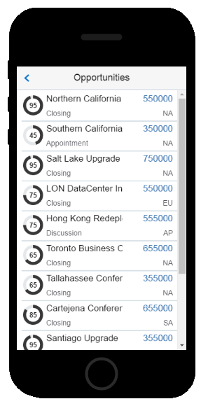
In this step, you create the basic layout for the first screen of the Opportunities screen flow.
Adding the Screen
To add a new screen to your app:
-
Click Application Screens in the left navbar.
View Image
-
Click New Screen.
View Image
-
For screen type, pick Detail and then click Next.
View Image
Description of this image -
Choose Simple Screen. Click Next.
View Image
Description of this image -
Enter
Opportunitiesas the screen title.View Image
Description of this image -
Choose List. Click Next.
View Image
Description of this image -
Click Finish.
View Image
Description of this image
Adding Data to the List of Opportunities
Previously, you used the Data Mapper to wire the dashboard components to the CRM service. In this step, you're going to use the QuickStarts. Not only do they step you through binding data, but they'll build the entire screen flow for you as well.
-
Click QuickStarts.
View Image
-
Click Add Data.
View Image
-
Complete the wizard as follows:
-
Choose the default layout option and then click Next.
View Image
-
In the Select Data Source screen, choose Opportunities and then click Next.
View Image
-
Complete the data mapping as follows and then click Next:
Map this field... ...To this field winpercent Graphic Source desc Title salestage subtitle revenue Value 1 region Value 2 When you're done, the Data page should look like this:
View Image
Description of this image -
You don't need to filter the data, so click Next and then click Finish in the Query page to complete the mapping. You won't see the win percent data in the Graphic Source field, but you will after you complete the next step, where you change its field type to a circular meter.
View Image
-
-
Because the winpercent field returns the win percentage for an opportunity and not an image (which is the default field type for an icon), you need to change the icon field type to a circular meter. To do this:
-
Double-click the Icon field in the Preview.
View Image
Tip: If needed, click QuickStarts to dismiss the QuickStarts panel.
-
In the Properties Inspector, open the Field Type menu and then choose Circular Meter.
View Image
The Opportunities list now displays the mapped data:
View Image
Description of this image
-
Creating the Opportunities Details Screen
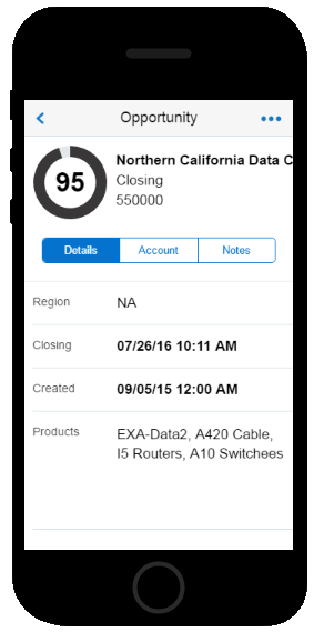
In this step, you'll create the detail screen that's comprised of a summary panel that displays the deal's highlights by replicating the opportunity name, win percent, and sales stage that display in the Opportunities screen. Users can reference this information as they access more detailed information using the screen's Details, Account, and Notes tabs. In addition to providing users with the specifics about an opportunity, this screen enables users to update an opportunity, or add notes.
-
Open the List component in the Properties Inspector by clicking List in the Properties Inspector or in the breadcrumbs trail.
View Image
-
Click QuickStarts.
View Image
-
Click Add a Detail Screen.
View Image
-
Complete the Add a Detail Screen wizard as follows:
-
Choose Screen with Top Tabs and Summary and then click Next.
View Image
-
Enter
Opportunityas the screen name. Name the tabsDetail,AccountsandNotes. Click Next.View Image
Description of this image -
You're going to create an edit screen that's based on this screen, so choose Form as the content type. Forms allow user input (unlike lists). Click Next.
View Image
-
-
In the Review page, click Finish.
Creating the Summary
The Opportunity screen has a summary panel that displays key details about an opportunity. This panel which displays the win percentage as a circular meter along with the company name, sales stage, and projected opportunity revenue behaves like a banner: it's always on display, allowing users to reference it while viewing related information in the Details, Account, and Notes tabs.
The Summary panel can only hold one UI component, like a single graph, a form, or an image. To allow it to accommodate a set of fields along with circular meter, add the Card component.
-
In the Properties Inspector, click Go to Detail Screen.
View Image
-
Open the Components Palette by double-clicking the Add button in the Summary pane or the Components icon in the navbar.
Select the Card component.
View Image
-
Drag the Card component into the Summary pane.
View Image
Description of this image To enable the win percent circular meter to display within the summary pane, change the Graphic field type as follows:
-
Click Graphic to open the properties tab.
View Image
Choose circular meter from the Field Type list.
View Image
-
- Bind the Card component to data:
-
Open the Properties Inspector for the Card component by selecting it in the Preview or from the breadcrumbs trail.
View Image
-
Click Quickstarts and then click Add Data.
View Image
-
In the Data Source page, choose Opportunity and then click Next. Notice that the Data Mapper includes all of the fields (which include Subtitle 1 and Subtitle 2) that you've selected for the Card component.
View Image
Description of this image Map the fields as follows:
Map this Opportunity field... ...To this Card field winpercent Graphic Source desc Title salesstage Subtitle 1 revenue Subtitle 2 The mapping should look like this:
View Image
Description of this image -
Click Next to go the Query page. The Oid (Opportunities ID) field in the Query Parameters section is already mapped. (Notice that the Oid field is purple, which indicates that it belongs to the Parent Screen category. In this case, the parent screen is Opportunities.) MAX anticipates that this value, which is unique for each opportunity, will return the correct data in the Opportunity screen. Accept this value and then click Finish.
View Image
-
-
Lastly, conserve the screen real estate by resizing the summary panel:
-
In the Preview, open the Properties Inspector for the screen by clicking the header.
View Image
-
In the Summary Size section of the Properties Inspector, click Custom.
View Image
-
Decrement the size to 100.
View Image
Description of this image
-
Creating the Details Tab
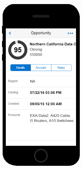
In this step, you'll add a tab to the Opportunity page that supplements the information that displays in the summary pane of the screen by displaying the sales region, the products included in the deal, and dates for the creation of the opportunity and its expected close.
-
Select the Form component in the Preview.
View Image
Description of this image -
Click QuickStarts.
-
Click Add Data.
View Image
-
Complete the mapping as follows:
-
In the Data Source page, pick Opportunity and then click Next.
View Image
-
In the Data page, build the edit form by dragging the following fields from the Opportunity section into the Form Component Fields section:
-
createdate
-
expectedclose
-
region
-
products
View Image
Description of this image
-
-
Click Next to advance to the Query page, which shows that the oid (Opportunity ID) from the parent screen, Opportunities, filters the data. You don't need to add or remove any values, so click Finish.
View Image
The Details page should look like this in the Preview:
View Image
Description of this image
-
-
Now that you've populated the detail screen with fields, you need to finesse the UI to make it more user-friendly by changing some of the field names and formats:
-
If needed, dismiss the QuickStarts panel by clicking Properties.
View Image
In the Properties Inspector for the Form component, click Fields
View Image
-
Click Createdate to open the Properties Inspector for this field.
View Image
-
Enter
Createdin the Field Label field. -
To make the date easier to read, choose Date Time as the field type.
View Image
-
Click Fields to return to the Fields Properties Inspector.
View Image
-
Repeat these steps to rename Expectedclose as
Closingand change its field type to the Date Time format. -
To allow the Products field to better accommodate the output text, first select the Products field in the Preview. Next, use the Properties Inspector to change the field type to Text Area. Increment the area's rows to 5.
View Image
Description of this image
-
-
Finally, reorder the fields by dragging and dropping them in place using the move function.
View Image
To do this:
Click Fields.
View Image
-
Use the move function to rearrange the field order as follows:
-
Region
-
Closing
-
Created
-
Products
When you're done, the Preview and Properties Inspector should look like this:
View Image
Description of this image
-
Creating the Edit Details Screen for an Opportunity
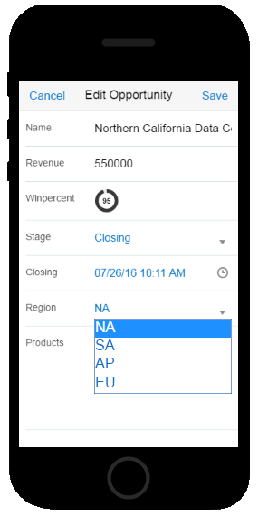
The Edit Opportunity screen enables users to track their progress on a deal.
Select the Form component by clicking Form in the breadcrumbs trail.
View Image
-
Click QuickStarts if the QuickStarts panel is not already displayed in the Properties Inspector.
View Image
-
Click Add Edit Screen.
View Image
-
Click Go to Edit Screen.
View Image
The Edit screen displays in the Preview, which has Cancel and Save actions in the header. The screen includes all of the fields from the Opportunity screen except for the createdate field. MAX doesn't include this field because app users can't change the value provided by this field. By design, the services that back a MAX application have fields that users can edit as well as those they can't. MAX excludes this latter group automatically when you build edit screens using the QuickStarts.
View Image
Description of this image -
This edit screen should look like the detail screen, so you need to reorder and rename fields. You also need to change some of the field types. In some cases, you'll do this so that the fields in this edit screen match their counterparts in the detail screen. In other instances, you'll change the field type so that users can pick a different region or sales stage.
-
In the Properties Inspector, click Fields.
View Image
-
Reorder the fields to match the Detail screen:
-
Desc
-
Revenue
-
Winpercent
-
Salesstage
-
Expectedclose
-
Region
-
Products
To do this, use the move function to drag the fields into place.
View Image
When you're done, the Properties Inspector should look like this:
View Image
Description of this image -
-
For the Desc field, enter
Namein the Field Label field. -
Click Winpercent. Change the name to
Win%.View Image
-
Choose circular meter from the Field Type menu.
View Image
Description of this image -
Next, select SalesStage from the menu in the Properties Inspector.
View Image
-
Enter
Stagein the Field Label field. Change this field from output text to a list of items by choosing Select from the Field Type menu.View Image
-
Select the Region field and then choose Select from the Field Type menu to create another list of items.
-
Rename the Expectedclose field as
Closingand change its field type to Date Time.View Image
For the Products field, change the field type to Text Area and expand the field to five rows.
View Image
When you're finished, the Edit Opportunity screen should look like this:
View Image
Description of this image
-
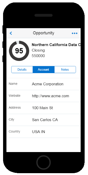
Creating the Accounts Tab
In this step, you'll add a tab that displays some basic information about the account related to the selected opportunity.
-
Navigate back to the Opportunity screen by first clicking Screen Flow in the left navbar.The Screen flow tool shows you all of the screens that you've created so far. Double-click the Opportunity snapshot in the screen flow to open the Opportunity screen in the Preview.
View Image
Description of this image -
In the Preview, click the Account tab.
View Image
Description of this image -
Double-click Add Component in the Preview to open the Components Palette.
Select the Form component in the Components Palette.
View Image
-
Drag the Form component into the Preview.
View Image
Description of this image -
In the Properties Inspector, click QuickStarts and then click Add Data.
View Image
-
Complete the Add Data QuickStart as follows:
-
Choose Opportunities in the Select Data Source page and then click Next.
View Image
-
In the Data page, first expand the account field.
View Image
The fields of the account object display.
View Image
Description of this image -
Drag the Account fields into the Form Component Fields section in the following order:
-
name
website
-
address
-
city and state -- create a concatenated field by dragging these two into the same field.
-
country and region (another concatenated field)
When you're done, the Data page should look like this:
View Image
Description of this image
-
- Next, Next. In the Query
page, click Finish. (You
don't need to filter the returned data.)
View Image

Description of this image
-
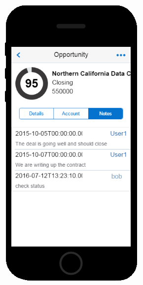
Adding the Notes Tab
In this step, you'll create a list of notes for each opportunity that are written by various app users. Each list item identifies the notes' author by app user name.
-
In the Preview, click the Notes tab.
View Image
Description of this image -
Double-click Add Component to open the Component Palette.
View Image
-
Drag a list component into the lower pane of the Preview.
View Image
The Properties Inspector for the List component should be open.
View Image
Description of this image -
Click Quickstarts and then click Add Data.
View Image
-
You don't need all of the list fields, so choose the option that includes only the Title, Subtitle, and Value 1 fields and then click Next.
View Image
-
In the Data Source page, choose the Opportunity Notes business object.
View Image
Map the fields as follows:
Map this Opportunity Notes field... ...To this List Component field createdate Title comment Subtitle username Value 1 View Image
Description of this image -
Click Next to move to the Query screen, which shows that the oid (Opportunity ID) from the Opportunities screen. The oid filters the data that the service returns to the list. Click Finish.
View Image
The populated list of notes should display in the Preview like this:
View Image
Description of this image
Adding the Create Note Screen
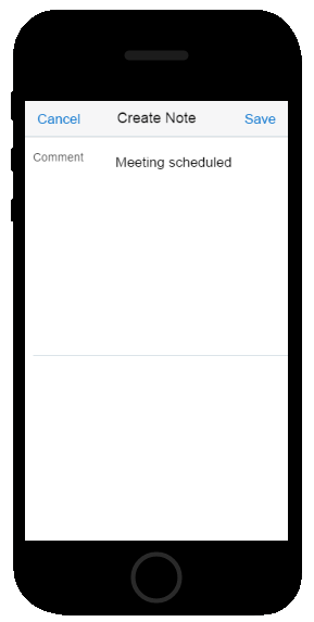
In this step, you'll create a form that enables users to jot down notes for a selected opportunity.
-
In the Preview, select the screen component by clicking the Opportunity header.
View Image
Description of this image -
In the Properties Inspector for the Screen component, click Header Buttons.
View Image
- In the Header Buttons panel, click Button.
View Image

- Enter Create Note in the Button Label field.
View Image

Click Action in the Properties Inspector.
View Image
Click Add Action.
View Image
-
Choose Tap.
View Image
-
Click Navigate to Field.
View Image
Put it in the DRAG AN ACTION HERE slot.
View Image
-
Click Add.
View Image
Create the screen as follows:
-
In the Screen type page, pick Create and then click Next.
View Image
In the Title page, enter
Create Noteand then click Next.-
Choose Opportunity Notes (the business object that you picked to populate the List components in the Notes tab) from the Business Object menu and then click Next.
View Image
Description of this image Click Finish to return to the Action tab.
View Image
-
Click Navigation Data Mapper.
View Image
The Configure Navigation Data Mapping page shows that the Opportunity ID (oid) is passed between the Notes tab of the Opportunity screen and the Create Note screen.
View Image
Description of this image From the Current Screen category (which should be open by default), drag oid into both of the Oid fields.
View Image
Description of this image Click Finish and then click Save in the Action tab.
You'll revisit the Navigation Data Mapper when you plot the interactions within the screen flow.
-
-
Click Go to Create Note.
View Image
-
The CRM service populates Comment and Username as the input fields in the form. Since you're going to display the name of the logged in user in the Notes tab, you don't need the user to add his or her name here. To remove the Username field, first right-click it in the Preview and then choose Delete.
View Image
-
Right now, the Comment field is only a single line, so it might not provide enough space for users to enter notes. To make it easier to use:
-
Open the Properties Inspector for the Comment field by either double clicking it in the Preview or by clicking Comment in the Properties Inspector.
View Image
-
Choose Text Area as the screen type.
View Image
Add some helpful text in the Hint field, like Type your comments here....
- Increase the number of rows to 10.
View Image

Description of this image
-
Populating the Notes Tab with the User Name
In addition to navigation actions, MAX also provides business actions, like the ones that refresh data. You can't edit these actions, but by using the Business Action Mapper, you can change the custom business actions that have been created as part of the service. In this step, you'll change the custom action called Create Opportunity Notes so that your app users' names appear next to the notes that they create.
-
Select the screen component for the Create Note page by double-clicking the header bar in the Preview.
View Image
-
Click the Actions tab in the Properties Inspector.
View Image
-
Click Create Opportunity Notes. This is a custom action for the Opportunity Notes business object.
View Image
-
Click Business Action Mapper.
View Image
The Configure Business Action Parameters page reveals how the Create Opportunity action enables the Create Screen to interact with Notes tab: it tracks new notes using the Opportunity ID (oid) from the parent Opportunity screen and it maps the values from the Create Notes' Comment and Username fields. The Create Notes screen has only one input field (Comments); app users can't enter their names here. To allow the name of the current user populate the list in the Notes tab alongside the comment that's entered in this screen, you'll need to change the parameter mapping.
View Image
Description of this image -
First, delete the Current Screen value from from the Username field. You don't want this parameter because it won't return the name of the current app user to the Notes tab.
View Image
Description of this image -
Expand the Application User category.
View Image
Description of this image -
Drag User Name into the Username field to populate the screen with the name of the current app user.
View Image
Description of this image -
Click Finish and then click Save after you return to the Configure Actions page.
Creating the Accounts Screen Flow
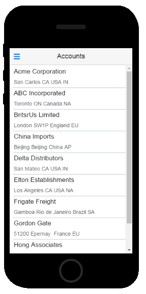
In this step, you create a second screen flow that gives your users access to account information. The first screen lists your company's accounts. When users click a list item in this screen, they'll open a detail screen that shows them some basic information about the account itself and list of the opportunities that belong to it. As you did previously, you'll use the QuickStarts to build this screen flow.
Adding the Accounts Screen
The Designer provides you with different ways to add screens to an app. Previously, you used Application Screens in the navbar to add the Opportunities screen. Here, you'll add a screen using the Properties Inspector for the Application Menu component.
-
Open the Dashboard by double-clicking the Dashboard snapshot in the screen flow.
View Image
- In the Preview, click the menu icon to open
the Application Menu component in the
Properties Inspector.
View Image

-
In the Properties Inspector for the Application Menu component, click Menu Item.
View Image
-
Complete the Create Screen wizard as follows:
-
In the Landing Screen page, choose Simple Screen and then click Next.
View Image
-
Enter
Accountsin the Screen Title screen and then click Next. -
In the Content screen, choose List and then click Next.
View Image
-
Click Finish.
-
Click Accounts in the Preview. Then click Go to Screen in the Properties Inspector.
View Image
-
Adding Data to the List
Previously, you enabled the dashboard components to display data using the Data Mapper tool. In this (and subsequent) steps, you'll use the QuickStarts. These wizards not only allow you to add data to your UI, but enable you to build entire screen flows.
To add data to the accounts list:
-
In the Properties Inspector for the List component, click the QuickStart icon.
View Image
-
Click the Add Data Quickstart.
View Image
-
In the Layout page, choose Title, Subtitle.
View Image
-
Choose Account as the business object.
View Image
-
Map the Accounts business object fields to the List Component as follows and then click Next.
-
Drag name to the Title field.
-
Drag city, state, country and region into the Subtitle field.
View Image
-
-
We're not going to filter this data, so click Finish in the Query page.
View Image
Back in the Designer, the Accounts list displays in the Preview showing mock data.
View Image
Description of this image
Creating the Account Screen
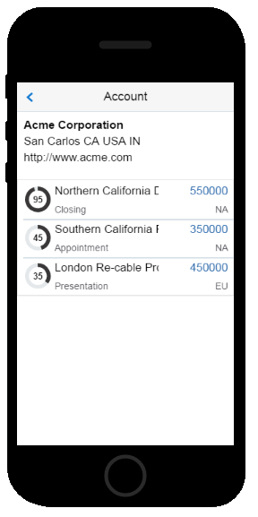
In this step, you add a screen that lets your users see the opportunities that belong to a selected account along with some high-level information about the account itself.
-
Click Add a Detail Screen.
View Image
-
Choose Simple Screen with Summary.
View Image
-
Enter
Accountin the Screen Title field and then click Next.View Image
-
Choose List and then click Next.
View Image
-
Click Finish.
View Image
-
Click Go to Detail Screen.
View Image
-
Open the Components Palette and then select the Card Component.
View Image
-
Drag the Card component into the Summary Panel in the Preview.
View Image
Description of this image In the Properties Inspector, click the Properties tab.
View Image
-
In the Properties Inspector for the Card component, clear the Graphic option. For this card, you're going to map data to the card's Title, Subtitle 1, and Subtitle 2 fields.
View Image
Open the QuickStart menu, choose Add Data and then choose Account. Click Next.
View Image
-
In the Data tab, map the fields as follows and then click Next.
Map this value... ...to this field name Title city, state, country, region Subtitle 1 website Subtitle 2 View Image
-
You need to filter the data by the Account ID (aid) so that users can see the opportunity details that belong to an account. MAX has volunteered the aid from the parent screen (Accounts), so click Finish.
View Image
In the Preview, the card displays mock data.
View Image
Description of this image -
Resize the summary pane:
-
Double-click the Account screen header in the Preview.
View Image
-
Click the Properties tab in the Properties Inspector if it's not already open.
In the Properties Inspector, click Custom and then decrement the size to 100.
View Image
-
-
Next, add data to the List component:
-
Select the List component in the Preview or in the breadcrumbs trail.
View Image
Description of this image - If the QuickStarts panel doesn't appear, click QuickStarts and then click Add Data.
-
You need all of the list fields for the account details, so choose the default layout and then click Next.
View Image
-
In the Data Source page, click Opportunities.
View Image
-
Map the fields as follows and then click Next:
Map this value... ...to this field winpercent Graphic Source desc Title salestage subtitle revenue Value 1 region Value 2 The Data screen should look like this:
View Image
Description of this image
You'll see the mapped data when you change the Icon field type from a graphic to a circular meter. You'll do that after you filter the data in the next step.
-
-
You need to filter the data by the Account ID (aid) to allow users to see the opportunity details that belong to an account. Because the aid parameter belongs to the Accounts screen, click the Parent Screen category. Next, drag aid into the Aid field in the Query Parameters section of the screen. Click Finish.
View Image
Description of this image In the Preview, select the Icon field.
View Image
-
Change the icon field from an image to a circular meter. The list data displays.
View Image
Description of this image
Adding Navigation
The QuickStarts added the screen navigation for the Opportunities and Accounts screen flows for you. You can traverse back and forth within them, but at this point, you can't access one from the other. Further, the dashboard isn't connected to the Opportunities flow, meaning that if you ran the app right now, it would open to the dashboard, but you couldn't drill down to the list of opportunities. In this step, you'll tie the app together by creating navigation actions from the dashboard to the Opportunities screen and from the Account screen to the Opportunity screen.
Mapping the Dashboard Metrics
In this step, you're going enable your users to drill down from the dashboard into the list of opportunities.
-
Navigate to the Dashboard using either the Screen Flow or Application Screens tools in the navbar.
View Image
-
In the Preview, select the 30d metric component.
View Image
-
In the Properties Inspector, click Actions.
View Image
-
Click Add Action.
View Image
-
Click Tap.
View Image
-
In the Configure Action page, choose Navigate to Screen as the action that's triggered when a user taps a list item.
-
Move the Navigate to Screen action into the field that says DRAG AN ACTION HERE.
View Image
-
Choose Opportunities from the Screen menu and then click Save.
View Image
-
By setting the Opportunities list as the target screen, you enable users to open the list of all of the opportunities when they click the 30d metric. You need to refine this mapping so that users see only the opportunities that are projected to close within 30 days when they click this metric. You'll narrow the items that display in the Opportunities page using the Navigation Data Mapper:
Click Navigation Data Mapper.
View Image
Description of this image -
The Current Screen category is open, displaying the field values that belong to the Statistics business object which back the Dashboard's LED Gauge components with data. Because these fields are used to return integers, you can't use them to control the display in the Opportunities screen. You're going to add a value instead, so click the Fixed Value category.
View Image
Description of this image -
Drag Fixed Value into the Closein field and then enter 30.
View Image
Description of this image -
Click Finish and then click Save after you return to the Configure Action page.
-
Repeat these steps for the 60d and 90d metrics by adding
30and60in the Closein field.
Mapping the Gauges
-
In the Preview, select the NA Region tile.
View Image
Description of this image -
Click the Action tab in the Properties Inspector.
View Image
-
Click Add Action.
View Image
-
Click Tap.
View Image
-
Choose Navigate to Screen and then pick Opportunities from the Screen menu.
-
Like the counters, you want to filter the items that display in the Opportunities list. This time, you'll use the region codes to filter the data. To start off, click Navigation Data Mapper.
View Image
-
Open the Fixed Value category and then add a fixed value of
NAto the Region field.View Image
Description of this image Click Finish and then Save.
-
Repeat these steps for the rest of the gauge tiles. Enter
SA,EU, andAPin the Region field. Click Screen Flow in the left navbar to take a look at the navigation from the Dashboard to the Opportunities screen.
View Image
Description of this image
Linking the Accounts Screen Flow to the Opportunities Screen Flow
In this step, you'll enable users to drill down from the Account detail screen to the Opportunity detail screen.
-
In the Screen Flow window, open the Account screen by double-clicking the Account screen shot.
View Image
-
Select the List component in the Account screen.
View Image
Description of this image -
Click the Actions tab.
View Image
Because you created this screen using the QuickStarts, MAX has already added the Load Screen action for the List component. Because you're going to add one more, click Component Action.
View Image
-
Click List Item.
View Image
-
Click Tap.
View Image
-
Choose Navigate to Screen and then pick Opportunity from the Screen list.
View Image
Description of this image Click Navigation Data Mapper.
View Image
-
If it's not already selected, click the Current Screen category.
View Image
Description of this image -
Map the Opportunity ID (oid) field to each Oid field in the Opportunity Screen Parameters section.
View Image
Description of this image -
Click Finish and then click Save after you return to the Configure Action page.
With the navigation complete, the screen flow should look like this:
View Image
Description of this image
Testing the App
At any point, you can test the app using the web-based simulator, or the MAX App.
Testing the App in the Designer
In this step, you return to the simulator to test the screen flow.
-
Click Test.
View Image
-
Find out which opportunities will close in 30, 60 or 90 days by clicking the metrics in the Opportunity Pipeline section to open the Opportunities page.
View Image
-
Click a list item to find out more about an opportunity.
View Image
-
Click through the tabs of the Opportunity screen.
View Image
Click Edit.
View Image
-
Update the opportunity by changing the region and the sales stage and then click Save or Cancel.
View Image
Click Create Note.
View Image
Add a note and then click Save.
View Image
Your new note appears in the Notes tab with your test user name next to it.
View Image
Click Back to return to the dashboard.
View Image
-
To sort the list of opportunities by region, click the region counters.
View Image
-
Drill down from the Opportunities screen and repeat the previous steps to view details, update an opportunity, and add notes.
View Image
Next, test the Accounts screen flow:
-
Return to the dashboard and then click the menu icon.
View Image
-
Click Accounts.
View Image
-
Click an account to open the details screen.
View Image
-
Click a list item to open the Opportunity screen.
View Image
-
Update an opportunity or create a note.
View Image
When you're done, click Back to Designer.
View Image
-
Testing the App on a Phone
You can install the test version of the CRM using the MAX App. You install the CRM app by scanning a QR code with the MAX App.
To generate this QR code.
-
Click Test.
View Image
-
Click Test on Phone.
View Image
-
Click Build Test Application.
View Image
MAX generates the test QR code.
View Image
-
Click the Show QR Code icon.
View Image
The QR code for testing appears. When you're ready to share your app, you'll generate a second QR for the final version of the app.
View Image
-
On your phone, click the MAX app icon to open the MAX App.
View Image
-
In the MAX landing page, click Scan.
View Image
-
Aim the scanner at the test QR code.
View Image
- Log in with your test user name and password.
View Image

Description of this image -
Repeat the steps for testing an app using the simulator, beginning with drilling down from the dashboard's metrics and gauges.
Sharing the App
Now that you've test the app, you're ready to share it with your users by giving them a QR code for the published app.
To generate this QR code:
-
In the Designer, click Publish.
View Image
-
Click Publish in the publish dialog.
View Image
-
In the Confirm Publish dialog, click Publish.
View Image
-
On your phone, open the MAX app and then scan the QR code for the published app.
View Image
-
Log in using your MAX user name and password.
View Image
Description of this image Tip: If you're running the published version of the CRM app on the same phone that you used to test it, you need to first delete the MAX App and then reinstall it before you scan the QR code for the published app.