Customizing OTBI Enterprise Reports and Dashboards
Overview
Purpose
In this tutorial you learn how to create an analysis and add it to a prebuilt dashboard in Oracle Transactional Business Intelligence Enterprise (OTBI Enterprise).
Time to Complete
Approximately 20 minutes
Create a New Analysis
-
Sign in to OTBI Enterprise as user with customization permissions.
View Image 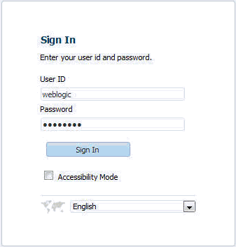
-
The default starting page is displayed. In this example, it is the Global Workforce Health Summary dashboard.
View Image 
-
Select New > Analysis.
View Image 
-
Select the Human Resources – Workforce Deployment subject area.
View Image 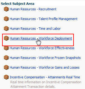
-
The Analysis Editor is displayed.
View Image 
-
In the left pane, under Subject Areas, expand Time > Gregorian Calendar.
View Image 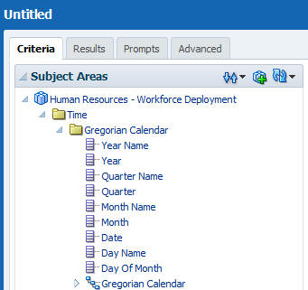
-
Double-click Year Name to add it to Selected Columns.
View Image 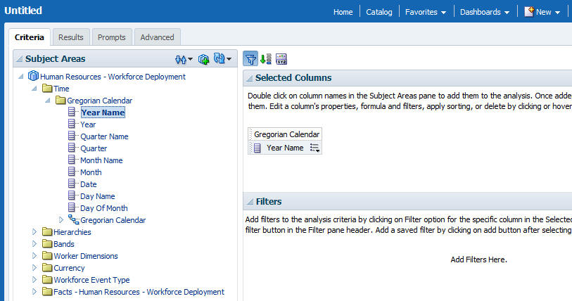
-
Expand Hierarchies > Department Hierarchy.
View Image 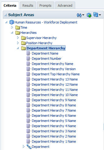
-
Double-click Department Hierarchy 13 Name to add it to Selected Columns.
View Image 
-
Expand Facts – Human Resources – Workforce Deployment > Workforce Deployment Facts.
View Image 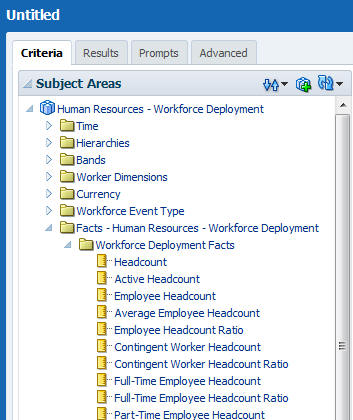
-
Double-click Headcount to add it Selected Columns.
View Image 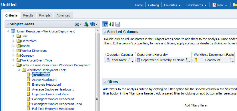
Add a Filter to the Analysis
-
For the Department Hierarchy 13 Name column, click the More Options button and select Filter to open the New Filter dialog box
View Image 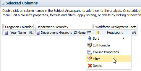
-
Click the Search button next to the Value field to open the Select Values dialog box.
View Image 
-
Double-click the following values to add them to the Selected field:
Consulting
Marketing
SalesView Image 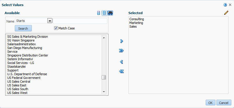
-
Click OK to close the Select Values dialog box.
-
The values are visible in the New Filter dialog box.
View Image 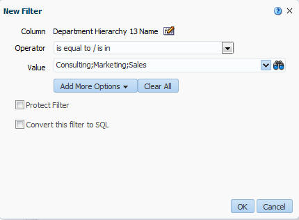
-
Click OK to close the New Filter dialog box.
-
The filter is displayed in the Filters pane.
View Image 
View the Results
-
Click Results.
View Image 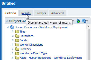
-
The analysis is displayed in the default Compound Layout, which includes a Title view and a Table view.
View Image 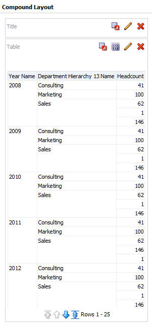
Modify the Compound Layout to Include a Graph View
-
Select New View.
View Image 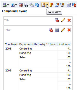
-
Then select Recommended Visualization for > Comparing Values.
View Image 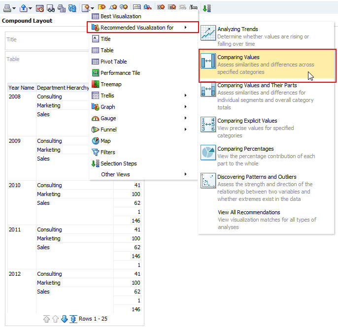
-
The Select Visualization dialog box is displayed.
View Image 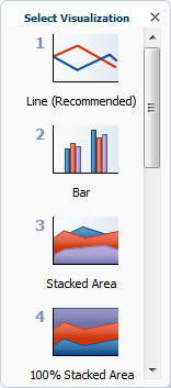
-
Select the Bar graph.
View Image 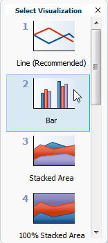
-
The bar graph is added to the Compound Layout. It may be necessary to scroll down to see the graph.
View Image 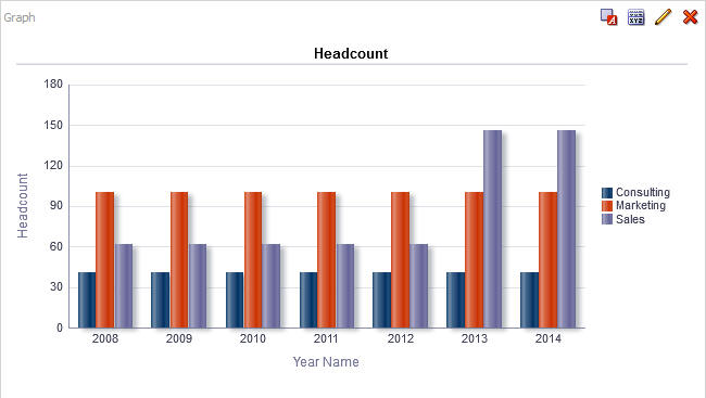
Modify the Compound Layout Title and Remove the Table View
-
Click the red X for the Table view to remove it from the Compound Layout.
View Image 
-
Click the Edit View button for the Title view.
View Image 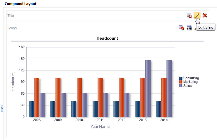
-
The Editing dialog is displayed.
View Image 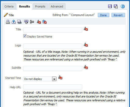
-
In the Title field, enter My Headcount Analysis and deselect Display Saved Name.
View Image 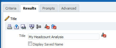
-
Click Done to return to the Compound Layout.
View Image 
-
The title is visible in the Compound Layout.
View Image 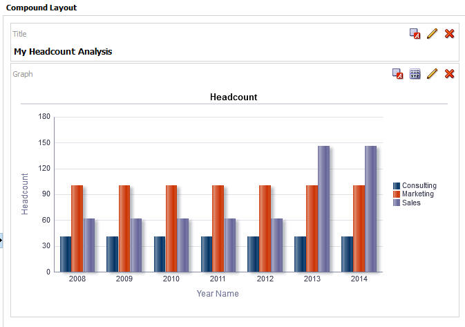
Save the Analysis
-
In the upper right corner, click the Save Analysis button to open the Save As dialog box.
View Image 
-
In the Save As dialog box create a new folder named My Shared Folder in Shared Folders.
View Image 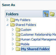
-
Name the analysis My Headcount Analysis and click OK to save it in My Shared Folder.
View Image 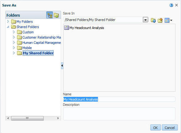
Add a New Page to a Prebuilt Dashboard
-
Click the Catalog link to open the Catalog.
View Image 
-
Expand Shared Folders > Human Capital Management > Dashboards.
View Image 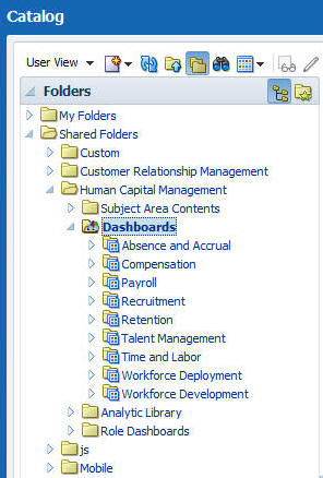
-
In the right pane, locate the Workforce Deployment dashboard and click Open to open the dashboard.
View Image 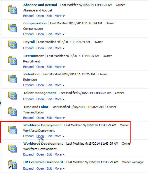
-
Notice that there are four dashboard pages.
View Image 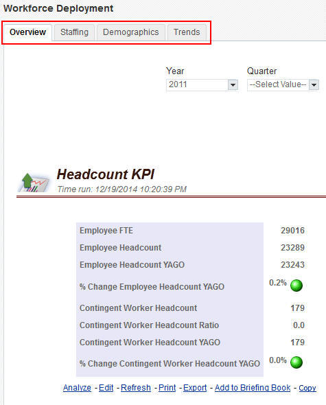
-
In the upper right corner, select Page Options > Edit Dashboard to open the Dashboard Editor.
View Image 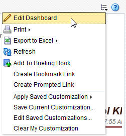
-
In the Dashboard Editor, click the Add Dashboard Page button to open the Add Dashboard Page dialog box.
View Image 
-
In the Add Dashboard Page dialog box, enter My Headcount as the Page Name and click OK.
View Image 
-
The My Headcount page is added to the dashboard.
View Image 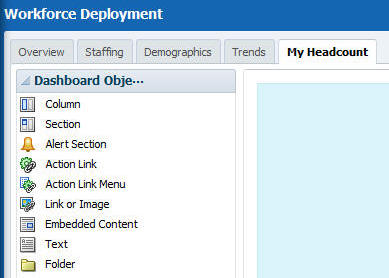
Add Content to the New Page
-
In the left pane, expand Shared Folders > My Shared Folder.
View Image 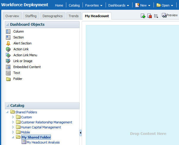
-
Select My Headcount Analysis and drag it into the “Drop Content Here” area.
View Image 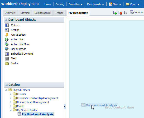
-
The analysis is added to the new page in the dashboard.
View Image 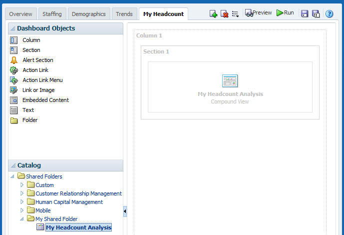
-
Click Save.
View Image 
-
Click Run.
View Image 
-
The dashboard displays the new page with the embedded analysis.
View Image 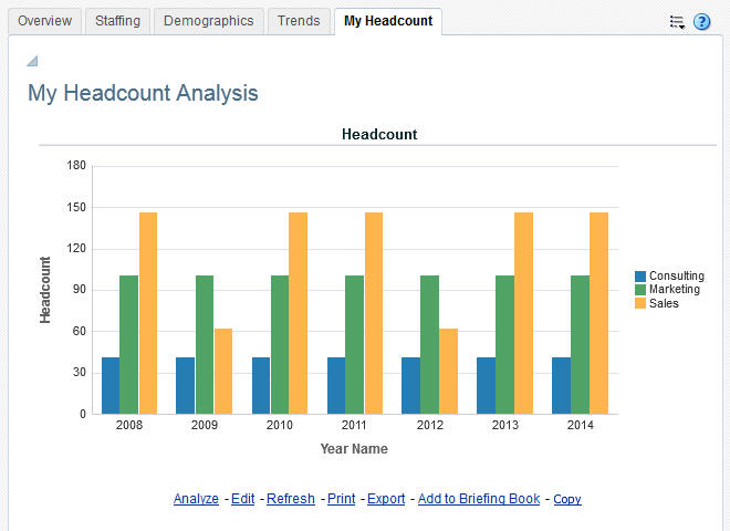
Summary
In this tutorial, you learned how to create an analysis and add it to a prebuilt dashboard in OTBI Enterprise. You learned how to:
- Create a new analysis
- Add a filter to an analysis
- Modify the default compound layout
- Add a new page to a dashboard
- Add content to a dashboard
Resources
To learn more about OTBI Enterprise for HCM Cloud Service, refer to additional documentation in the OTBI Enterprise Cloud Library.
Credits
- Lead Curriculum Developer: Jim Sarokin
 Overview