Building Charts, Gantts and Maps with Oracle Application Express 4.0
Purpose
This tutorial shows you how to build charts, gantts and maps in Oracle Application Express 4.0.
Time to Complete
Approximately 60 minutes.
Overview
Oracle Application Express 4.0 includes the integration of AnyChart 5.1 resulting in improved performance, decreased rendering time, and decreased update time. In addition to added support for maps and Gantt charts, this release now features scrolling support, interactive labels, markers in legends, multiple data markers, and content menu localization.
Prerequisites
Before starting this tutorial, you should:
- Install Oracle Database 11g.
- Install Oracle Application Express Release 4.0.
- Download and unzip the apexcharts.zip file into your working directory.
- Create a workspace and user to perform this tutorial.
Creating a Simple Charting Application
You want to create a simple chart a perform the following steps:
|
. |
Enter the following URL in your browser to log in to Oracle Application Express. http://<yourhostname>:8080/apex
|
||||||||||||||
|---|---|---|---|---|---|---|---|---|---|---|---|---|---|---|---|
|
. |
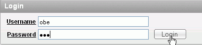
To log in to Oracle Application Express, enter the following details,
and click Login.
|
||||||||||||||
| . |
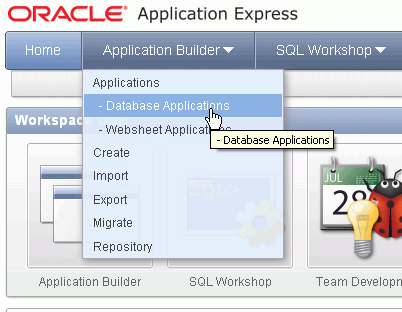
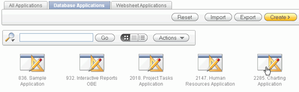
From the Oracle Application Express home page, click the down arrow next to Application Builder tab and select Applications > Database Applications.
|
||||||||||||||
| . |
Click Create.
|
||||||||||||||
| . |
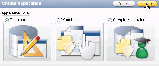
Select Database and click Next.
|
||||||||||||||
| . |
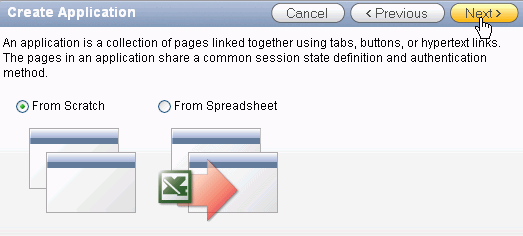
Select From Scratch and click Next.
|
||||||||||||||
|
. |
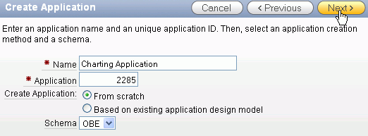
Enter Charting Application for Name and click Next.
|
||||||||||||||
|
. |
Make sure Blank is selected for Page Type, enter Home for Page Name and click Add Page.
|
||||||||||||||
|
. |
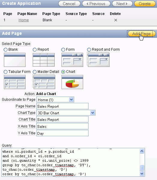
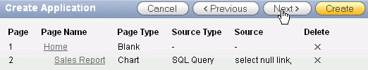
Select the Chart Page Type and specify the following and click Add Page.
Query: select null link,
|
||||||||||||||
|
. |
Click Next >.
|
||||||||||||||
|
. |
Accept the default and click Next >.
|
||||||||||||||
|
. |
Accept the defaults and click Next.
|
||||||||||||||
|
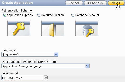
. |
Select an application date format from the list and click Next.
|
||||||||||||||
|
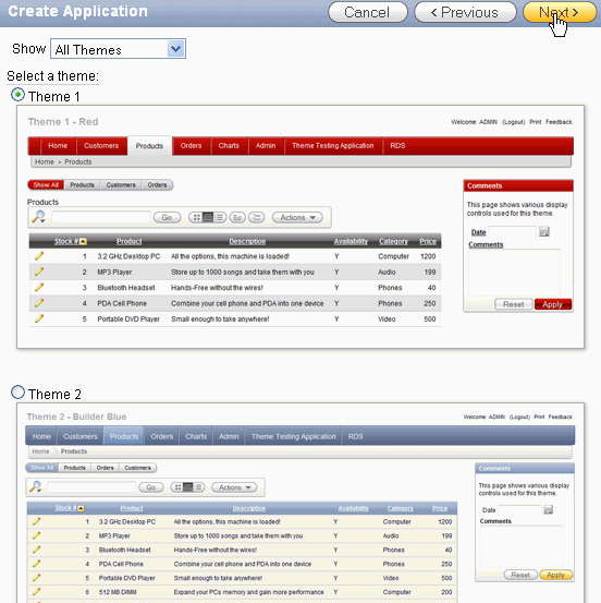
. |
Make sure Theme 1 is selected and click Next.
|
||||||||||||||
|
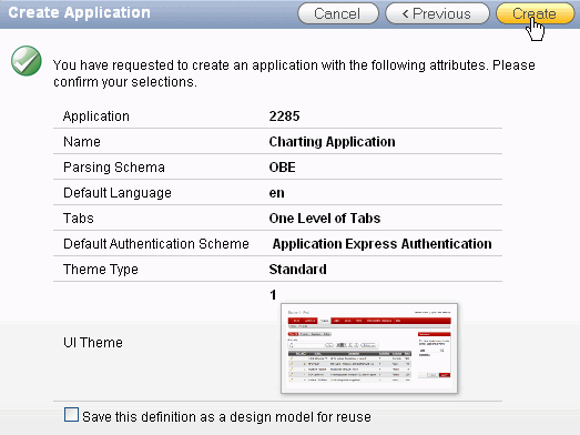
. |
Click Create to create the application.
|
||||||||||||||
|
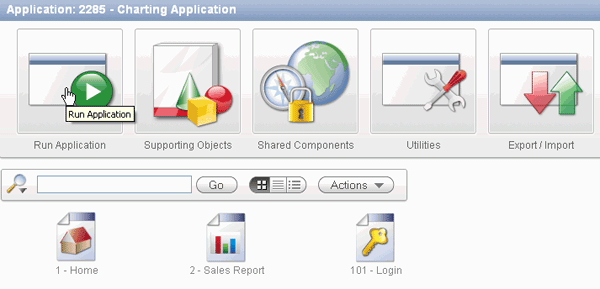
. |
Click Run Application.
|
||||||||||||||
|
. |
Login to your application and click Login.
|
||||||||||||||
|
. |
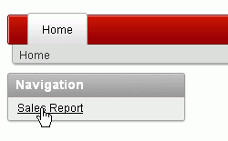
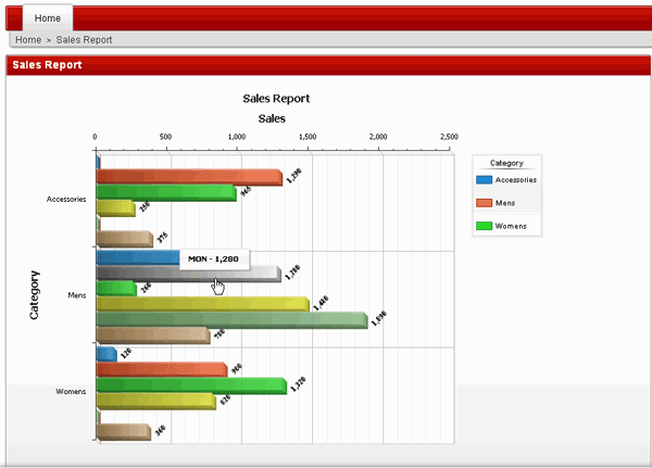
The Home page is displayed. Select the Sales Report link.
|
||||||||||||||
|
. |
The initial report is displayed. You see the Sales Values by day. In the next topic, you want to refine the chart. Select the Edit Page link in the developer toolbar.
|


Refining your Chart
You want to make some changes to the chart you just created. Perform the following steps:
| . |
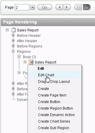
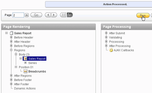
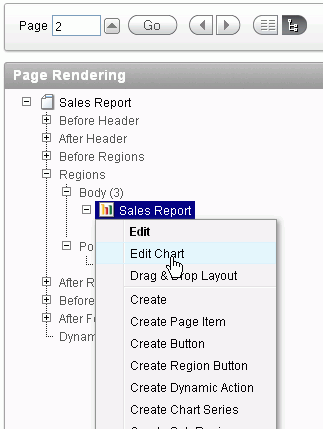
Under Regions > Body (3), right click the region Sales Report and select Edit Chart.
|
||||||||
|---|---|---|---|---|---|---|---|---|---|
| . |
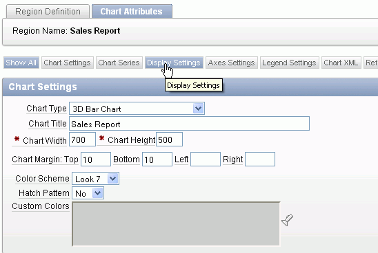
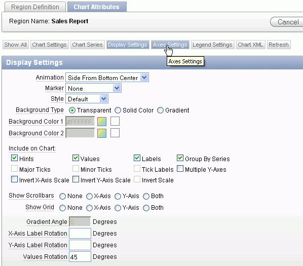
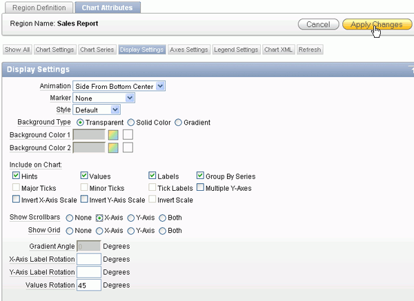
Make the following changes and click the Display Settings subtab.
|
||||||||
| . |
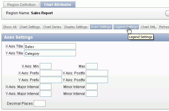
Make the following changes and click the Axes Settings subtab.
|
||||||||
| . |
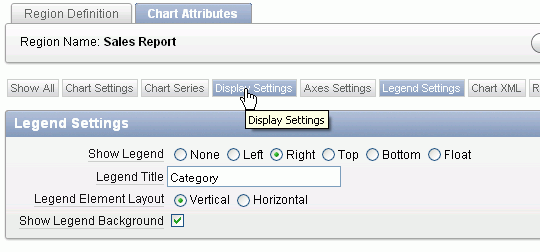
Change the Y Axis Title to Category and click the Legend Settings subtab.
|
||||||||
| . |
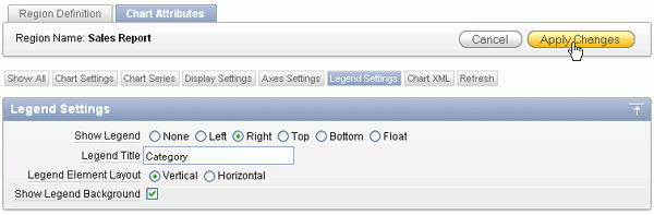
Select Right for Show Legend, enter Category for Legend Title and click Apply Changes.
|
||||||||
| . |
Click Run.
|
||||||||
| . |
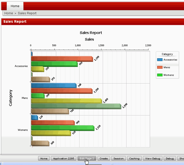
Notice that the chart has changed quite significantly. Each category is now grouped by Day so all the sales for each Day within a category are grouped together. Before the sales was grouped by Day. In addition, notice that the values are rotated by 45 degrees.
|
||||||||
| . |
If the diagram has a lot of values, you can turn on the scrollbars. Select the Edit Page link in the developer toolbar.
|
||||||||
| . |
Right click the Sales Report Region and select Edit Chart.
|
||||||||
| . |
Select the Display Settings subtab.
|
||||||||
| . |
Select X-Axis for Show Scrollbars and click Apply Changes.
|
||||||||
| . |
Run the page again. Select the Run Page icon.
|
||||||||
| . |
Notice that there is now a scrollbar on the X-Axis. Move the scrollbar down.
|
||||||||
| . |
Notice that the chart moves as your scroll down. In the next section, you add some resource data so you can create a Resource Gantt chart. Select the Home link in the developer toolbar.
|


Adding Resource Information
In order to create the Resource Gantt chart, you need to load some pertanent resource information. Perform the following steps:
|
. |
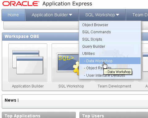
Select the arrow next to SQL Workshop and select Data Workshop under Utilities.
|
|---|---|
|
. |
Under Data Load, select Spreadsheet Data.
|
|
. |
Under Load From, select Upload file (comma separated or tab delimited) and click Next.
|
|
. |
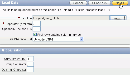
Click Browse...
|
|
. |
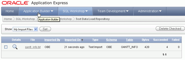
Select the gantt_info.txt file from the directory where your files for this tutorial are located and click Open. Make sure the check box for First row contains column names is checked and click Next.
|
|
. |
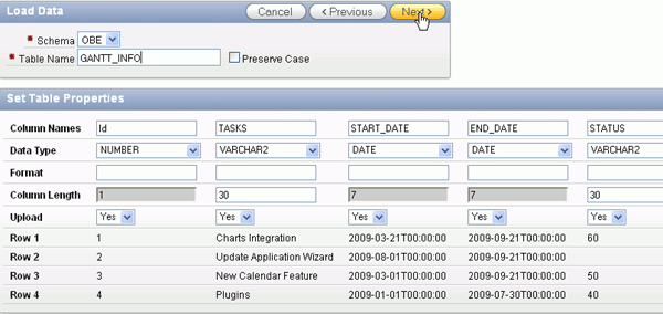
Enter GANTT_INFO for Table Name and click Next.
|
|
. |
Select Use an existing column for Primary Key From and select Not generated for Primary Key Population and click Load Data.
|
|
. |
The GANTT_INFO table was created and the data was loaded successfully. In the next section, you will create a Resource Gantt Chart based on this data. Click the Application Builder tab.
|


Creating a Resource Gantt Chart
You are now ready to create a resource gantt chart based on the data you just loaded. Perform the following steps:
| . |
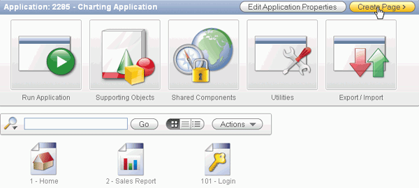
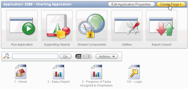
Select your Charting Application.
|
|---|---|
. |
You are going to create a new page for the resource gantt chart. Click Create Page.
|
. |
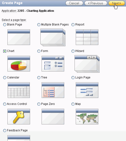
Select Chart and click Next.
|
| . |
Select Flash Chart and click Next.
|
| . |
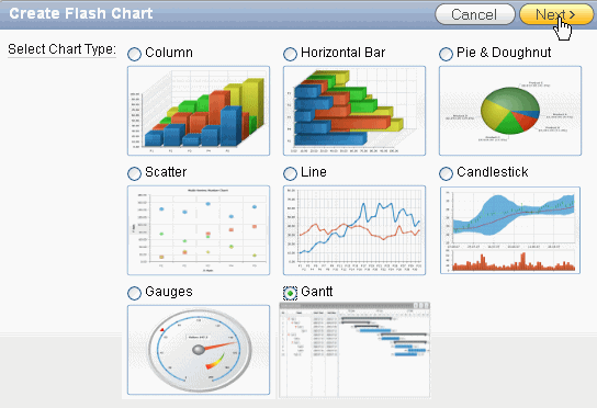
Select Gantt and click Next.
|
| . |
Select Resource Gantt and click Next.
|
| . |
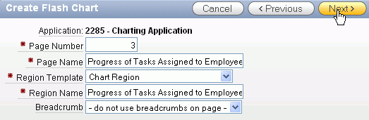
Enter Progress of Tasks Assigned to Employees for both Page Name and Region Name and click Next.
|
| . |
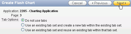
Accept the defaults and click Next.
|
| . |
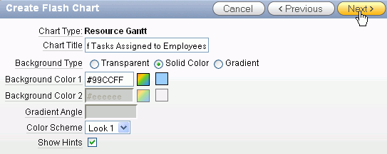
Enter Progress of Tasks Assigned to Employees for Chart Title, select Solid Color for Background Type, select a color from the color palette for Background Color 1 (or you can use the color specified in the screenshot #99CCFF), select Look 1 for Color Scheme and click Next.
|
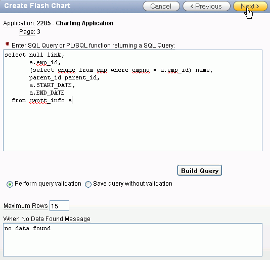
| . |
Enter the following SQL and click Next. select null link,
a.emp_id,
(select ename from emp where empno = a.emp_id) name,
parent_id parent_id,
a.START_DATE,
a.END_DATE
from gantt_info a
|
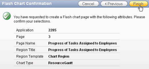
| . |
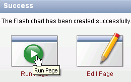
Click Finish to create the page.
|
| . |
Click Run Page.
|
| . |
The Resource Gantt chart is displayed. You can see when each employee is working on a particular task. In the next section you will load some map data so that you can create a map chart.
|


Loading Population Data
Before you create your map, you need to load some population data into your database. Perform the following steps:
| . |
Select the arrow next to SQL Workshop and select Data Workshop under Utilities.
|
|---|---|
| . |
Under Data Load, select Spreadsheet Data.
|
| . |
Under Load From, select Upload file (comma separated or tab delimited) and click Next.
|
| . |
Click Browse...
|
|
. |
Select the population_info.txt file in the files directory and click Open. Then click Next.
|
|
. |
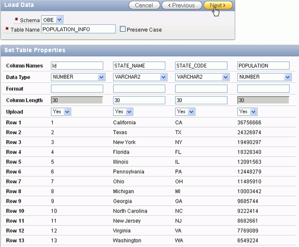
Enter POPULATION_INFO for Table Name and click Next.
|
|
. |
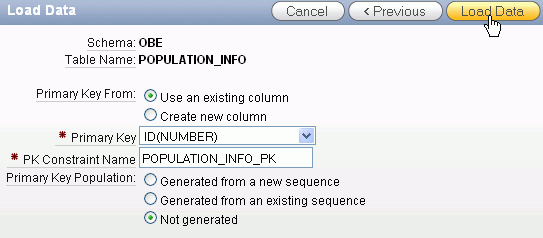
Select Use an existing column for Primary Key From and select Not generated for Primary Key Population and click Load Data.
|
|
. |
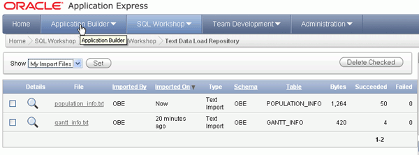
The POPULATION_INFO table has been created and the data loaded. Select the Application Builder tab.
|


Creating a Map Chart
You can now create the Map Chart by performing the following steps:
| . |
Select your Charting Application.
|
|---|---|
|
. |
Select Create Page. Note that you could have created a Map chart region on an existing page.
|
|
. |
Select Map and click Next.
|
|
. |
Make sure United States of America is selected and click Next.
|
|
. |
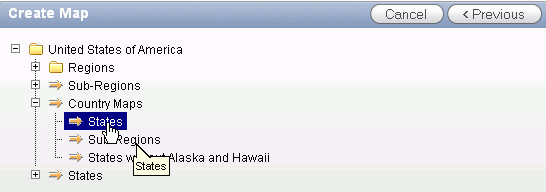
Expand Country Maps and select States.
|
|
. |
Enter US State Populations for both Page Name and Region Name and click Next.
|
|
. |
Click Next.
|
|
. |
Enter US State Populations for Map Title and click Next.
|
|
. |
Enter the following SQL and click Next. select null link,
|
|
. |
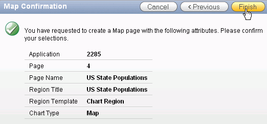
Click Finish.
|
|
. |
Click Run Page.
|
|
. |
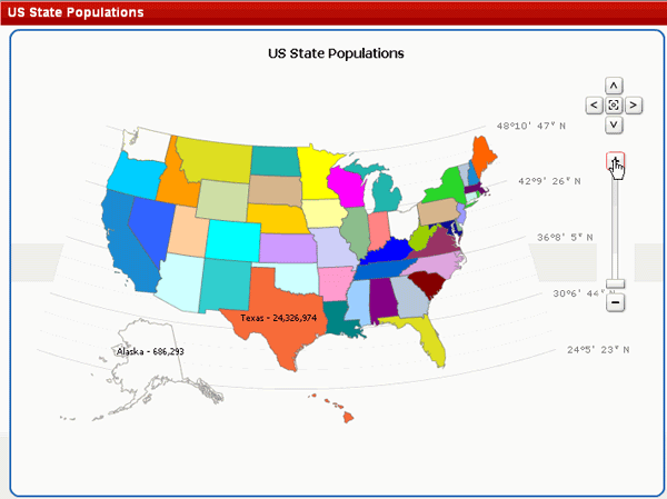
The chart is displayed. Place your cursor on one of the states to see the population for the state.
|
|
. |
Select the Zoom + icon to zoom into the map.
|
|
. |
Notice that when the map is closer you see the population values in the map. You can also modify some of the display settings to change the way the map looks. Select the Edit Page link in the developer toolbar.
|
|
. |
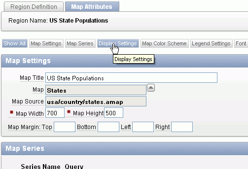
Right click the US State Populations region and select Edit Chart.
|
|
. |
Select the Display Settings subtab.
|
|
. |
Click No Lines for Show Grid and select the Eckert 3 Map Projection and click Apply Changes.
|
|
. |
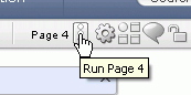
Click the Run Page icon.
|
|
. |
Notice that the map no longer has lines and the projection is slightly different. You can experiment with the different settings.
|


Summary
In this tutorial, you have learned how to:
- Create and modify a simple chart
- Create a resource gantt
- Create a map
![]()

|
About
Oracle |Oracle and Sun | |