Input/Choose Color Usage Guideline 

RCUX Document Version 5.0.0 for Oracle® Fusion Middleware 11g Release 1 Patch Set 1 (11.1.1.2.0)
Last Updated 05-Aug-2010
The Input/Choose Color component allows a user to pick a color for an object or page element, such as the color of a bar in a graph.
Related Guidelines
| Guideline | Section | For Information About |
|---|---|---|
| Secondary Windows | Inline Selectors and Modal Dialogs | Used with Color Selection Panel and Custom Color Dialog. |
Refer to the ADF Faces Rich Client demos page to find demos and tag documentation for the ADF elements related to this component:
| ADF Element | Notes |
|---|---|
| af:chooseColor | Color selection component. |
| af:inputColor | Color input component. |
General Principles


Purpose:
Modify the color of an object or page element.
Description:
- The Input/Choose Color component is an inline selector with a Color icon swatch and a drop-down arrow button. See Color Icon for details.
- The Color icon displays a selection panel containing a palette of color swatches and buttons. See Color Selection Panel for details on panel contents, and Color Palettes for details on the different pre-defined palettes.
- If the palette does not contain the desired color, the user can select or specify a custom color. See Custom Color Dialog for details.
- The Color icon swatch may be placed to the right (left in bi-directional layouts) of the element to be colored, or may be associated with a text field that accepts direct user input. See Color Text Field for details.
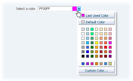
Input/Choose Color Component
Usage:
- Each object allowing color customization can have a separate color selector, or product teams can specify a single color selector to apply color selection to several objects (this also applies to custom color selection).
- Product teams may use other target elements for Input/Choose Color besides a text field, but this requires a custom implementation.
- Only one color value is valid per object.
Input/Choose Color Elements


The following image shows the principal Input/Choose Color elements:

Input/Choose Color Elements
Color Icon


Purpose:
Indicates the current color selection, and allows users to display a palette of colors in a selection panel.
Description:
- The Color icon consists of a color swatch and a drop-down arrow button.
- Clicking the drop-down arrow opens the color selection panel.
- The color swatch in the Color icon is not clickable, but always displays the currently selected color.
- When a color is selected from the selection panel, the color swatch refreshes to show the selected color.
Usage:
- The Color icon can be used in a form layout or in a table cell, either on the page or in a dialog window.
- The Color icon may be disabled if a user does not have privileges to change the color of an object.
- Product teams may associate a Color icon with more than one target element.
Color Selection Panel


Purpose:
Provides a palette of colors for users to choose from, as well as the option to choose custom colors.
Description:
- The selection panel allows a user to choose a color by clicking one of the colors in the palette. The selected color is reflected in the Color icon currently in focus.
- Users can pick any color swatch in the palette, including the "Transparent" color swatch.
- Each swatch in the color palette has a color name, which appears in the ALT text and tooltip of each color swatch, along with the HEX and RGB values:
- The ALT text and tooltip for color swatches in the color palette is "[Color Name] (HEX Value / RGB Value)", such as "Red (#FF0000 / 255, 0, 0)".
- An 'x' swatch indicates no color, or transparent color for elements that support transparent colors.
- Users can click the Last Used Color button to apply the previously selected color value to the current object. This is helpful when the user needs to apply the same color to multiple objects.
- Users can click the Default Color button to roll back to the original color value assigned to the target element.
- Only one last used color and one default color can be assigned to a single target object.
- Colors appear in the custom color row when:
- The target object has already been assigned a color outside of the color selection palette.
- The user selects a custom color from the Custom Color Dialog.
- The custom color row fills from left to right with custom colors. When the row is full, the newest custom color replaces the oldest custom color.
- Custom color information persists only within a browser session.
- The color selection panel changes size depending on the size of the color palette.
- For details on each of the color palettes, see Color Palettes below.
Custom Color Dialog


Purpose:
Allows users to choose a color not provided in the color palette.
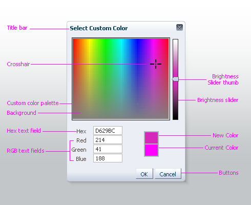
Custom Color Dialog
Description:
- When the user launches the Custom Color dialog, the currently selected color is identified both by crosshairs in the custom color palette and by the current color swatch.
- Users may specify a custom color as follows:
- By moving the crosshairs to a new color location, or
- By entering color values in the Hex or RGB text fields.
- Users adjust color brightness by moving the Brightness slider.
- Custom colors are saved on a per browser session basis:
- Custom color information is lost when ALL browser windows are closed, or a user logs out of the application or application suite.
- The only custom color information that persists beyond a browser session is a custom color applied to an object.
Color Text Field


Purpose:
Allows users to enter color values using either hexadecimal or RGB formats.

Color Text Field
Description:
- Text fields support two color selection interactions:
- Typing a color value in the text field.
- Picking a color from the inline selector or custom color dialog.
- The text field accepts both hexadecimal color values (such as FF0000 or #FF0000) and comma-delimited RGB color values (such as 255, 0, 0). The entered value is converted to hexadecimal color format upon field exit.
- The field accepts a hexadecimal color with or without the "#" symbol in front of the color value. If user enters the hexadecimal color with the symbol, it is stripped out on field exit.
- An application must specify which fields require a color selection. Non-required fields may be left empty (with no color selected.)
Usage:
- The color text field is optional; it is primarily used for expert users who want to enter custom values directly rather than navigating through the Input Color and Custom Color dialog.
- The recommended default width for the text field is 16 characters (EMs) or 90 pixels.
- Color selection applies to only one text field. To offer color selection for multiple text fields, a separate color selector must be used for each field.
- In cases where the current object color is transparent or not specified, the text field should read "Transparent" or "None", respectively.
Color Palettes


The Input/Choose Color component provides three different palettes: 49, 64, and 121 colors.
Choosing a color palette should be based on the task and the needs of users, helping them accomplish their tasks without confusing or distracting them. In most instances this means using the palette with the fewest colors. Use the heuristics below to determine which palette to choose.
- Good information design and page layout design relies on using a limited number of colors in the interface. Small palettes make it easier for a user to reliably pick the same color when editing page elements and help users create well-designed pages.
- As a rule, business applications are not graphics-intensive and do not need large palettes to effectively customize page elements. Large palettes may provide too many options for users and make it difficult for users to repeatedly find the color they are looking for.
- Examples of interfaces where small palettes (49 or fewer colors) are acceptable are: e-mail applications, document customization, CSS editing.
- Consider whether your users are familiar with a specific palette. If so, using the same palette will preserve a consistent user experience and may enhance usability by preventing users from having to relearn where the colors they need are located.
- Do not use different color palettes within an application. Users rely on consistent and predictable results when choosing colors.
- For most users in most circumstances, the default 49-color palette provides a good range of colors. This palette is recommended as the default palette for the Input/Choose Color component.
- If user tasks within an application require a palette with more than 49 colors, it is recommended to use the 64-color palette, unless more colors are definitely required. Always use the smallest palette that will meet users' needs.
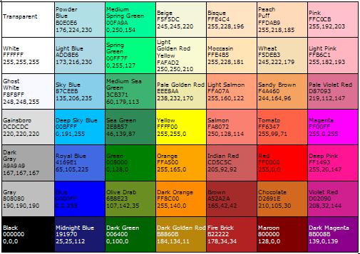
49-color Palette (Default)
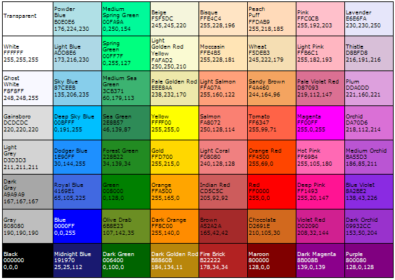
64-Color Palette
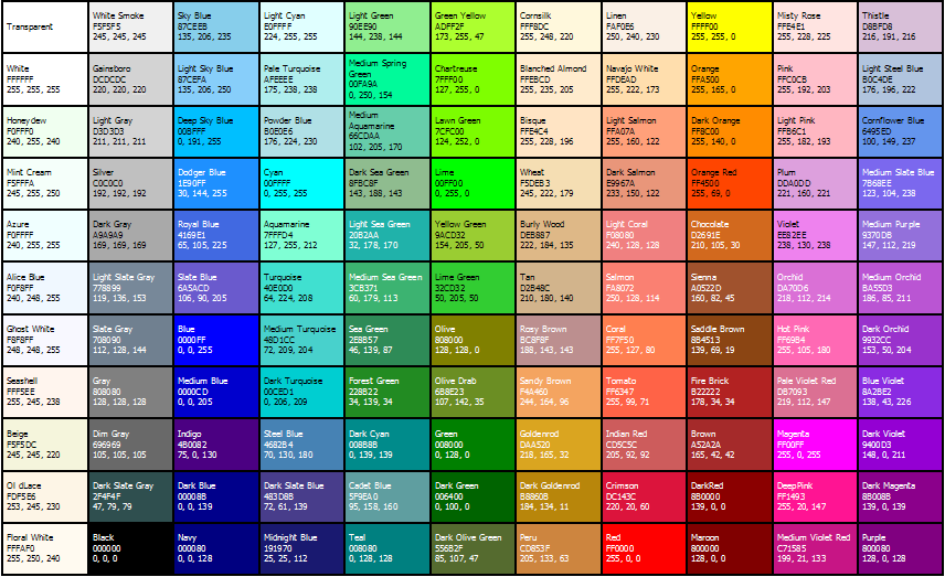
121-Color Palette