ListofValues (LOV) Usage Guideline 

RCUX Document Version 5.2.0 for Oracle® Fusion Middleware 11g Release 1 Patch Set 1 (11.1.1.2.0)
Last Updated 09-Nov-2010
The ListofValues (LOV) component allows users to select from a large set of values to help populate a field on a page or field in a table.
- General Principles
- LOV Text Field
- LOV Choice List
- Contextual Information
- Favorites List
- Full List
- Smart List
- Search Option
- Custom Actions
- Dependent Fields and LOV Choice Lists
- Select-Only LOV
- Auto-Suggest
- Search and Select Dialog
- LOVs with Filters
- LOVs and Create Option
Related Guidelines
| Guideline | Section | For Information About |
|---|---|---|
| Search and Query | All | Principles used in LOV search. |
| Select Choice | All | Common properties with LOV Choice List. |
| Input/Output Text | All | Common properties with LOV Text Box. |
Related ADF Elements
Refer to the ADF Faces Rich Client demos page to find demos and tag documentation for the ADF elements related to this component:
| ADF Element | Notes |
|---|---|
| af:inputListOfValues | LOV Text Field |
| af:inputText | Text Box |
| af:inputComboboxListOfValues | LOV Choice List |
| af:autoSuggestBehavior | Shows a list of suggested values that match a partial string in input text. |
General Principles


Purpose:
Select a value from a large list.
Description:
- The general term LOV is commonly used to refer to:
- LOV Text Field: A text field with a Search icon in a form or table cell. The Search icon shows a magnifying glass.
- LOV Choice List: A choice list in a form or table cell that includes the entry "Search . . ."
- Search and Select Dialog: A modal dialog containing a search panel and results table. The dialog can be accessed from either the LOV Text Field or LOV Choice List. See the related sections below for details.
- Both LOV Text Fields and LOV Choice Lists allow robust pre-search capabilities. The value is checked against the database list of values, and based on the findings, the appropriate functions occur. For example, if there is an exact match, dependent fields may also be populated. Alternatively, if the user enters a partial string and presses Enter or Tab, the Search and Select dialog appears, where the user can select one of the partial string matches.
- The LOV component follows the search principles listed in the Search and Query guideline. For instance, the LOV field should not be case sensitive.
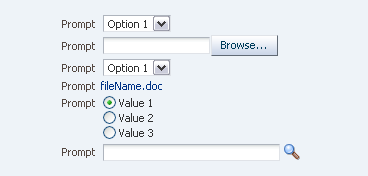
LOV Text Field in a Form
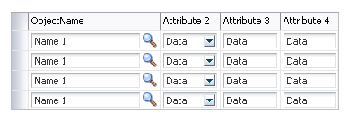
LOV Text Fields in a Table
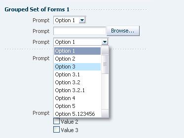
LOV Choice List in a Form
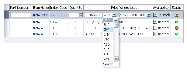
LOV Choice Lists in a Table
Usage:
- The LOV component should be used in place of a standard choice list when the list to choose from is too large.
- Use an LOV Choice List when some values are more likely to be chosen than others. The LOV Choice List is the preferred option.
- Use an LOV Text Field when all values are equally likely to be chosen, or when use of an LOV Choice List causes performance issues.
- Product teams may include an "Add" button in a table to launch an LOV dialog that can give users the ability to search on a customized set of values. See Populating a Table from the Search and Select Dialog for details.
- If an LOV Choice List or Text Box is associated with an excessive number of values, and a pre-search (based on a value entered in the field) takes a long time, it may be necessary to use a filter to decrease the number of values. See LOVs with Filters for details.
LOV Text Field


Purpose:
Allows users to enter or select an item from a large list.
Description:
- The LOV Text Field consists of a text box with a Search icon showing a magnifying glass.
- The Text Field accepts exact or partial values that are verified against a list of values on pressing Enter or Tab, or on clicking the Search icon. See Verification of the LOV Text Field and Population of the LOV Text Field below for details.
- The Search icon opens the Search and Select dialog, which supports pre-searching based on full or partial values. Clicking the Search icon always opens the dialog, even if the user enters an exact match LOV value in the text box and then clicks the icon.
- The Search and Select dialog performs a "Starts With" search on the string that is in the box, or shows all values if nothing is in the box. A blank table may alternatively be shown if blind queries are not allowed for performance reasons; blank tables contain the string "No rows to display."
- If there are no matches for a partial string and the user clicks the Search icon, the dialog typically displays all values; however, if blind queries are not permitted for performance reasons, the dialog displays an empty table with the string "No rows to display."
- Search on partial string also occurs on pressing Enter or Tab, as follows:
- If there is only one match for the partial string, the field automatically completes with that value.
- If there are multiple matches, the dialog appears with a "Starts With" search on that string.
- If the user presses Tab and there are no matches, the dialog appears with all values unless the application accepts non-matching values. See Population of the LOV Text Field below.
- Search is initiated only by clicking the Search icon, or by pressing Enter or Tab. Clicking elsewhere outside the field results in an error if there is no exact match, unless the application accepts non-matching values. See Population of the LOV Text Field below.
- See the Input/Output Text guideline for a description of the Prompt and Box elements shown in the following image.

LOV Text Field Elements
Usage:
- The LOV Text Field may be used in a form or in a table cell. In the case of the table, the column name is the equivalent of a prompt.
- Use the LOV Text Field when users need to input a value from a large list, and it is not possible to determine which values are more likely to be chosen.
- Auto-Suggest search results behavior may be used with LOV Text Fields when it is expected there will be fewer than 10 resulting items for each letter of the alphabet. See Auto-Suggest for more information.
- Product teams decide whether a non-matching string should be accepted as a new value or as an incorrect value. In some cases this decision may be made at the product group level.
- Verification should not send the user to a different page.
- It is recommended to copy the user's string from the box on the originating page into the search region of the Search and Select dialog when the dialog is launched.
- An LOV Text Field can be select-only when the user is allowed to select a value but not to type in a value. See Select-Only LOV for more information.
- By default, the width of the box is 30 characters (EMs) or 170 pixels, but product teams may want to adjust the box width to align with other fields in a multiple column Form Layout, or to preserve a consistent width for the same type of field throughout an application. If the width of the box is set to be shorter than the length of the string of characters in the selected or default option, the option is clipped.
Verification of the LOV Text Field


Verification consists of comparing a string against a list of values. Verification of the LOV Text Field occurs when users:
- Press Enter or Tab out of the field (to the Search icon).
- Click another UI element in the page.
- Click "dead space" or "white space" in the UI.
Verification does not occur when the user clicks the Search icon, which always opens the Search and Select dialog. Verification occurs after the user closes the dialog and focus returns to the LOV Text Box.
Verification does not include additional checks to validate the string in the current context. For example, an application may include a part number in a list of values, but additional validation may be needed to determine whether that part is in stock.
Clicking outside the field (except on the Search icon) results in an error if there is no exact match, unless the application accepts non-matching values. This commonly occurs when a user has the option to expand a personal list of values that is derived from a master source list, such as a list of specific personal goals based on a more general list.
Population of the LOV Text Field


The following table shows example scenarios and flows for populating an LOV field that accepts matching values only. In each of these scenarios, the user is looking for "San Francisco":
| Search Type | User Action | Result | Notes |
|---|---|---|---|
| Exact string match | The user enters "San Francisco" and presses Tab. | Exact match detected. Focus remains on the LOV text field. | An exact match occurs as long as there are no other cities or towns in the database with "San Francisco" as part of their names. For example, if a town named "San Francisco de Campostella" also existed, then two matches would be found for the string entered in the LOV and would be displayed in the Search and Select dialog. |
| Partial string with one match | The user enters "San Fran" and presses Tab. |
One match is found. The field is populated with the full string of the matching value. Focus remains on the LOV text field. | An exact match occurs only as long as there are no other cities or towns in the database with "San Fran" as part of their names. For example, if a town named "San Franco" also existed, then two matches would be found for the string entered in the LOV and would be displayed in the Search and Select dialog. |
| Partial string with multiple matches | The user enters "San" and presses Tab. |
Multiple matches are found. The Search and Select dialog appears with multiple matches to select from, according to the partial string "San". The Search field in the dialog should be pre-populated with criteria entered from the primary page (that is, "San"). | The user clicks the "San Francisco" row, and then the OK button. The dialog is dismissed and the full string is returned to primary window. The cursor appears in the LOV Text Field. If the user clicks Cancel in the Search and Select dialog, the dialog is dismissed. If the user attempts to exit the field, leaving the partial string, the field should appear in an error state, unless non-matching values are accepted. |
| No match | The user enters "San Focisco" and presses Tab. |
No matches are found. The Search and Select dialog appears with the set of all values. This is the recommended behavior, but may not always be possible due to performance issues. If blind queries are not allowed for performance reasons, an empty table appears instead, and displays the string "No rows to display." | If only existing values are permitted for the field, the field should appear in an error state when the user removes focus from the field. Instead of showing an error state, product teams may decide to accept a non-matching value as valid input, depending on the context of the LOV within the application. In this case, when the user removes focus from the field, the non-matching value should remain with no error indicator. |
| No string entered | The user selects the LOV Search icon without entering anything in the field. |
The Search and Select dialog opens with the set of all values. This is the recommended behavior, but may not always be possible due to performance issues. If blind queries are not allowed for performance reason, an empty table appears instead and displays the string "No rows to display." | The user may either search in the dialog (or dismiss it and search from the primary page) to find the item or look for the item in the displayed set. When the user finds the item, the user clicks the "San Francisco" row, and then the OK button (or double-clicks the row). The dialog is dismissed and the full string is returned to the primary window. The cursor appears in the LOV Text Field. If a user navigates to an LOV field, does not enter any information, and then presses Tab, client-side validation should occur on the field to see whether it is blank. If blank, server-side verification should not occur, and the field should be ignored. |
LOV Choice List


Purpose:
Allows users to select an item from a large list.
Description:
- The LOV Choice List provides similar functionality to the LOV Text Field except:
- The LOV Choice List includes a drop-down arrow to display a list of options.
- Instead of a Search icon, the list includes a "Search …" option to open the Search and Select dialog.
- The LOV Choice List shares elements and behaviors with Select Choice, except:
- The box is editable.
- The options in an LOV Choice List may be displayed in multiple columns.
- When the user types a string into the LOV Choice List box and presses Enter or Tab, the behavior is identical to the LOV Text Box. See Verification of the LOV Text Field and Population of the LOV Text Field for details.
- Typing a string in the box does not cause the LOV Choice List panel to appear. The panel opens only when the user clicks the drop-down arrow or uses an equivalent keyboard command.
- By default, if the LOV Choice List contains more than 19 items, excluding the Search option, a vertical scroll bar appears.
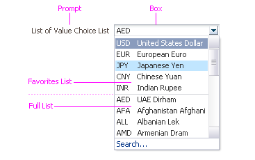
LOV Choice List Elements
Usage:
- The LOV Choice List may be used in a form or in a table cell. In the case of the table, the column name is the equivalent of a prompt.
- The LOV Choice List panel may contain either a Smart List or a Full List, and may optionally contain a Favorites List as well, as described below.
- Use the LOV Choice List when users need to input a value from a large list and:
- The values in the choice list are expected to be frequently reused by users, such as a list of departments or a list of organization members, or
- It is possible to organize the Full List of values in a way that makes it easier to locate a value than by opening the Search and Select dialog, such as an alphabetical list of major cities, or a set of account codes that are recognizable to the user.
- It is recommended to include no more than two columns of data in the LOV Choice List panel. When more columns must be displayed, use an LOV Text Box to launch the Search and Select dialog, which can display more columns of data.
- Auto-Suggest search results behavior may be used with LOV Choice List when it is expected there will be fewer than 10 resulting items for each letter of the alphabet. See Auto-Suggest for more information.
- An LOV Choice List can be select-only when the user is allowed to select a value but not to type in a value. See Select-Only LOV for more information.
- By default, the width of the box is 30 characters (EMs) or 170 pixels, but product teams may want to adjust the box width to align with other fields in a multiple column Form Layout, or to preserve a consistent width for the same type of field throughout an application. If the width of the box is set to be shorter than the length of the string of characters in the selected or default option, the option is clipped.
Contextual Information


Purpose:
Allows product teams to provide context-specific information and actions for the LOV choice list in a pop up dialog.
Usage:
See the ContextInfo usage guideline.
Favorites List


Purpose:
Displays a set of most recently used values.
Description:
- The maximum length of the Favorites list is five items by default, but the product team may change this number.
- The Favorites list is automatically populated using MRU behavior as follows:
- The order of the values in the list shows the user-chosen values in the order in which they were selected from the LOV (the most recent appears first in the choice list panel).
- When the Favorites list contains less than the maximum number of values, and the user enters another valid value or selects one from the Search and Select dialog, the new value is appended to the top of the Favorites list. Users can continue to add values until the the Favorites list reaches its maximum number of entries.
- When the Favorites list already contains the maximum number of values, the new value is added to the top of the Favorites list but the oldest value is removed from the bottom of the Favorites list (until that value is used again).
- The Favorites list may be used alone or in conjunction with a Full List or a Smart List. Items within the Favorites list also appear in the Full list or the Smart list.
Usage:
- The Favorites list is recommended where the user frequently selects among a small set of values. In cases where selections are made infrequently and there is little regularity among selections, it is recommended to hide the Favorites list and show only the Full List or Smart List.
- The default size of the Favorites list is five items, but product teams can configure the number of items to match expected usage.
- MRU items are sorted to show the most recently selected at the top, so users have no easy way to scan the list. Consequently, it is not recommended to increase the number above 15 items, as selecting an item from a longer list with no apparent organization may take longer than using the Search and Select dialog.
- Favorites lists should not be used in tables. In a table, there is usually no correlation between the selected value and the specific row, unless order is relevant. Thus, the user might select an option for a record in a certain row, but that record may appear in a different row at another time.
Full List


Purpose:
Displays the full set of LOV values.
Description:
- The LOV Choice List may optionally contain a Full List of options below the Favorites List.
- The list of available options may be restricted based on selection in a controlling field (for instance, a list of cities based on a state selected in a controlling choice list).
Usage:
- Items in the Full List should have a logical order (such as a sorted list of account codes), allowing users to quickly scan and select the item that interests them. Items may be ordered alphabetically or numerically if no other logical order can be found; however, note that alphabetical ordering does not make sense in some languages, particularly Asian languages.
- When a Full List is well ordered, it can be easier to use than the Search and Select dialog because it requires fewer steps to select an item.
- It is recommended to not display the Full List when the list of options is so great that it becomes slow to display (due to performance problems), or it becomes difficult to scan.
- When the data set supports display of a Full List, it is generally recommended to display it in conjunction with a relatively short Favorites list. The Favorites List should be omitted only if the Full List is short, and is organized in a manner that is easy to scan.
- A Smart List should be used instead of the Full List when there is a large set of specific values that are applicable to the user (for example, a list of bank branches near the user's location rather than a list of branches worldwide). See Smart List below for more information.
Smart List


Purpose:
Dynamically renders a list of the best options according to a user's needs.
Description:
This optional list is context-sensitive and renders a list of favorites based on transaction logic defined by teams. The Smart List appears in addition to the MRU (Most Recently Used) list, and in place of a Full List.
- By default, the Smart List may contain up to five items, but product teams may change this number.
- Items in the Smart List appear at the top of the choice list below the MRU, and are separated from the MRU list by a separator.
Usage:
The Smart List may be used to present users with a "Recommended" or "Suggested" list of items based upon the tasks they are performing. It places the recommended options at the top of the list.
- For example, when a manager is performing work flow to promote an employee, the Smart List for the new job title may be filtered to show only relevant positions to which the employee may be promoted.
- The user still has the option to search the Full List using the Search and Select Dialog.
Search Option


Purpose:
Displays the Search and Select dialog.
Description:
- The Search option is displayed in a non-scrolling region at the bottom of the LOV Choice List panel.
Custom Actions


Purpose:
Perform actions on the LOV list.
Description:
- Product teams may put links to custom actions (such as Create…, Edit, etc.) into the LOV Choice List.
- Custom actions appear after the "Search…" option at the bottom of the panel.
Usage:
- There is no limit to the number of custom actions a team may add to the panel, but it is recommended to limit the number to no more than four actions, which, together with the "Search…" option, results in a group of five (the maximum recommended number in a menu item group).
- Custom action links should have trailing ellipses when more information is needed to complete the action. See Ellipses in the Menus guideline for details.
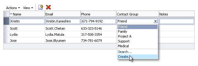
LOV Choice List with Create Action
Dependent Fields and LOV Choice Lists


An LOV Choice List may have associated dependent fields (or widgets). For instance, a user may select a bank branch location from an LOV field, and then the associated address information may be automatically populated based on the selected branch.
- An LOV Choice List with dependent fields may be in a form or in a table, with one dependent field or several. Dependent widgets may be any standard web widget (a field, choice list, text area, and so on) or another LOV.
- If an LOV field has associated dependent fields/widgets, and users do not have the security privileges or the need to change or input new dependent values, the dependent fields/widgets should be set as read only to prevent input entry errors.
- If dependent fields cannot be populated with data until a specific selection is made in the LOV, it is recommended to disable the dependent fields rather than hiding them.
- Dependent fields placed in Hide/Show portions of a table should also be automatically populated with associated values returned by a primary LOV field selection. Note however that, as a general rule, fields in hide/show table portions should not be required fields.
- When an LOV with dependent fields is cleared or provided with a non-matching value, the product team should also clear the dependent values automatically.
- One LOV Choice List may be dependent on another, such as a City field dependent on the selection in a Country field. In this case:
- The City field should be disabled until a selection is made in the Country field.
- Once a country is chosen, the City list of values should be populated based on that country.
- If a different country is chosen, the current value in the City field should be cleared automatically, and the list of cities should be refreshed based on the new country.
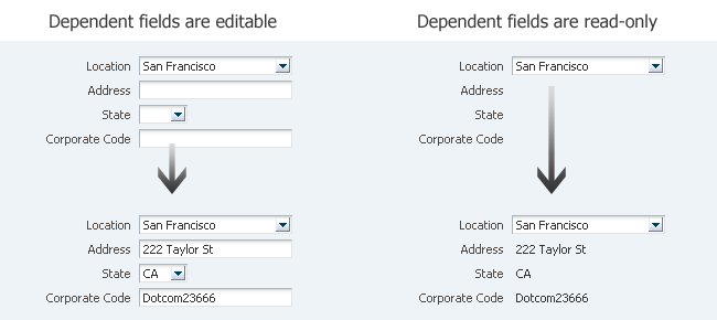
Form with LOV Choice List and Dependent Fields
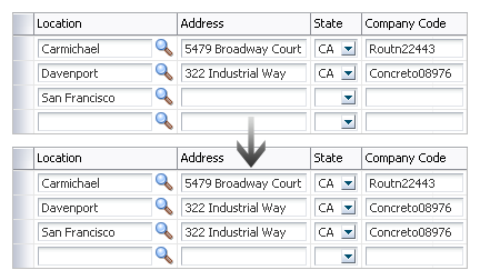
Table with LOV Choice List and Dependent Fields
Select-Only LOV


Purpose:
Allow users to launch an LOV dialog from a read-only LOV Choice List or LOV Text Field by selecting a value from the LOV Choice List panel or Search and Select dialog.
Description:
An LOV Text Field that cannot be edited by typing can be edited by selecting from the LOV Choice List panel or from the Search and Select dialog. The Select-Only LOV displays the Search button and allows users to activate it to change the value through the Choice List panel or dialog.
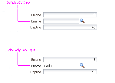
Views of Default LOV Input Mode and Select-Only LOV Input Mode
Usage:
- Select-Only LOVs should not be used in applications that require keyboard-intensive use. Because they do not support Auto-Suggest behavior or matches based on partial values, Select-Only LOVs are less efficient for keyboard users than editable LOVs.
- Select-Only LOVs may be provided in cases where it may be difficult to format the value correctly.
- As with editable LOVs, the field in Select-Only LOVs should be made wide enough to accommodate most values without clipping.
- Select-Only LOVs cannot be cleared once a value has been selected; therefore, they should not be used when the LOV value is optional, unless an alternative means of clearing the field is provided, such as a Clear button or a "None" choice in the LOV.
Auto-Suggest


Purpose:
Presents a filtered list of search results when a user begins typing an entry.
Description:
- Auto-Suggest presents the most-likely search results based on past usage, as well as presenting matches based on a simple "starts with" search across all values.
- A maximum of 10 of the most popular search results may appear in a panel below the text field. If the entry has no match, the search panel closes.
- Select-Only LOVs do not support Auto-Suggest behavior or matches based on partial values.
Usage:
- LOV Text Fields and LOV Choice Lists: Auto-Suggest behavior should be used with LOV Text Fields or LOV Choice Lists only when it is expected that fewer than 10 items for each letter of the alphabet will be in the results. Since Auto-Suggest shows no more than 10 matching values for a partial string, users may assume that the value they are seeking doesn't exist if the value doesn't appear in the results panel.
- Auto-Suggest searches must be case insensitive.
Search and Select Dialog


Purpose:
Allows users to search and select an item using advanced criteria fields.
Description:
- The Search and Select dialog is a modal dialog that is launched from an LOV Text Box or LOV Choice List. See the Secondary Windows usage guideline for more information about dialogs.
- The dialog contains a Search region and a results table.
- When the dialog is launched with a partial string in the originating field, the Search panel is pre-populated to perform a "Starts With" search using that partial string, and the results table shows the list of matching records.
- By default, the Search panel includes search fields with the full set of searchable attributes for the data source required to obtain the value for the LOV field on the instantiating page.
- The user selects a value by double-clicking a row in the results table, or by clicking a row and clicking the OK button.
- The results table supports single selection only.
- If the user clicks Cancel in the Search and Select dialog or clicks the OK button without making a selection in the results table, the dialog is dismissed, and any text in the LOV Text Box or LOV Choice List on the instantiating page remains unchanged.
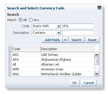
Search and Select Dialog with Initial Results Set
Usage:
- Product teams can configure the title of the dialog. The default is "Search and Select: Object", where the term "Object" is replaced with the prompt name of the instantiating LOV field, such as "Search and Select: City."
- Product teams can add a single Create toolbar button to the results table, but no other custom toolbar actions and menus are allowed in the table.
- If the item is not found, the results table shows all results. However, if blind queries are not permitted for performance reasons, an empty table displays with the string "No rows to display."
- Product teams may hide the Search region in the dialog, but this is not recommended, as the LOV is designed for use cases where the user may need to search for a specific result. When the Search region in the dialog is hidden, the "Search ..." option for the LOV Choice List is re-labeled as "More ..."
Populating a Table from the Search and Select Dialog


A user may need to select a value to populate a new row in a table. For instance, a user may need to add competencies to a table of competencies. Product teams can implement this using a custom Search and Select dialog, as described below.
- Associate an "Add" command and toolbar button with a table.
- When the user clicks the Add button, a custom Search and Select dialog appears with the first set of values from the entire list pre-queried in some logical order, depending on the data set. The dialog may support single or multiple selection.
- The user locates and selects the appropriate value or values, either by using the search mechanism in the dialog, or by scrolling the results table to scan through the items.
- When the custom Search and Select dialog closes, the table on the primary page is redrawn and scrolls if needed to show the new row or rows.
- It is recommended to re-sort the table with the new rows or row and scroll the table to show the first (or only) row.
- If the user has privileges to edit the items, product teams may make the new row or rows editable.
- See Select and Add in the Common Table Actions guideline for more information.
LOVs with Filters


It may be necessary to have a choice list filter with a dependent LOV field; the field may be either an LOV Choice List or an LOV Text Box. The filter limits the total number of values found in the Search and Select dialog, and values that can be verified if entered in the LOV field.
- A filter may be associated with an LOV field in either a form or in a table cell.
- If the filter is associated with an LOV field in a table, the choice list filter and the LOV field should be placed in the same cell of the table.
- Using a filter with an LOV field is recommended if the list of values:
- Has a well known set of filters that are appropriate to the entire set of values, or
- Is very large, and the filter reduces the time required to show values for user selection.
- It is recommended to set a default item in the choice list filter, and not to leave the choice list blank.

Form with Filter and LOV Field

Table with Filters and LOV Fields
LOVs and Create Option


When an application accepts non-matching values, and a user enters a non-matching value, an object is created automatically and added to the list. Users can edit the object later to define its attributes.
When an application accepts only matching values, an item may not be found in the LOV because it does not yet exist. In this case, depending on business rules, product teams may enable users to create an item. The method used depends on user familiarity with the data and the type of LOV field:
- When users are familiar with the data, and are expected to know whether an item already exists:
- LOV Text Box: Place a "Create . . ." button after the LOV Search icon.
- LOV Choice List: Insert a custom "Create . . ." option in the choice list. This method is also useful when the LOV Choice List contains a Full List that can be scanned quickly. See Custom Actions for details.
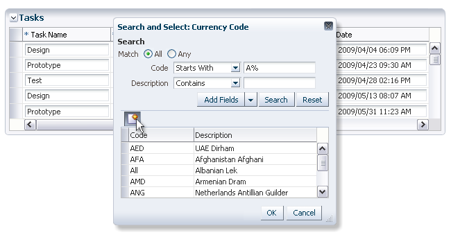
LOV Text Box with Create Button

LOV Choice List with Create Option
- When users are not expected to know whether an item already exists, a "Create . . ." button may be shown in the Search and Select dialog. In this way, if users fail to locate an item, they have the option to create it directly within the dialog without having to return to the instantiating field.
- After saving the new object in the creation dialog, the creation dialog should be closed and the newly created object should be automatically selected in the Search and Select dialog.

Search and Select Dialog with Create Button
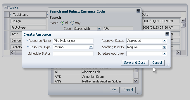
Create Object Dialog Launched from Search and Select Dialog