Message Framework Usage Guideline


RCUI Document Version 5.2.0 for Oracle® Fusion Middleware 11g Release 1 Patch Set 1 (11.1.1.2.0)
Last Updated
31-Jan-2011
FusionFX applications can display messages within the current page or in a dialog. There are five types of messages: Critical Error, Error, Warning, Confirmation, and Information.
Related Guidelines
| Guideline | Section | For Information About |
|---|---|---|
| Language in UI | All | General directions for writing message text. |
| Help Framework | Note Windows | Combining messages with Help in a note window. |
Related ADF Elements
Refer to the ADF Faces Rich Client demos page to find demos and tag documentation for the ADF elements related to this component:
| ADF Element | Notes |
|---|---|
| af:message | Displays a single message. |
| af:messages | Displays the full set of messages for a page. |
| af:dialog | Displays custom messages (not component-specific). |
| af:icon | Displays messaging icons. |
General Principles


Purpose:
Messaging communicates information in response to user action or changes in system status.
Description:
FusionFX messages are divided into different types, depending on the purpose of the message, such as warning a user that data has not been saved, or alerting the user to data entry errors. See Message Types below for details.
FusionFX applications use different methods to display messages, depending on the scope of the message:
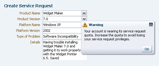
- Component Message - The message applies to a specific component only, and is displayed in a note window attached to the component.
- Global Message - The message applies to the entire page, and is displayed in a dialog box or message box. The standard forms of dialog box or message box may also list any component messages for the page.
- See Message Display Methods for details.
In addition, FusionFX applications use JavaScript alerts exclusively for popup blocker alerts and for display of Active Data messages in screen reader mode. See Active Data in the Table Elements guideline.

Component Message in a Note Window
Global Message in a Dialog
Usage:
- Messages should always present information to the user in a concise, helpful manner. To achieve this, messages must:
- Be specific enough to address problems encountered by users.
- Use terms that are familiar to the application's users.
- Use terms consistently from one message to another.
- Avoid unnecessary explanations—longer messages are more difficult to scan.
- Meet translation requirements.
- Messages may include tokens to render text, numbers, or dates if all of the following conditions are true:
- The string cannot be predicted prior to run-time. For example, product teams know in advance if the object type in a certain context is an "order", so should use that term instead of a token, but a token is necessary to display the order's requestor name, order number, or ship date.
- The message does not communicate enough information without the token.
- The use of the token meets internationalization requirements.
- When developing message text, product teams should refer to the specific messaging guidelines for their company. This is essential to ensure re-use of standard messages, use of standard syntaxes, and consistency of message style. In addition, see the Language in UI guideline for general directions on writing style.
Overview of Message Types


Messages appear in response to a user action (such as validating or confirming the user's input), a system action (such as a database failure), or other reasons as specified by the application developer. FusionFX applications divide messages into five standard types, ranked in severity as follows:
- Critical Error - Alerts the user to unrecoverable errors due to circumstances beyond the user's control.
- Error - Alerts the user that one or more actions have failed due to data inaccuracies. The application requires immediate attention and/or correction before continuing.
- Warning - Alerts the user to a condition or a situation that may require a decision before continuing.
- Confirmation - Informs the user that data has been submitted or changed.
- Information - Informs the user about changes in the business or application environment.
Depending on the message type and the scope of the message, messages can be displayed using one or more methods. See the following section for details.
Message Display Methods


Messages can be displayed using one or more of the following methods:
- Note Window: Popup window for component messages.
- Message List Dialog: Modeless dialog for global messages, and to list component messages.
- Message List Box: A fixed box for global messages, and for listing component messages (alternative to the Message List Dialog).
- Custom Message Dialog: Modal or modeless dialog for messages that must be combined with custom controls.
The following sections describe each message display method. For details on use of each method with specific message types, see the related message type section later in this guideline.
Note Window


Purpose:
Displays component-level messages.
Description:
- A note window is always associated with a specific component, such as a choice list or a text field, and may contain both component messages and Help text. Messages always appear above the Help text. See Note Windows in the Help Framework guideline for details.
- Note windows are always modeless.
- Note windows do not include scroll bars. The window expands to fit its contents.
- When a single component has more than one message to display at a time, the note window messages are listed in order of severity; for example, Error messages are placed above Warning messages.
- The note window displays the icon and title for the message with the highest level of severity. For example, if the component has both a Warning message and an Error message, the title is "Error".
- When a page has messages for multiple components, or global messages also need to be displayed, the note window includes navigation controls. See Note Window Navigation below for details.

Single Component Message in a Note Window
Usage:
- Note windows should be used to display component Error and Warning messages. Other types of messages, including global Error and Warning messages, should be displayed only in a dialog box or message box. See the following sections for details.
- Component messages should be brief and effective:
- Even though a note window can expand to show additional content, verbose text is difficult to scan in a small window.
- The maximum recommended size for a note window containing messages is one-fourth the size of a maximized browser window at 1024 x 768 resolution. If larger, the note window will tend to obscure the object of the note.
- Component messages may also be displayed in the Message List Dialog. If each message is verbose, the dialog may become difficult to scan.
- See General Principles above for more information on writing messages.

Multiple Component Messages in a Note Window
Note Window Navigation


When a page has other messages, note windows provide navigation buttons to view those messages:
- Previous and Next Traversal Arrows: Navigate to the previous and next components with messages and display the message in a note window. The buttons are omitted when the page has only a single component message.
- "All" Button: Displays the Message List dialog, which lists both global and component messages. Users can then click the component link in the Message List dialog to jump to the component message. The All button is omitted if the page has no other messages.

Note Window with Navigation Buttons
Message List Dialog


Purpose:
Displays global and component messages.
Description:
Message List dialogs display one or more messages about the page in general as well as listing any component messages.
- The Message List dialog appears when a page has:
- One or more global messages.
- Two or more component messages.
- A global message and one or more component messages.
- Message List dialogs share many of the same characteristics as regular dialogs (see Dialogs in the Secondary Windows guideline) with the following exceptions:
- Message List dialogs are always modeless, and contain a single "OK" button to dismiss the dialog.
- Message List dialogs support special formatting for text in the Dialog Message Region.
- Message List dialogs initially appear centered in the upper half of the browser window.
- Message List dialogs support all five severity levels: Critical Error, Error, Warning, Confirmation, and Information.
- The dialog title displays the icon and title for the message with the highest-level severity. For example, if the dialog contains four Warning messages and one Error message, the dialog title is "Error".
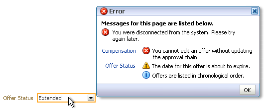
Message List Dialog with Multiple Messages
Usage:
- Message dialogs provide the strongest form of messaging, as they require the user to acknowledge the message by clicking an action/navigation button. Consequently, they should be used primarily for Critical Error, Error, and Warning messages, but may also be appropriate for Information and Confirmation messages that must be brought to the attention of the user.
- When displaying Information and Confirmation messages that may be safely overlooked, consider using a Message List Box instead of a dialog.
- Product teams cannot customize the behavior of the Message List dialog. If teams require other functions, such as custom buttons, or need to display a modal dialog, they can replace the Message List dialog with a custom message dialog.
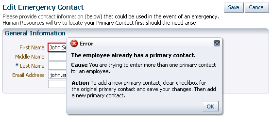
Message List Dialog with Single Complex Message
Dialog Message Region


The message region of the Message List dialog is populated with global messages, component messages, or both. Messages are listed in the following order:
- Summary Text: Appears when there is more than one message in the dialog. The default text is "Messages for this page are listed below.", but product teams can change the text.
- Global Messages: When more than one global message is present, the messages are ordered by severity. See Message Types for details.
- Component Messages:
- Messages are listed in the same order as their components.
- If a component has multiple messages, the messages are listed in order of severity; for example, Error messages are placed above Warning messages.
- Each component message is preceded by a link to the related component. The link text depends on the target component:
- If the target component has a prompt, the link text is identical to the prompt.
- If the target component is in a table column, the link text is identical to the table column header.
- Each link is followed by a brief explanation of the problem, with suggestions to correct it. This text is identical to the text in the component message. See Note Window for details.
- When the user clicks a link, the page scrolls to the component with the Error or Warning message.
Message List Box


Purpose:
Displays global and component messages that persist until the page is resubmitted.
Description:
A Message List box is an alternative to the Message List dialog for display of global and component messages.
- Message List boxes include the same Message Region as the Message List dialog.
- Message List boxes persist on the page until the user addresses the cause of the message and the page.
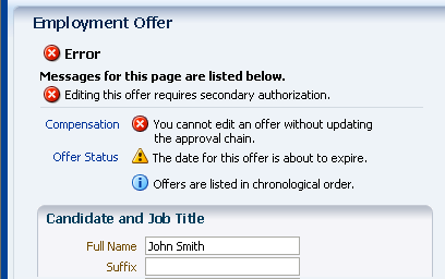
Message Box with List of Component Messages
Usage:
- Message List boxes are less obtrusive than Message List dialogs, so should be used only when messages can be safely ignored:
- On the base page, the Message List box should be reserved for Confirmation or Information messages.
- On a printable page, the Message List box may be used to display any message type along with base page content.
- A Message List box may be placed anywhere on the page, but it is recommended to place it below the primary header of a page.
Custom Message Dialogs


Purpose:
Display global messages with custom text and controls.
Description:
- When product teams provide a custom message dialog, the custom dialog appears instead of the Message List dialog.
- Custom message dialogs can be either modal or modeless.
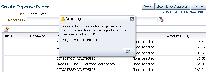
Custom Warning Message Dialog
Usage:
- The most common use of custom message dialogs is for Warning messages, where users must make a choice before continuing. In this case, the dialog is usually modal, with Yes and No buttons to make the choice. For example, a Warning message for conditions that could result in loss of data should be modal, to make sure the user is aware of the consequences of continuing with the current action.
- Other custom message dialogs should be modeless because this enables the user to interact with the base page while referring to the message.
- Custom dialogs can have other buttons besides OK. Common alternatives are as follows:
- Yes: Used in place of OK. Dismisses the dialog and performs a page specific action. Yes is always paired with No.
- No: Dismisses the dialog and prevents a page specific action. No is always paired with Yes.
- Cancel: Cancels a process or choice and dismisses the dialog.
- Printable Page: Dismisses the dialog and launches a printable version of the primary page and the message text in an external window. See the Printable Page guideline for details.
- Clicking the Close box on the message dialog should perform the same function as clicking a Cancel button.
- If users may need to read a message only once, product teams should include a "Do not show this message again" check box below the message region. In this case, it is recommended to also provide a user preference labeled "Display all previously hidden messages" so the user has a way to see the hidden messages again.
- A "Do not show this message again" check box is most suitable for Confirmation and Information messages. It should not be used on Critical Error or Error messages, as it is important to show errors to the user every time they occur.
- A "Do not show this message again" check box may be used for common or innocuous Yes/No Warning messages that simply ask the user to verify an action. In this case, the user's choice should be remembered for subsequent encounters of the message.
- For Warning messages that provide a notification to the user, it may be appropriate to have a "Do not show this message again" checkbox, depending upon the severity of the consequences.
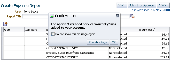
Custom Confirmation Message Dialog
Message Types


When messages are displayed, standard page title icons and text denote each of the five message types, which are ranked in severity as follows:
- Critical Error
- Error
- Warning
- Confirmation
- Information
FusionFX applications also provide a separate type of message or indicator to show that processing is taking place. See the Progress/Status Indicator guideline for details.
The following sections describe each of the five standard message types in detail.
Critical Error Messages


Purpose:
Alert the user to an internal software error outside of the user's control.
Description:
Critical Error messages occur when an application encounters an internal error. The error is not caused by a particular user action but is a result of a software state outside of the user's control.
- One example of a Critical Error message is when a server goes offline while the user is working within an application that depends on that server. The message could read as follows: "You were disconnected from the system. Please try again later."
- Critical Error messages are displayed at the page level only, using a Message List dialog or a custom message dialog.
- Critical Error messages include the same icon as regular error messages. The default dialog title is "Critical Error".
- When combined with other messages, Critical Error messages are placed above all other messages.
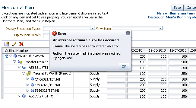
Critical Error Message (uses standard Error icon)
Usage:
- It is recommended to display Critical Error messages in a dialog box rather than a Message List box, so users notice the message.
- Product teams can change the dialog title, but this is not recommended.
Error Messages


Purpose:
Alert the user to problems that must be resolved before continuing.
Description:
- Error messages alert the user to data inaccuracies when leaving a field or submitting a page, and which require a data change to continue the task. Causes of data inaccuracies include failure to follow formatting or validation rules, and required fields that have been left blank.
- Global Error messages are displayed in a Message List dialog or a custom message dialog.
- Component Error messages are displayed in a Note Window and may also be listed in a Message List dialog.
- Error messages are identified by the Error icon and the default title text "Error".
- When combined with other messages, Error messages are placed above all other messages except Critical Error messages.
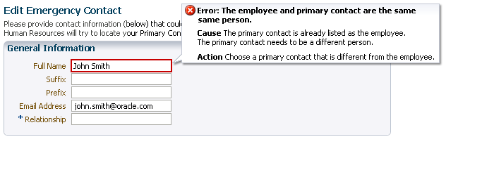
Component Error Message in a Note Window
Examples:
- Component — in Note Window:
- The due date cannot be later than the contract end date.
- Passwords must be at least eight characters in length and must contain a mix of uppercase and lowercase letters.
- Global — in Message List Dialog or Message List Box:
- You cannot delete an expense report until you delete all expense items for the expense report.
- You cannot update this invoice because it is selected for payment.
Usage:
- It is recommended to show global error messages in a dialog box rather than in a Message List box, so users notice them.
- Error messages should clearly:
- Describe the problem in terms that are familiar to the user.
- Identify the cause of the problem.
- Specify how to correct the problem.
- Provide any additional content required by your company, such as details for administrators.
- Component validation (on leaving the field) with error messages in a note window is preferred over global validation (on page submit), because it allows the user to correct the problem immediately. However, it is better to use global validation and display the error message in the Message List dialog when:
- Component validation would be too slow.
- The user task requires rapid data entry into a large number of fields, so it is better to validate all data at the end of the task and avoid interrupting the flow of data entry.
- Dependencies cannot be validated until the user completes a subsequent page in a task flow.
- Product teams can change the dialog or message box title.
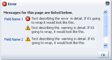
Component Error Message in Message List Dialog
Warning Messages


Purpose:
Alert the user to a condition that may need their attention.
Description:
- Warning messages alert the user to potential problems, such as unsaved data.
- Global Warning messages are displayed in a Message List dialog or a custom message dialog.
- Component Warning messages are displayed in a Note Window.
- Warning messages are identified by the Warning icon and the default title text "Warning".
- When combined with other messages, Warning messages are placed after Critical Error and Error messages, and above Confirmation and Information messages.
Examples:
- Component—in Note Window:
- Specifying a value of xxx will result in potential problem yyy.
- The date specified is after the end of the fiscal year.
- Global—in Message List Dialog:
- Your email account is nearing its disk space quota. Download messages to your local system to make more space available for future messages.
- The system is going down in {nn} minutes. Save your work and log out as soon as possible.
- You must change your password before: {PSWRD_EXP_DATE}.
- Global—in Custom Message Dialog:
- You have specified a start date after the end of the fiscal year. Continue with this transaction? Yes/No
- You have unsaved changes. Save changes before continuing? Yes/No

Warning Message in Note Window

Warning Message in Message List Dialog
Usage:
- Warning messages are appropriate when the user encounters a situation that requires a decision before proceeding, such as an impending action with potentially destructive, irreversible consequences.
- Product teams can change the dialog or message box title.
- Depending on the severity of the consequences, product teams may choose to display certain Warning messages in custom message dialogs, so users are forced to provide an explicit response before continuing.

Warning Message in Custom Dialog
Confirmation Messages


Purpose:
Notify the user that a transaction has been completed successfully.
Description:
- Confirmation messages are page level messages that inform the user that data has been submitted or changed. Confirmation messages appear after the user submits the page. No interaction is required from the user other than to dismiss the message if it is displayed in a dialog.
- Unless product teams build a custom message dialog, Confirmation messages are displayed in a Message List dialog or a Message List box along with any other messages.
- Confirmation messages are identified by the Confirmation icon and the default title text "Confirmation".
- When combined with other messages, Confirmation messages are placed after all other types of messages except Information messages.

Confirmation Message in Message List Box
Examples:
- Your work was saved.
- Your changes were submitted for approval.
- Your changes were distributed for review.
- Your changes were applied.
- Your order was submitted. Your confirmation number is: 02345790
- Your portfolio was created.
Usage:
- Confirmation messages should not be displayed after every transaction, but should be reserved for the following contexts:
- The change resulting from the user action is not clearly visible on the page.
- Users may need to record or print Confirmation numbers and transaction details, such as a purchase order number and invoice.
- Confirmation message text should be as concise as possible while still clearly identifying the change.
- When combined with other messages in a dialog or message box, the placement of the Confirmation message should match its severity level—after Critical Error, Error, and Warning messages, and before Information messages. This is addressed automatically in the Message List dialog, but must be done manually in custom message dialogs.
- If product teams implement a custom message dialog for the page, Confirmation messages may also be displayed in that custom message dialog. This is useful when:
- The user needs to print the Confirmation message together with the base page. In this case, provide a Printable Page button in the dialog.
- Users need to choose where to go after closing the dialog, such as after adding an item to a shopping cart. In this case, the dialog could include buttons to "Check Out" or "Continue Shopping".
- Product teams can change the dialog or message box title.

Custom Confirmation Message Dialog
Information Messages


Purpose:
Inform the user about changes in the business or application environment.
Description:
- Information messages are global messages that inform the user that data has changed in the system.
- Unless product teams build a custom message dialog, Information messages are displayed in a Message List dialog or a Message List box along with any other messages.
- Information messages are identified by the Information icon and the default title text "Information".
- When combined with other messages, Information messages are placed after all other types of messages.

Information Message in Message List Dialog
Examples:
- The corporate fiscal year end is now March 31, 2010.
- CompanyXYZ is offering free screening for cholesterol in building 6 at corporate headquarters through September 2011.
- Your dental benefits plan now includes dependent children under the age of 18.
Usage:
- Information messages should be used:
- To describe system changes that do not originate with the user, and
- When no action on the part of the user is required.
- If product teams have implemented a custom message dialog for the page, Information messages may also be displayed in that custom message dialog.
- Information message text should be as concise as possible without sacrificing clarity. Information messages should form complete sentences.
- If it is necessary to provide contextual information at the field level, display it as instruction text within a note window. See Field-Level Instruction Text in the Help guideline for details.
- Product teams can change the dialog or message box title.
Validation


FusionFX components support client-side and server-side validation:
- Client-side Validation: This validation is performed immediately in the browser without requiring a round-trip to the server. Since there is no communication with the server, using client-side validation can reduce the performance impact of page actions that involve validation. However, client-side validation requires developers to write extra Javascript, which could make pages load more slowly and possibly be less secure.
- Server-side Validation: This validation is performed on the middle-tier. Since a round-trip to the server is required, server-side validation can result in slower performance for page validation actions. However, server-side validation provides the best means for performing heavier computation or using more complex business logic that would be too difficult to implement in Javascript.
- Server-side validation can fire either when a field loses focus or when a form is submitted. Many ADF components have simple, built-in client-side validators which check for formatting errors, data type mismatch, required field entry, etc. In general, however, product teams are responsible for defining validation behavior. The following are validation guidelines for common scenarios.
Individual Form Fields


- Where possible, validate field input when the field loses focus, particularly when the value drives other fields in the form.
- Validations for required fields and inter-field dependencies (that is, a combination of two or more fields) should be performed only when the form is submitted.
- Users should be allowed to fill out fields in any order.
- Error messages in the message list dialog should clearly list the labels of the fields where validation failed.
Tables and Tree Tables


- Individual fields in table cells should be validated the same way as individual fields in an input form.
- Error messages in the message list dialog should clearly list the headers of the columns which contain the fields where validation failed.
- Row-level validation is not supported.
Page Navigation


- Pages should have a page-level Submit button that validates all fields on the page before navigating to a new page in the flow. See the Buttons guideline for recommended button text.
- For error messages, navigation should be allowed to continue only after all errors have been resolved.
- For warning messages, the warning should be presented to the user when the submit button is clicked the first time, and should be shown each time the user clicks the Submit button after changing something on the page.
Tab Navigation


- Switching to a different tab will execute a page submit action; thus, validation behavior is the same as navigating between pages.
- When validation errors exist on fields that are "hidden" behind undisclosed regions or tabs, the error icon should be placed after the disclosure icon or before the tab name. The validation messages should then be displayed when those fields are revealed. This is a very rare case. Most validation is performed at page navigation or submission, before fields get hidden.
Composite Components


- Validation for a composite component, such as a master-detail, is similar to that of hidden components. The error icon should be placed before the master field, and then the validation messages on the detail fields should be displayed when the master field is selected.
- If the master field is responsible for the validation failure, the behavior is the same as that of an individual field.
Read-Only Pages


- Do not show validation messages on a read-only page.
- Validations should be performed at the time the data is submitted, when the user has the opportunity to correct the data.
- Where possible, when there are data dependencies between fields, the dependent fields should be grouped together on the same page or in a sub-process.
- If dependencies across pages are unavoidable, inform the user of the dependency by using Help text or an information message at the point of data entry, rather than raising an error on a read-only page after entry.