Table Elements Usage Guideline 

RCUX Document Version 5.1.0 for Oracle® Fusion Middleware 11g Release 1 Patch Set 1 (11.1.1.2.0)
Last Updated
27-Jun-2011
Tables are the principal method for displaying and interacting with data in FusionFX applications. This guideline provides detailed descriptions of the elements that may be used in each region of a table.
- General Principles
- Table Title Area
- Table Cells
- Columns
- Rows
- Row Headers
- Show Details Column
- Required Field Indicator
- Changed Field Indicator
- Help Text
- Active Data
- Table Menus
- Table Context Menus
- Toolbars
- Actions Column
- QBE (Query by Example) Bar
- QBE Fields
- Status Bar
- Scroll Bars
Related Guidelines
| Guideline | For Information About |
|---|---|
| Table Overview | Introduction to table design and interaction. |
| Table Information Design | Range of layout options, include grid lines and banding, row and column span, totals, use of scroll bars and alignment of cell contents. |
| Table Display Manipulation | Describes range of options for users to modify the display of a table, including sorting, filtering, resizing columns, and other configuration options. |
| Common Table Actions | Describes common data-specific actions, such as Create, Delete, and Duplicate. |
| Table Interaction Methods | Provides heuristics for use of different interaction methods within a table, such as use of select and act methods, editing within tables, functional icons, and drill-down. |
| PivotTable | Pivot Tables share much of the same design and behaviors as tables. |
| Graph | Tabular data display is a common alternative to graphical data display. |
| Gauge | Displaying gauges in table cells. |
| Tree | Use of scroll bars in a Tree region. |
| Browser and System Requirements | Screen width recommendations for scroll bars. |
| All components that support scrolling | See Scroll Bars below for list of links. |
Related ADF Elements
Refer to the ADF Faces Rich Client demos page to find demos and tag documentation for the ADF elements related to this component:
| ADF Element | Notes |
|---|---|
| af:column | Column in a table. |
| af:panelCollection | Adds toolbars and status bar to a table. |
| af:table | Scrollable Table component |
| af:treeTable | Scrollable TreeTable component |
| af:tree | Scrollable Tree component. |
General Principles


Purpose:
The following sections describe the elements of a table.
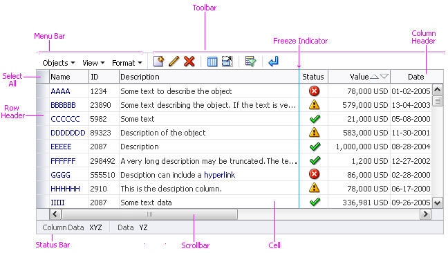
Table with Common Elements
Table Title Area


Tables are usually placed beneath a header, subheader, or subsubheader, which function as a table title. For details, see the Headers guideline.
The area between the table title and the table can be populated with components that are related to the table but not part of it, such as:
- Instruction text - See the Help Framework guideline.
- Search panel - See the Search and Query guideline.
Table Cells


Purpose:
Table cells may contain data or components that act on data.
Description:
- A table cell is the intersection of a row and column, so the number of cells in a table depends on the number of rows and columns.
- Cell selection is not supported except to input or edit data in a web widget.
- Read only cells support the following formats: alphanumeric, numeric, date, time, and currency.
- When keyboard focus is in a table cell, pressing Tab moves focus right one cell, and pressing Shift+Tab moves focus left one cell.
Valid Cell Content


Both read-only and editable table cells may include any of the following elements, in any combination:
- Link
- Button
- Status Icon
- Functional Icon
- Input/Choose Date Selector
- Text (in alphanumeric, numeric, date, time, or currency formats)
- Disclosure Icon
- Required Field Indicator
- Changed Field Indicator
In addition, the following input elements are supported within editable table cells:
- Input/Output Text: Text Field
- Input/Output Text: Text Area
- Select Choice List (Select-One and Select-Many)
- Spinbox
- Checkbox
- Select Radio
- Input/Choose Color
- Input/Choose Date
- LOV (Text Box and Select Choice)
Columns


Purpose:
Columns arrange cells vertically to display object names, object attributes, data entry widgets, and controls that act on data.
Description:
- Column selection is supported.
- Columns can be demarcated with grid lines and banding, grouped under a parent column (spanned), and totaled. See Table Information Design for details.
- Columns can be resized, hidden, reordered, frozen, and sorted. See the Table Display Manipulation guideline for details.
Usage:
- The topmost cell in a column is usually a column header.
- A table should have at least one column, but there is no technical requirement to display a column.
- The maximum number of columns in a table is unlimited, but it is recommended not to exceed six to eight columns (depending on column width) to avoid horizontal scrolling.
- A table may contain more columns in certain cases. For details, see Table Width in the Table Information Design guideline.
- Column width can be set in pixels and percentages. Any column can also be set to a minimum width. If the sum of the column widths is less than the total width of the table, a specific column can be set to stretch and fill the remaining space.
- If a column contains fixed width elements such as Web widgets or functional icons, product teams should specify a minimum width in pixels for that column to accommodate the fixed width elements.
Column Headers


Purpose:
Indicate the function of the column, and may optionally allow column selection and column sorting.
Description:
- Column headers are mandatory if column selection, column check boxes, or sorting are supported.
- A column header must contain at least one of the following: text, a status icon, or a check box.
- When both sorting and selection are supported simultaneously, the column header is broken into two invisible selection and sort sections. Otherwise the column header consists of a single section.
- Mousing over the selection section changes the cursor to column selector. Clicking with the column selector cursor selects the column.
- Mousing over the sorting section changes the cursor to default. Clicking with the default cursor sorts the column. See Column Headers and Sorting below for details.
- Column header text may span both selection and sort sections. In this case, sort icons overlay the column header text when there is not enough space for all column header elements.
- A column header may also contain a:
- Sorted Column Icon: If the column has been sorted. See Column Headers and Sorting below for details.
- Required Field Indicator: If all cells in the column contain required fields.
- Help icon: If Help is required on the contents of the column. See the Help Framework guideline for details.
- Column headers support Table Context Menus.
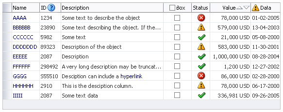
Column Headers with Different Types of Content
Usage:
- Development teams may set column headers to wrap or to truncate text if the text is too long to display in a single line. Users can change these settings using the column header context menu.
- It is recommended to wrap text by default, so users can see the entire column header directly.
- Consider setting the column header to truncate long header text for production users, to maximize the space available to display rows of data. The entire string should appear in a tooltip on hover. For more details on truncation, see the Headers guideline.
- Avoid long column header labels that wrap to more than two lines, as these use up space that should be reserved for data, and could wrap to even more lines in translation.
Column Header with a Status Icon


Purpose:
Indicates that the column lists a specific type of on/off status for each row in the table.
Example:
An e-mail client uses status icons to indicate that a message has been flagged, read, given an attachment, or marked as Spam. Each row would use those columns to indicate whether the status was true for that row.
Usage:
- Status icons may be displayed alone, or combined with column header text, in which case the status icons appear in front of the text.
- Use status icons alone when:
- The product's users will recognize and distinguish the status icons without additional labeling.
- It is necessary to display multiple statuses, and column header text uses too much horizontal space.
- The table does not have enough space to include column header text without horizontal scrolling or removing an attribute column.
- When placed in a column header, a status icon must not be combined with any other icon, indicator, or Web widget.
- Status icons must have a tooltip that explains their purpose.
Column Header with a Check Box


Purpose:
A check box in a column header allows users to select/deselect all cells in the column.
Example:
A table listing a set of files includes a column for the user to mark each file as read-only or editable. The user can change the state of all files by clicking the check box in the column header, and then change the individual status of any file by clicking the check box in that file's row.
Usage:
- Check boxes may be displayed alone, or combined with column header text, in which case the check boxes appear in front of the text.
- Use check boxes alone when:
- The product's users will recognize the purpose of the check box without additional labeling.
- The table does not have enough space to include column header text without requiring horizontal scrolling or removing an attribute column.
- When placed in a column header, a check box must not be combined with an icon, indicator, or any other Web widget.
- If a check box is displayed alone, provide a tooltip that explains its purpose, such as "Select All/None".
Column Headers and Sorting


Column headers support both sorting and selection. When both are enabled, the header is divided into two sections, as shown in the following figure. If only sorting is enabled, then the sort section fills the entire header.
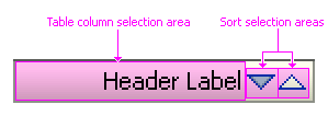
Sort and Selection Sections in a Column Header
- Column header text may extend across the entire column header if necessary. In this case, Sort icons overlay the column header text.
- Clicking the Selection section selects the column.
- Mousing over the Sort section displays the Sort able Column Indicator. Clicking within the Sort section sorts the column. The Sort direction depends on:
- Whether the user clicks a Sort icon or clicks elsewhere in the Sort section
- Whether the column is already sorted
- The previous sort direction
- The following section describes how each of these conditions affects the sort direction.
Column Sort Direction


Sortable columns have different sets of icons depending on whether the column is already sorted and in which direction it was sorted.
- If a sortable column has not yet been sorted, the Sortable Column Indicator appears on mouseover of the Sort section:
- The Sortable Column Indicator consists of both up and down arrow icons without an indication of sort direction.
- Clicking an arrow performs a sort in the direction of the arrow.
- Clicking anywhere else in the Sort section of the column header performs an ascending sort.
- Once a column has been sorted, the Sorted Column Icon is displayed on mouseover of the Sort section:
- The Sorted Column Icon arrows indicate the current sort direction.
- Clicking an arrow performs a sort in the direction of the arrow, but clicking anywhere else in the Sort section of the column header toggles the sort.
- The arrow icons have the tooltips "Sort Ascending" and "Sort Descending" to indicate the sort direction.
- For more information on sorting, see Sort in the Table Display Manipulation guideline.
Rows


Purpose:
Arrange cells horizontally to display an object name, object attributes, data entry widgets, and controls that act on the object.
Description:
- Row selection is supported. See Row and Column Selection in the Table Interaction guideline for details.
- Double-click to edit a row is supported. See Click-To-Edit Tables in the Table Interaction guideline for details.
- Rows can be demarcated with grid lines and banding, and grouped under a parent row (spanned). See Table Information Design for details.
- Rows cannot be resized, hidden, frozen, or sorted. See the Table Display Manipulation guideline for details.
- A table may be configured as to switch cells in the current row from read-only to editable modes. See
Usage:
- The first cell in a row is usually a row header.
- A table may be empty, without any rows, if no items have been added/created or if a query returns no results.
- The maximum number of rows in a table is unlimited.
Row Headers


Purpose:
Allow row selection and may indicate the function or status of the row.
Description:
- Row headers are mandatory if row selection is supported.
- Clicking a row header selects the row. Clicking a read-only cell in a row also selects the row.
- A row header may contain text, such as numbers, for row ordering purposes.
- Row headers support Table Context Menus.
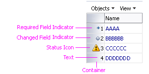
Row Headers with Different Types of Content
Usage:
- Row headers can use status icons in the same way as a Column Header with a Status Icon.
- Row headers may be omitted (unless row selection is supported). However, row headers can serve a variety of important functions, including indicating status or function of a row, indicating changed or required fields, or containing textual information that is helpful for row ordering purposes, etc.
- A row header may contain the following elements:
- A Required Field Indicator, if all cells in the row are required fields.
- A Changed Record Indicator, if any cell content in the row has changed since page submission.
- Status Icon, if any cell elements in the row have generated messages (such as warning or error messages).
- Any text string, as required by a product.
These elements may be placed in the row header if product teams can make the Table component aware of the individual rows. If this is not possible, teams should use the status indicators that come with an element inside a cell (for example, a text box). Alternatively, product teams can place status icons in one of the data columns.
- Row header text may be sequential, either numerically or alphabetically.
- Subtotal row headers must be empty. See Subtotals in the Table Information Design guideline for details.
- By default, row headers have a width of 100 pixels. Product teams may specify a custom width to accommodate the contents of the row header column. If no contents are displayed in the column, it is recommended that product teams set row header column width to nine pixels.
- The minimum width of a row header column is 12 pixels. If no contents are displayed in the column, it is recommended that product teams set the row header column width to nine pixels.
- If possible, the column width should be set so that contents are displayed in full view.
- Product teams should specify the padding between multiple elements inside a row header cell as three pixels.
- Row headers may wrap or truncate if the text is too long to display in a single line. Users can change these settings using the row header context menu.
- It is recommended to wrap text by default, so users can see the entire row header directly.
- Consider setting the row header to truncate long header text for production users, to maximize the space available to display columns of data. When truncated, the entire string appears in a tooltip on hover. For more details on truncation, see the Headers guideline.
- Avoid long row header labels that wrap to more than two lines, as these use up space that should be reserved for data, and could wrap to even more lines in translation.

Row Headers with Different Text Options
Show Details Column


Purpose: Contains Disclosure icons that allow users to display hidden row details.
Description:
- When used, the Show Details column is the first column in the table, after the row headers (if they exist).
- The Show Details column cannot be selected, hidden, frozen, resized, sorted, or reordered.
- When the Show Details column is displayed, all menu options and elements associated with freezing functionality are turned off. The Show Details column and column freezing are mutually exclusive.
Usage:
- Consider implementing a Show Details column when all of the following conditions exist:
- It is useful to display additional object attributes within the table.
- The table does not scroll horizontally.
- Adding more columns to contain the attributes would cause the table to scroll horizontally.
- Users do not need to compare the additional details from one row to another.
- By default, each cell in the show details column contains a disclosure icon. Product teams may turn off individual disclosure icons. Turning off the Disclosure icon is only recommended for rows that do not have hidden details.
- Disclosure icons are collapsed by default, but product teams can set any or all Disclosure icons to be expanded. Consider doing so when:
- All rows in the data set can be displayed on a single page.
- Certain objects in the data set contain attributes with low frequency of occurrence, but of greater importance to users. Examples might include an employee with unusual language skills, a customer with a high number of product returns, or a part with multiple suppliers.
Row Details Region


Purpose: Displays object attributes that do not appear in the tables attributes columns.
Description:
- The row details region is a rectangular region which appears directly beneath a row when its disclosure icon is expanded; the region spans the width of the entire table.
- The row details region cannot be selected.
- If the content of the row details region exceeds the width of the table, it will wrap if the content supports wrapping; otherwise a horizontal scroll bar will appear.
- The row details region may contain all components except the following: Branding, Breadcrumbs, Context Region, Global Links, Page Layout, Splitter, Level 1 and 2 Tabs, and Train.
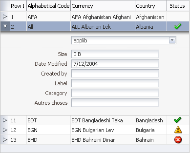
Table with Row Details Region Expanded
Usage:
- By default, the height of the row details region adjusts to match the region's content. However, product teams can set the height of all row detail regions to a fixed pixel height. If region content exceeds this set height, a vertical scroll bar will appear at the end of the region. Consider setting the height of the row details regions when:
- Some objects may have a disproportionately large number of details, and consequently would obscure most or all other rows when expanded, or
- The Disclosure icon is set to expanded by default, but it is unclear how extensive details may be for some objects.
- When the row details region is hidden by default:
- Avoid placing editable widgets in the row details region, because users may not see them.
- Never place required fields in the row details region, because users who do not expand the region and fill in the required fields will experience an error condition when they try to leave the page.
- For performance reasons, it is not recommended to nest tables within a row details region. If it is absolutely necessary to nest a table within the region:
- The nested (inner) table may only contain view-only elements.
- The nested table may not provide sorting functionality.
- The nested table may not include another Show Details column.
Required Field Indicator


Purpose:
Identifies fields that must be completed before submitting the page.
Description:
- The Required Field Indicator is a text asterisk, *.
- In tables, the Required Field Indicator can be placed in column headers, in row headers, or in individual cells.
- If a Help icon is also present in a column header, the Required Field Indicator appears between the Help icon and the column header text.
- If a Changed Field Indicator is also present in a row header, the Required Field Indicator is placed after the Changed Field Indicator.
- When placed in a cell, the Required Field Indicator appears before the web widget used to edit the content of the cell.

Editable Table with Required Field Indicator in Column Header
Usage:
- ADF provides ALT text and tooltips to indicate required fields. Product teams may additionally provide key notation to define the Required Field Indicator. Refer to Key Notation in the Headers guideline for information regarding usage.
- The placement of the Required Field Indicator depends on which fields are required:
- When a table contains a column of editable cells that are all required fields, place the Required Field Indicator in the column header.
- When a table contains a row of editable cells that are all required fields, place the Required Field Indicator in the row header, unless all column headers contain a Required Field Indicator.
- When a table contains a mix of required and non-required fields, place the Required Field Indicator in each cell that is a required field. See the note below for implementation details.
- When a row contains a controlling field (choice list or LOV choice list) that has dependent fields in other cells, a dependent field may become required when a selection is made in the controlling field. In this case, the cell containing the required dependent field should have a Required Field Indicator.
- For example, a table in a product purchase application may display two columns of choice lists, labeled Product Type and Product Option. Depending on the product type selected in the first column, the choice list in the Product Option column may or may not become a required field. In this case, the required field indicator should appear before the product option choice list rather than in its column header.
- The following links provide more information about dependent fields:
- Conditionally Required Fields in the Select Choice guideline.
- Controlling and Dependent Fields in the Form Layout guideline.
- Dependent Fields and LOV Choice Lists in the LOV guideline.

Click-To-Edit Table with Required Field Indicator in Cells
Changed Field Indicator


Purpose:
Indicates that a value in a row changed after page submission.
Description:
- In tables, the Changed Field Indicator is placed in the row header.
- If a Required Field Indicator is also present in the row header, the Changed Field Indicator is placed before the Required Field Indicator.
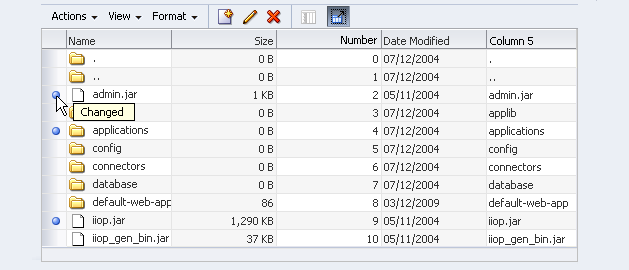
Editable Table with Changed Field Indicator in Row Header
Usage:
Same as Input/Output Text.
Help Text


Purpose:
Provides instructions on using a table.
Usage:
- Tables do not display Help on a cell by cell basis. Instead, product teams can provide Help text in two ways:
- Instruction text in the Table Title Area that is applicable to the entire table.
- A Help icon in a Column Header, with information applicable to a single column.
- It is recommended to provide Help only when users would otherwise not be able to complete the current task successfully.
- See the Help Framework guideline for more information.
Active Data


Purpose:
Refers to data provided through the Active Data Service (ADS), which can be refreshed without user action.
Description:
- Active Data is indicated on the page in two ways: page-level status indicators (see the Progress/Status Indicator guideline) and the component-level twinkle effect.
- Component-level twinkle provides a visual affordance for data within a table that is being updated, to distinguish it from other data in the table.
- The twinkle effect lasts for one second and is not configurable.
- Active Data can be used only in read-only Table, Tree, TreeTable, Graph, and Gauge components.
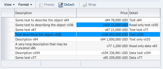
Table Cells with Component-Level Twinkle Effect
Usage:
- Active Data is often used when displaying information that is subject to constant change, such as stock quotes, mortgage rates, currency exchanges, account balances, and cell phone minute usage.
- Active Data may also be used to generate a work list. In this case, the page contains search criteria and runs searches automatically to display a table containing the work list data. When a new work list item matches the user's predefined criteria, it would appear in the user's work list automatically.
- There is no limit to the quantity of Active Data in a table. However, when providing Active Data within multiple regions on a dashboard or overview page, the page can become overly busy when the Active Data elements are updated, and users may not notice individual changes. Consequently, it is recommended to limit Active Data to three or fewer components per page.
Table Menus


Purpose:
Provide access to all permissible commands for the table.
Description:
- Table menu bars contain one or more menu names, which open to display a list of menu items.
- Menu items may execute commands directly, launch dialog boxes, or open submenus.
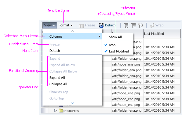
Table Menu Elements
Usage:
- Menus are only mandatory when their corresponding direct manipulation actions are supported in the table.
- Common table menus include an object-specific actions menu, a View menu, and a Format menu. See the related subsections below for details.
- Menus are used in multiple FusionFX components. See the Menus guideline for general menu usage, including:
- Naming menu items
- Grouping menu items
- Sequence of groups
- Use of submenus
- If all applicable menu commands fit easily on a Toolbar, use the toolbar instead of a menu bar to save screen space and avoid duplication of commands.
Object-Specific Actions Menu


Purpose:
Provides commands that act on objects in the table.
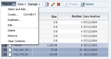
Generic Object-Specific Actions Menu
Usage:
- Product teams may use different names for object-specific actions menus depending on their company's standards and the object types in the table:
- If the table contains a single type of object, and the table title does not clearly describe the table's contents, use the object type, such as Employee, as the menu name.
- The term "Objects" may alternatively be used for tables that contain multiple types of objects.
- The list of potential actions depends on the object type, and is not provided with the table component. Common actions are shown in the example image above. For more details, see the Common Table Actions guideline.
- The Language in UI guideline provides a comparison of related terms, many of which may appear in an actions menu. Menu items commonly use terms that also appear on buttons. The Buttons guideline provides a complete list of standard terms and their usage.
- Commands from an object-specific actions menu may also be provided in a Toolbar.
- If a table does not include row headers to enable row selection, the table may still provide selection independent actions in the menus or object-specific actions in an Actions Column containing functional icons.
View Menu


Purpose:
Provides commands that typically affect the display of the table data, such as its layout or order. The data itself does not change. For instance, Reorder and Sort are considered valid commands under this menu.
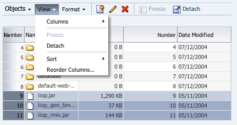
View Menu
Usage:
- The View menu is mandatory if the table supports any View-related actions through direct manipulation or context menus. In that case, those actions must also be available from the View menu.
- View menu commands are especially useful for high data density tables where horizontal scrolling is required to view all attribute columns or when vertical scrolling is required to see all rows.
- Common View menu commands are shown in the example image above. For recommendations on when to use different View menu items, see the Table Display Manipulation guideline.
- Product teams can add menu items to the View menu. The View menu should be limited to menu commands that affect table display; menu commands that result in changes to table data should be placed in the object-specific actions menu.
View: Columns Submenu


Purpose:
Allows users to select which columns to display.
Description:
- The Columns submenu lists up to 10 columns with check mark toggles.
- If the table has more than 10 columns, a 'Show More Columns' menu item appears at the bottom of the Columns submenu.
- If the table contains column groups, each column group opens a submenu with its child columns.
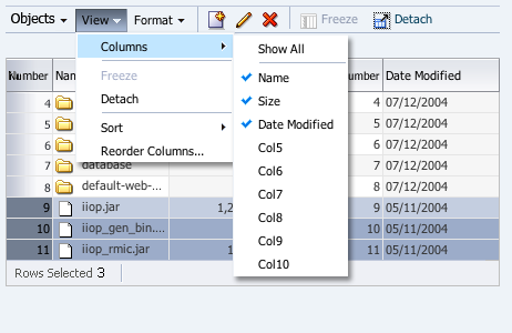
View: Columns Submenu - Basic
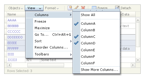
View: Columns Submenu - With More than 10 Columns
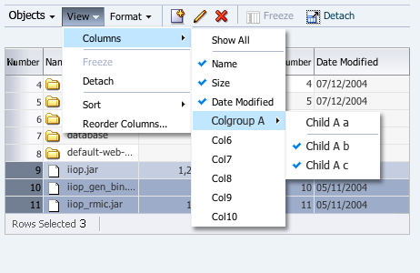
View: Columns Submenu - With a Column Group
Usage:
- Use the Columns submenu if the table scrolls horizontally. Users can de-select some columns to view the remaining columns without scrolling.
- Use the Columns submenu if both of the following conditions are true. If only one is true, consider providing only drill-down details.
- Objects have additional attributes that users may need to view.
- Users may need to compare the attributes of multiple objects by viewing them in a table.
View: Sort Submenu


Purpose:
Allows users to specify the sort order based on the selected column or to launch a dialog box to specify a sort order based on multiple columns.
View: Sort Submenu
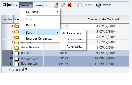
Usage:
- Use the Sort submenu if column header sorting is supported. See Column Headers and Sorting above for a description of sorting functionality.
- Sorting functionality is generally not needed in tables with record sets of 10 or less rows.
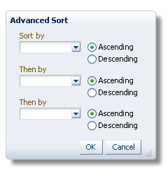
Advanced Sort Dialog
Format Menu


Purpose:
Provides commands that typically affect attributes of the table data. In the case of text data, the affected attributes may included its style, such as font or size.
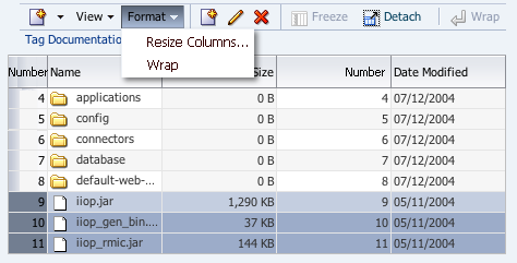
Format Menu
Usage:
- The Format menu contains the Resize Columns and Wrap Text commands by default.
- The Resize Column command must be provided if the table supports direct manipulation of column width.
- For more details, see the Table Display Manipulation guideline.
Table Context Menus


Purpose:
Provide commonly-used commands applicable to the selected row or column.
Description:
- Rows and columns have different context menus, with column context menus primarily displaying commands for manipulation of column display, and row context menus primarily displaying applicable object-specific commands. Both types of context menus include only selection-dependent commands.
- When a row or column is selected, users invoke a context menu by right-clicking anywhere in the selected row or column.
- When neither rows nor columns are selected, users invoke context menus as follows:
- Column Context Menu - by right-clicking on a column header.
- Row Context Menu - by right-clicking on a row header or any read-only cell in the row.
- When multiple rows or columns are selected, right-clicking anywhere in those rows or columns displays the context menu. Menu items are enabled only if they are applicable to all selected rows or columns.
- Right-clicking on the Select All header cell displays a row context menu. Menu items are enabled only if they are applicable to all rows in the table.
- Right-clicking a link within a cell of the table displays the browser's context menu rather than the row context menu.
- The vertical order of menu items for the action context menu automatically matches that of its associated menu and submenus, which are configured by product teams.
- For more information on context menus, see Context Menus in the Menus guideline.
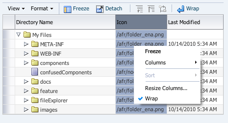
Column Context Menu
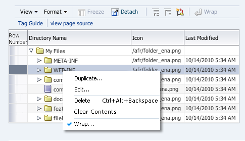
Row Context Menu
Usage:
- Context menus should be implemented if a table has a menu bar or toolbar, or supports direct manipulation of rows and columns.
- Context menu items should be divided into groups. Groups should be logical, according to function, with a menu item separator between groups.
- There is no limit to the number of context menu items allowed. However, it is recommended to list no more than four context menu groups, and no more than 10 to 12 context menu items, to avoid creating a long list where it is more difficult to scan and select items.
Toolbars


Purpose:
Provide direct access to the most frequently used table commands.
Description:
- For a detailed description of Toolbars and their usage, see Component Toolbars in the Toolbars guideline.
Table with Menu Bar and Toolbar
Usage:
- Toolbars should only be used for tables that allow actions on objects or manipulation of table display.
- If only a small subset of table objects is compatible with a certain action, that action should not be included in the toolbar.
- In general, toolbar actions are enabled or disabled based upon the availability of table data. For instance, if the table is empty, then data-dependent actions (such as Delete and Update) should be disabled, and should be enabled when rows appear. In addition there are two other types of cases within which a toolbar's actions can be enabled or disabled:
- In a multiple-selection table, when an action can be performed on any row, but can only be applied one row at a time, and cannot be applied upon multiple rows at once. In this case, the action can be enabled or disabled, based on the selection (meaning, number of selected rows, etc.)
- When the action can be performed on some rows but not others.** For instance, when certain rows cannot be deleted or edited because the user lacks permissions. In such cases, the action should be enabled regardless of the selection. If the user's selection includes rows to which a given action may not be applied, and the user invokes that action, then product teams should provide a warning message to inform the user of the reason(s) the action cannot be performed on those rows.
- If a toolbar action can be performed outside of the table (for example, "Create"), then it may be enabled even if no table data is available.
- The default table toolbar commands are derived from the View and Format menus:
- QBE (Query by Example)
- Freeze
- Detach
- Wrap
- When the default buttons (provided by ADF) are used in a toolbar, they always appear before any custom buttons added by product teams.
- Product teams can disable or hide any toolbar commands independently of the menu system, so they can configure a toolbar when it is displayed alone, or hide a less frequently used toolbar item when the toolbar is displayed in conjunction with a menu bar.
- When product teams provide a toolbar, and also provide support for object-specific actions, they should include toolbar buttons for the most common of those actions, such as:
- Create or Add
- Duplicate
- Edit
- Delete or Remove
- Clear Contents
- See the Common Table Actions guideline for more information on commands that act on objects.
- See the Table Display Manipulation guideline for more information on commands that affect table display.
Actions Column


Purpose:
Provide direct access to object-specific commands using a column of functional icons.
Description:
- An actions column may contain one or more functional icons per cell.
- Actions columns may be implemented together with row or column selection but this is not recommended as it mixes models for performing actions on objects.
- Action columns may be implemented together with menus and toolbars containing selection-independent commands.
- By default, actions columns are the last columns in a table, to distinguish them from attribute columns. Product teams can override this placement if necessary.
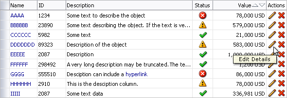
Table with Actions Column
Usage:
- Actions columns are not provided as part of the ADF table component, and must instead be implemented by development teams. See the ADF documentation for more details.
- Consider using an actions column when all of the following are true. Otherwise, place the actions in a menu and toolbar.
- The action must be enabled and disabled for individual rows, and access to this action is very important for the specific object.
- An action can only be performed on a small number of objects in the table, and users perform that action one row at a time.
- The action is not valid for more than one object at a time
- There are no more than four actions placed in actions columns.
- There is enough space for the additional column or columns without requiring horizontal scrolling.
- A column may contain more than one functional icon, but it is recommended to place no more than three functional icons in a cell.
- When a column contains a single type of functional icon, the column header should be the action name or a non-clickable instance of the functional icon. When a column contains more than one type of functional icon, the column header should be "Actions".
QBE (Query by Example) Bar


Purpose:
Locates records matching specified criteria.
Description:
- The QBE bar appears directly above the table column headers.
- When the QBE bar is used in conjunction with a Search panel:
- Data entered into the QBE text fields is appended using the AND operator to data entered into any search panel fields.
- The query is run when the user clicks the Search button in the Search panel, or presses the Enter key while focus is in one of the search fields.
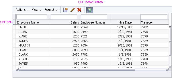
Table with QBE Bar
Usage:
- The QBE bar is optional and only recommended for advanced users working with complex data sets.
- The QBE bar is hidden by default until the user clicks show QBE on the menu bar or toolbar. Product teams may choose to show the QBE bar by default where frequency of use is expected to be high.
- If a table is used in conjunction with a search panel, it is not recommended to have a QBE filter for a criterion that is already shown in the search panel.
QBE Fields


Purpose:
Specify search parameters for one or more table columns.
Description:
- Each column that supports query by example may have a QBE text field or date field aligned directly above the column header. See the Text Field section in the Input/Output Text guideline and the Input/Choose Date guideline for details.
- If a column does not support QBE, the space in the QBE bar above that column is left blank, without a field.
- At least one column must support QBE to display the QBE bar.
- QBE text fields support the following operators:
- Greater than: >
- Less than:<
- Great than or equal to: >=
- Less than or equal to: <=
- And: and
- Or: or
- QBE fields support wildcards. See the Wildcards section of the Search and Query guideline for details.
- QBE searches may be case-sensitive or case-insensitive. However, it is recommended that teams make them case-insensitive in order to yield the most search results for a given query.
- QBE fields are 100% of the width of their associated column. If the user resizes a column with an associated QBE field, the QBE field adjusts to 100% of the column's new width.
- If a user hides, freezes, or reorders a column with an associated QBE field, the QBE field hides, freezes or reorders with the column.
Status Bar


Purpose:
Provides status for the table state.
Description:
- The status bar must have at least one type of status text to be displayed.
- The status bar may display up to three types of standard status text and three types of custom status text. Standard status text includes: rows selected, columns hidden, and columns frozen.
- If the user is unable to select rows, freeze columns, or hide columns, and does not have any custom status text, the status bar is hidden.
- If the user is able to select rows, freeze columns, and/or hide columns, then the status bar is required.
- The status bar does not support context menus.
- The width of the status bar container is determined by the width of the table.
- The status bar is not part of the scrollable region of the table.
- When the browser is resized, the status bar may no longer have enough horizontal space to show all of its status text. In this case, the excess status text is displayed in an overflow list. See Overflow Lists in the Toolbars guideline for details.
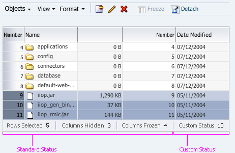
Table with Status Bar
Standard Status Text


Purpose:
Provides status for number of rows selected, number of columns hidden, and number of columns frozen.
Description:
- The three forms of standard status text, each have the syntax: "Prompt: Value":
- Rows Selected: N
- Columns Hidden: N
- Columns Frozen: N
- If the user is unable to perform one of these actions, then its status text is omitted.
- If the action has not yet been performed, then its status text is omitted. For example, when a table is unfrozen, instead of displaying "Columns Frozen: 0", the status text is omitted until the user freezes a column.
Custom Status Text


Purpose:
Provides product-specific status for the entire table.
Usage:
- Custom status text appears after standard status text.
- If standard status text is not present, custom status text is the first status text in the status bar.
- Product teams may display up to three instances of custom status text.
- Custom status text should follow the same rules as standard status text, including using the syntax: "Prompt: Value".
Scroll Bars

Purpose:
Allow users to navigate to records or attributes of a table that are not currently in view within a component. Scrolling can occur vertically or horizontally.
Description:
- Scroll bars take their general characteristics from the user's browser and operating system.
- FusionFX object list components (Table, Tree, and TreeTable) all display built-in scroll bars when there is not enough space to display the full contents of the component, even though they take general characteristics from those generated by the browser.
- Scroll bars are present only when needed, and appear and disappear based on table content and browser size. For information on setting table size, see Table Size in the Table Information Design guideline.
- Scroll bars may scroll automatically in response to direct manipulation actions. For more information on automatic scrolling, see the Table Display Manipulation guideline.
- A vertical scroll bar is displayed when the height of a component is not great enough to show all the objects in the list.
- A horizontal scroll bar is displayed when the width of the component is not great enough to show:
- All object attributes in table or tree table.
- Full object names for all expanded nodes in a tree.
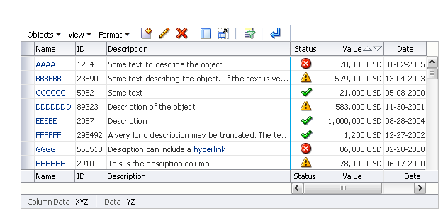
Table with Vertical and Horizontal Scroll Bars
Examples:
- A table set to display 10 records at a time currently shows records 81-90. The vertical scroll bar allows the user to bring records 91-100 into the viewable area of the table.
- A table with a Show Details column includes content in the hide/show region that exceeds the width of the table. A horizontal scroll bar allows the user to access all of the hidden content.
- A tree displayed in an auxiliary content region is expanded to three levels, all of which are viewable. If the user expands nodes further to show more levels, a vertical scroll bar may be needed to provide access to all the expanded nodes, and a horizontal scroll bar may be needed to show all expanded object names.
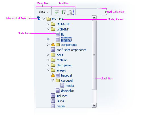
Tree with Vertical Scroll Bar
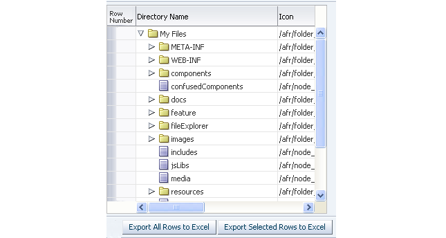
Tree Table with Horizontal and Vertical Scroll Bars
Usage:
- Vertical scrolling within a table is not problematic, and there is no problem with having multiple vertical scrolling regions on a page. However, it is recommended to avoid placing a scrolling component directly within another scrolling component, because users may click the wrong scroll bar. For example, if a scrolling table were placed in a scrolling accordion pane, users would easily become confused by the double scroll bars.
- When working with smaller sets of data (less than 25 records), it is recommended to set the table height to auto-size so all rows in the data set can be displayed without vertical scrolling.
- Horizontal scrolling should be avoided except in specific cases. See Horizontal Scrolling below for details.
Scroll Bar Elements


The following image shows elements in a scroll bar.

Scroll Bar Elements
Usage:
Scroll bar elements are not configurable. Nevertheless, product teams can exercise some control over scroll bars as follows:
- Increasing the width and height of the table, tree, or tree table to reduce scrolling, where applicable.
- The Table Height and Table Width sections of the Table Information Design guideline apply to both tables and tree tables.
- See Tree Region in the Tree guideline.
- When the number of records to be retrieved is not known in advance, product teams should set the block size, described later in this guideline.
Horizontal Scrolling


Horizontal scrolling should be avoided wherever possible, because users may not realize that important information or actions are hidden from view.
- To avoid horizontal scrolling in tables and tree tables:
- Product teams should carefully manage the number of columns, especially those with wide content. See Table Width in the Table Information Design guideline for details.
- When objects have too many attributes to be displayed within a table or tree table, consider using one of the following design options:
- Provide a drill down link or a Show Details column.
- Use column groupings for table or tree table data.
- Text inside the table can be greatly affected during translation. The table may expand up to 100% during this process.
- When trees contain deeply nested hierarchies, horizontal scrolling may be unavoidable when lower levels are expanded. In this case, either leave the tree collapsed by default, or only expose the number of levels that can be displayed without horizontal scrolling. With this approach, horizontal scrolling only occurs when users expand a node, and it is more likely that users will see the change in the tree.
- A limited amount of horizontal scrolling may be appropriate to optimize data entry and reduce task completion times. However, limit horizontal scrolling to less than three screen widths of columns. Consider allowing horizontal scrolling when production users need to:
- Quickly review or compare information across multiple objects in a table.
- See the context of other records while viewing a specific object.
- Quickly review and act upon multiple objects in succession.
Block Size


Purpose:
Minimize performance problems when retrieving data in a table, tree, or tree table.
Usage:
- When the row count is known, the position of the thumb on the scroll bar depends on the number of total rows and those currently displayed.
- Block size is relevant to scrolling only when row count is unknown.
- When the row count is not known, block size is used to determine the position of the thumb on the scroll bars.
- The block size determines the increments in which scrolling space increases when the row count is unknown. The default block size is 25 rows for the initial load of the table, and then loads 50 rows as the user scrolls through the data.
- If there are more than 25 rows, these rows are not retrieved until the thumb reaches the very bottom of the bar (either by dragging the thumb or pressing and holding the down arrow). This action triggers the retrieval of the next 50 rows which bumps the thumb up the bar and causes the tooltip message, "Fetching Data…" to appear.
- When block size is set to nn, and there are more than nn rows, additional rows are not retrieved until the thumb reaches the very bottom of the bar, either by dragging the thumb or pressing the down arrow. This action triggers the retrieval of the next nn rows which bumps the thumb up the bar and displays the tooltip message, "Fetching Data…"
- Product teams may change the block size, but it is not recommended to set a larger block size than 50 records, because performance may suffer.