Button
amx:commandButton
The Button component generates an action event (i.e. perform an action or navigate to another page) when pressed. It can contain label, an icon, or both. The button commonly consists of the following elements:
- Container: Button container depends on device platforms and use cases. In some case the border of the container is not visible.
- Text: Text is center aligned in the button. Use of the label is optional.
- Icon: An optional icon may be placed in the button.
This component is commonly used on tablets and phones.
Appearance
Appearance characteristics for this component.
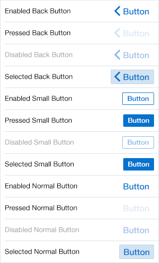
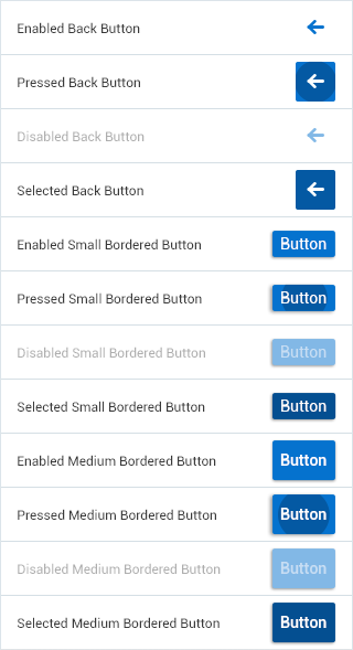
- State: Supports enabled, disabled, pressed, and selected.
- Elements: Container, text, and icon.
- Selection: Supports selected and unselected.
- Container: Most sizes of buttons have containers, but iOS Normal buttons are border less.
- Icon: Icons can be placed before or after the text.
- Back: There is also a support for Back button style.
- Sizes: Component has Small, Normal, Large, and Action Sheet sizes.
- Color Style: These include Default, Highlight, Alert, Confirm, Black, Bright, White, and Outline.
- Placement: Typically used in headers and footer, but maybe used in any Layout component.
- Rendered: This component can be shown or hidden.
Behavior
Common behaviors for this component.
- Press: On press, the button shows the selected appearance. This appearance is also shown when the button is pressed and then the user drags their finger away from it.
- Release: Triggers the action.
Usage
Usage guidelines for this component.
- Use generic labels for buttons, such as Submit, Create, Edit, etc...
- Use Back style buttons for "Back to Page" buttons. The Back style buttons should be placed in any of the Page facets (the primary facet in the header will be defined as Back Button).
- Use Small buttons on the page. Do not use them in Headers or Footer.
- Use Normal buttons in Headers and Footer. They maybe used in other locations too.
- On iOS, Normal buttons maybe just display an icon (no text) to achieve states on an icon.
- Use Large buttons cautiously on the page, when there is a single action that needs to be performed.
- Use Action Sheet Buttons to make contextual selections. Use Popup to create Action Sheets.
- If users have access to a button, but that button is currently unavailable, disable it. If users do not have access to that button, do not disable it, but hide instead.
- On iOS, buttons are used to invoke actions (e.g. Save, Cancel, Send) and navigate between pages (e.g. Back).
- On Android, buttons are typically only used to invoke actions. Navigation on Android is often performed by using the device "back" key or the device "options menu".
- For the current release (MAF 2.0), all Header and Footer icons and buttons should be themed to the Alta Blue color (#0572CE).
Sample
AMX sample code for this component.
The following is a sample code for a Default Style Button with Text Label:
 <amx:facet name="primary">

    <amx:commandButton id="cb1"
    text="Cancel"
    action="cancel"
    actionListener="#{myBean.rollback}"/>

    </amx:facet>
The following is a sample code for a Default Style Button with Image Icon:
 <amx:facet name="primary">

    <amx:commandButton id="cb1"
    icon="plus.png"
    action="add"
    actionListener="#{myBean.AddItem}"/>

    </amx:facet>
The following is a sample code for a Default Style Button with Image Icon:
 <amx:facet name="footer">

    <amx:commandButton id="cb2"
    icon="folder.png"
    text="Move (#{myBean.mailcount})"
    action="move"/>

    </amx:facet>
The following is a sample code for a Back Style Button with Text Label:
 <amx:facet name="primary">

    <amx:commandButton id="cb1"
    text="Back"
    action="__back"/>

    </amx:facet>
The following is a sample code for a Highlight Style Button with Text Label:
 <amx:facet name="secondary">

    <amx:commandButton id="cb2"
    text="Save"
    action="save"
    styleClass="adfmf-commandButton-highlight"/>

    </amx:facet>
The following is a sample code for an Alert Style Button with Text Label:
 <amx:commandButton id="cb1"
    text="Delete"
    actionListener="#{myBean.delete}"
    styleClass="adfmf-commandButton-alert" />
Related
- Used On: Phone, Tablet
- Also Called: Button, Push Button
- Related Components: Link
- Resources: None

Fig 1. iOS Buttons

Fig 2. Android Buttons