List View
amx:listView, amx:listItem
The List View component is a common method of presenting multiple records of enterprise data. Each list item or row should include only key data that will help the user decide whether to drill into a list item or not. Each list item or row can display one or more Output Texts or Labels. Drilling into the list item will provide additional details on the selected object.
The List View component has many variations, such as:
- Full List View: Spans the entire area without displaying the page background on the left or right.
- Inset List View: Similar to a Form where it has square corners and displays the page background on the left and right.
- Springboard List View: Displays a list of items in the Springboard.
- Editable List View: Allows for reordering list items.
The following is a list of common elements that may appear in a list view:
- Icon or Image
- Labels or Text
- Links
- Count bubbles
- Carets
- Indicator
- Indexer
- Contextual Actions
- Dividers
- Drag Handle
This component is commonly used on tablets and phones.
Appearance
Appearance characteristics for this component.
- Container: White, transparent in Springboard.
- List Item States: Enabled, pressed, and selected.
- List Item Background (Pressed/Selected): Medium Grey or Aqua Blue.
- List Header: Black, bold. White, bold in Springboard. Initial letter capitalized. Separates list items by an attribute (firstLetter or all, which is default). Headers can be collapsible (default is false).
- Label or Text: Black, white in Springboard.
- Second Line Text: Dark Grey, White in Springboard. Smaller than other labels and output text.
- Link: Blue, white in Springboard.
- Icon or Image: Represents the list item or status of that item. Placed on left of the list item.
- Caret: Indicates drilling to another page. Grey in color. White when the list item is pressed/selected. Not shown on Android.
- Count bubble: Blue (default) and red.
- Drag Handle: Appears on right side of each list item and allows for reordering list items.
- Divides: Horizontal lines that separate list items.
- Indicator: Appears when a list fetches for more items.
- Indexer: Appears on right side of the list. Supports Auto or Off. In Auto, depending on the screen size and availability of list items, it may show full alphabet along with dots or disabled letters. When loading items progressively, letters in the indexer may appear disabled. These letters will become enabled as soon as items in the list view are loaded.
- Contextual Action: Appears on swipe to left. Shows actions that are available on the list item.
Full List View
- Layout: Spans the entire area.
- Icons: If available, displayed on left side of list items.
- Caret: If used, displayed on right side of list items.
- Link: Blue color.
- Indicator: Appears when loading additional list items.
Inset List View
- Layout: Does not span the entire area.
- Corners: Square corners.
- Caret: If used, displayed on right side of list items.
List View with Headers
- Headers: If available, create groups of list items. Can contain an arrow that collapses or expands the group.
- Count Bubble: Displayed on right side in dividers. Supports blue (default) and red.
- Indexer: Displayed on right side of the list view.
Editable List View
- Drag Handle: Displayed on right side of list items.
- Contextual Actions: Appear on swipe. The actions slide over the row that triggered it.
- Background: Transparent when dragged.
Behavior
Common behaviors for this component.
- Performing Actions: Tap a list item to perform an action.
- Selection: Tap a list item to select it.
- Drilling: Tap a list item to drill to another page.
- Scrolling: Swipe/Drag the list up/down.
- Fast Scrolling: Tap a letter in the indexer to scroll directly to the list header that starts with the letter.
- Collapsing/Expanding List Headers: Tap the header to collapse or expand it.
- Reordering: Press the drag handle to undock the list item and move it where needed. Release the finger to complete the action. The list is automatically rearranged and scrolls automatically up/down when needed.
- Pull to Refresh: When the user drags down on the list to try to refresh the list. Currently not supported in MAF.
- Fetching More Items: When scrolling down the list or tapping the "Load More..." link, the list loads additional list items. In such case, an indicator appears to indicate that.
Usage
Usage guidelines for this component.
- Use consistent height in all list items in the List View.
- Use consistent size of icons or images in all list items in the List View.
- Use animated transitions when drilling down on phones. Use animated transitions sparingly on tablets.
- Use dividers to group list items based on some criteria.
- Use count bubbles to indicate number of items in a group.
Sample
AMX sample code for this component.
The following is the sample code for Full List View.
 <amx:listView var="row" id="lv1">

    <amx:listItem id="li1">

    <amx:outputText value="List Item 1" id="ot4"/>

    </amx:listItem>

    <amx:listItem id="li2">

    <amx:outputText value="List Item 2" id="ot5"/>

    </amx:listItem>

    </amx:listView>
The following is the sample code for Full List View with Icons.
 <amx:listView var="row" id="lv2">

    <amx:listItem showLinkIcon="false" id="li3">

    <amx:tableLayout width="100%" id="tl1">

    <amx:rowLayout id="rl1">

    <amx:cellFormat width="40px" halign="center" id="cf1">

    <amx:image source="images/photo1.png" id="i1"/>

    </amx:cellFormat>

    <amx:cellFormat width="100%" height="43px" id="cf2">

    <amx:outputText value="List Item 1" id="ot6"/>

    </amx:cellFormat>

    </amx:rowLayout>

    <amx:rowLayout id="rl2">

    <amx:cellFormat width="40px" halign="center" id="cf3">

    <amx:image source="images/photo1.png" id="i2"/>

    </amx:cellFormat>

    <amx:cellFormat width="100%" height="43px" id="cf4">

    <amx:outputText value="List Item 2" id="ot9"/>

    </amx:cellFormat>

    </amx:rowLayout>

    </amx:tableLayout>

    </amx:listItem>

    </amx:listView>
The following is the sample code for Inset List View.
 <amx:listView styleClass="adfmf-listView-insetList" var="row" id="lv3">

    <amx:listItem id="li4">

    <amx:outputText value="List Item 1" id="ot7"/>

    </amx:listItem>

    <amx:listItem id="li5">

    <amx:outputText value="List Item 2" id="ot8"/>

    </amx:listItem>

    </amx:listView>
The following is the sample code for Inset List View with Icons.
<amx:listView styleClass="adfmf-listView-insetList" var="row" id="lv4">
<amx:listItem showLinkIcon="false" id="li6">
<amx:tableLayout width="100%" id="tl2">
<amx:rowLayout id="rl3">
<amx:cellFormat width="40px" halign="center" id="cf6">
<amx:image source="<add path to your image>" id="i3"/>
</amx:cellFormat>
<amx:cellFormat width="100%" height="43px" id="cf5">
<amx:outputText value="List Item 1" id="ot12"/>
</amx:cellFormat>
</amx:rowLayout>
<amx:rowLayout id="rl13">
<amx:cellFormat width="40px" halign="center" id="cf16">
<amx:image source="<add path to your image>" id="i13"/>
</amx:cellFormat>
<amx:cellFormat width="100%" height="43px" id="cf15">
<amx:outputText value="List Item 2" id="ot112"/>
</amx:cellFormat>
</amx:rowLayout>
</amx:tableLayout>
</amx:listItem>
</amx:listView>
Related
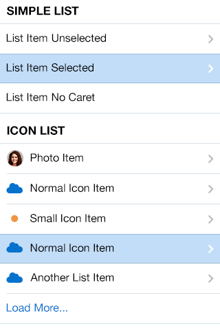
Fig 1. iOS List View Full

Fig 2. Android List View Full
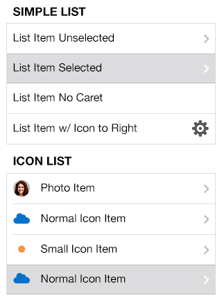
Fig 3. iOS List View Inset
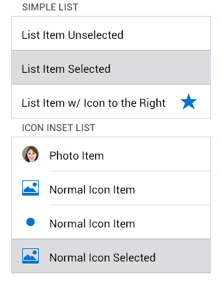
Fig 4. Android List View Inset
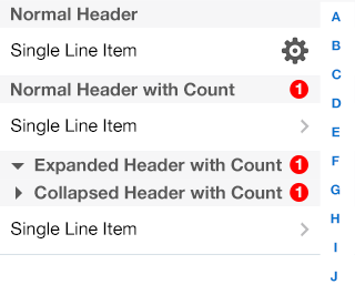
Fig 5. iOS List View Headers
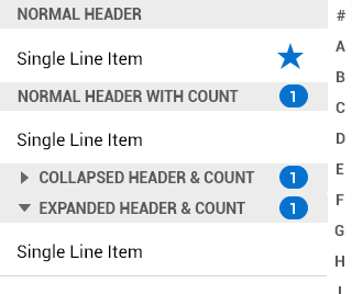
Fig 6. Android List View Headers
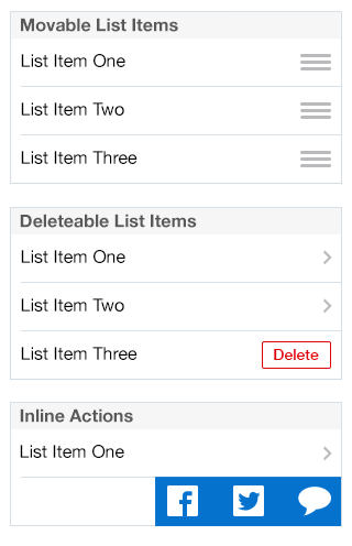
Fig 7. iOS List View Editable

Fig 8. Android List View Editable