Page Level Message
The Page Level Message pattern is used in response to a system action, (such as a database failure), or for other reasons as specified by the application developer. Page Level message have multiple options for placement and position. Page Level Message should be clear and concise.
The message pattern describes four types of messages:
- Error: Informs the user about issues related to data input, validation or application functionality. These have a red theme.
- Warning: Informs the user about a pending action or situation that may need attention. These have a yellow theme.
- Confirmation: Informs the user that an action has been completed successfully. These have a green theme.
- Information: Informs the user about changes to data or system in the application, but which are not errors, warnings or confirmations. These have a blue theme.
Appearance
Appearance characteristics for this component.
Configuration Options
- Placement: Inline or Overlay
- Inline - Messages can be placed inside the page content. Existing content is moved up/down to accommodate the message. Banded edge-to-edge
- Overlay - Messages are overlaid on top of existing content. Existing content does not move. Banded edge-to-edge.
- Background Color - The background of the message area can be configured in multiple color options to match the existing OS or to convey message severity (ie. red, yellow, green, etc)
- Position - Top or Bottom of Screen
- Top - Messages can be shown at the top of the screen below the branding area.
- Bottom - Messages can be shown at the bottom of the screen above the navbar (similar to snackbars on Android).
- Animation - Messages will allow for the use of standard OS animations for showing/hiding messages.
Message Truncation
If a message's entire contents cannot fit on a single line, the message will truncate. If the truncation prevents the message from being fully understood, then a "More Details" link appears. Clicking the "More Details" link causes the message area to expand to reveal the message in its entirety.
Multiple Messages
When there are multiple messages of the same severity level, a “count” icon will display, showing the number of messages
Behavior
Common behaviors for this component.
- Duration: Page Level Messages should persist unless informational or a confirmation which can be auto dismissed after XX miliseconds. Contrary to Material Design Guidelines, Messages which are errors or alerts will not auto dismiss.
- Dismissing: Page level messages can be dismissed by clicking the close icon or 'X'. Contrary to Material Design Guidelines, messages will contain a close icon.
- Severity Icon: Page Level messages can contain a severity icon to reflect the severity of the message. Contrary to Material Design Guidelines, messages will contain a severity icon.
Usage
Usage guidelines for this component.
- When the user clicks on the message count link, the message area expands to show all of the messages.
- Fatal/critical Error messages may be set to persist until the user resubmits a correct entry and manually closes the message, or can be closed by the user.
- Warning messages behave the same as fatal and critical messages and require the user to close the message.
- Informational and Confirmation messages are transient and dissolve after a five-second display in view.
- If user is at the bottom of a form and performs an action that creates a message, the message appears at top of the screen, but screen does not scroll.
- Each type of message is associated with a certain color; the background of the message is colored as an indicator of its severity level.
Related
- Used On: Phone, Tablet
- Also Called: Banners, Messaging
- Related Components: Popup, Text
- Related Patterns: Badge, Field Level Message
- Resources: None

Fig 1. Confirmation iOS
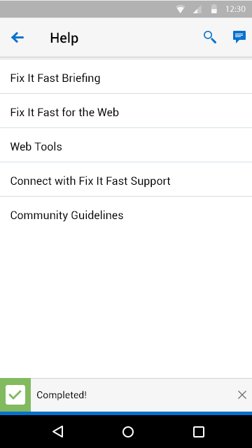
Fig 2. Confirmation Android
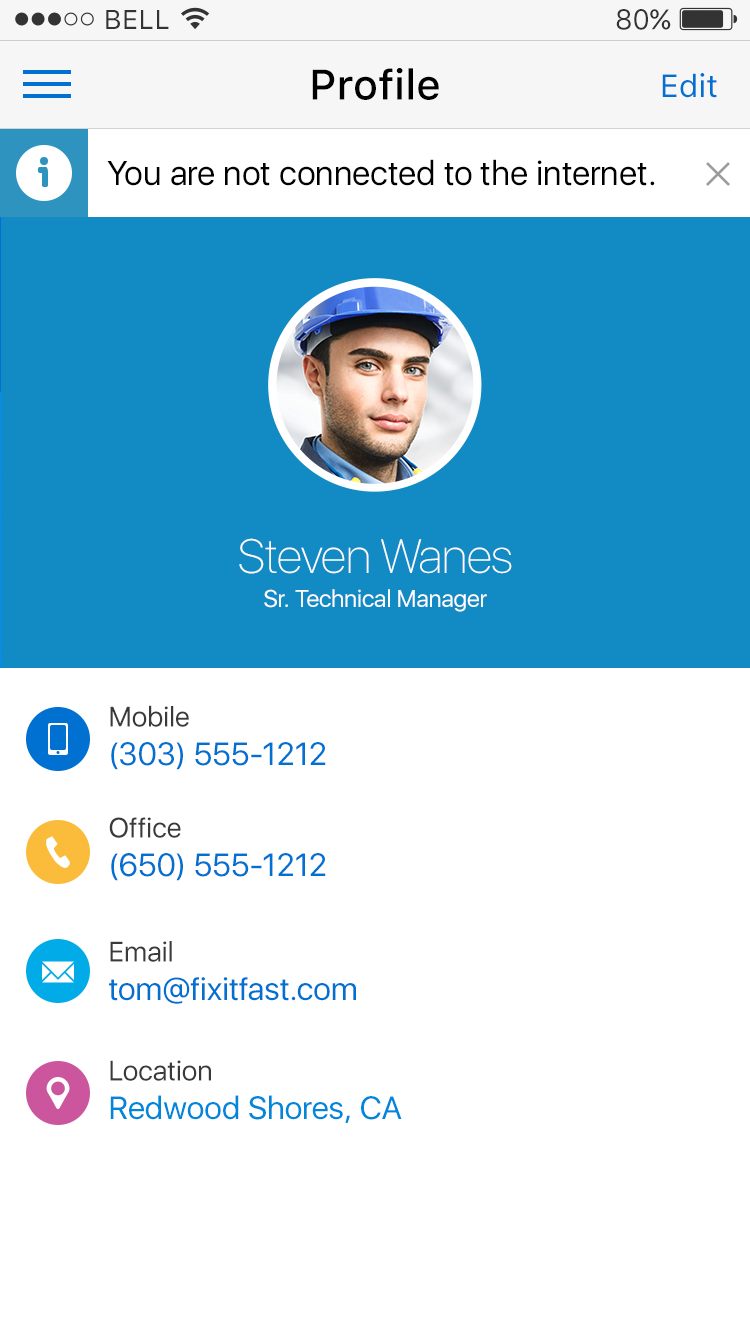
Fig 3. Information iOS
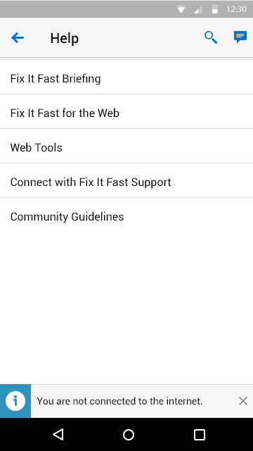
Fig 4. Information Android
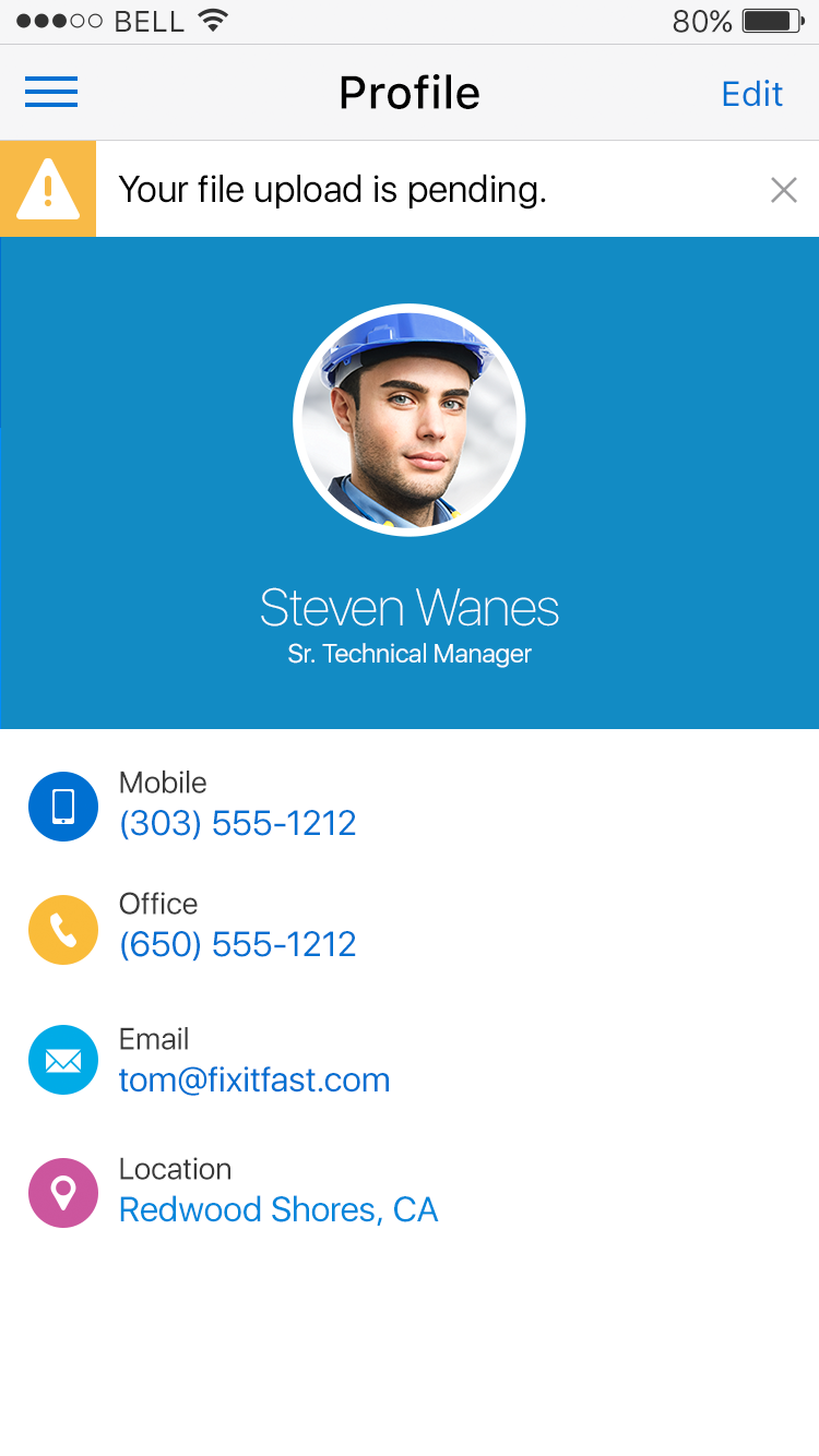
Fig 5. Warning iOS
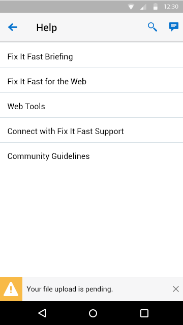
Fig 6. Warning Android
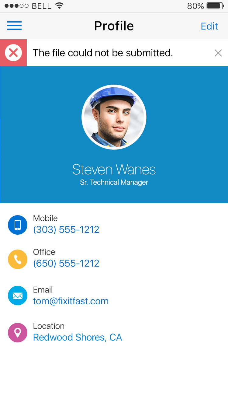
Fig 7. Error iOS
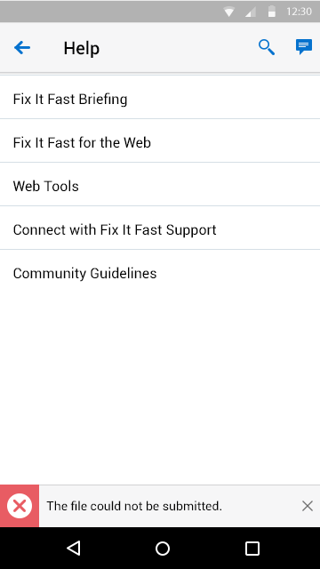
Fig 8. Error Android