Contents
- Overview
- Elements and Appearance
- Multiple Selection of Rows
- Scroll Policy
- Column, List, and Grid Layouts
- Additional Resources
Overview
Data grids are perhaps the most universally familiar UI component for transactional applications. The data grid can take a number of layouts: table, list, and grid. Additionally, a data grid can accommodate a number of different configurations — a table with a status bar, a list view with a toolbar, or a grid with high water mark scrolling, for example.
Elements and Appearance
Header
All data grids must appear below an identifying header.
- A header sets the overall UI context for the data grid and informs the user about the information contained within the data grid.
- It is poor UI to rely on data grid content to provide the context. For example, a data grid of contacts without a header could equally refer to a list of customers or a list of employees – leaving users to make potentially incorrect assumptions about the context.
The following layouts can set the data grid header:
- Page header or section header
- Navigation tab
When the spatial proximity of a navigation tab is close to a data grid, either may substitute for a dedicated header.
The illustrations below depict how data grids should appear with headers.

Width
A data grid may be displayed to the full width of the page in which it appears. The goal is to avoid having to use horizontal scrollbars, which can occur easily with tables. If scrollbars appear to be unavoidable with a table, consider using an alternative data grid layout, such as the List View.
If the width of the table columns do not match the full width of the table viewport, then select a column to widen, which will consume the balance of the table viewport width. Typically the most salient column, such as the object name, is the one widened, to ensure that the column's values remain fully visible. Users prefer to not have to routinely resize a table column to see the most significant data column.
ToolBar: Actions, Search, and Sort
The data grid toolbar is optional.
- A toolbar hosts data grid-level actions, such as setting the sort order for the entire data grid or letting the user change the data grid format from a table to a list view. Data grid-level actions may affect one, many, or all data grid objects, based on selection.
- The toolbar may also have a keyword search input text field for searching across all records in the data grid. The search term may filter the data grid to those records that match. Optionally, access to advanced search features is provided by a link.
The following image provides a toolbar with a series of data grid-level actions.

- The sort control is perhaps the most common element of a data grid toolbar. Special attention is given to this control above others in the data grid toolbar, in order to provide the user with consistent and reliable sorting.
- There are two essential elements of a data grid sort control: sort attributes and sort order. Sort attributes (for example, Price, Sections) are offered as a choice list in combination with sort order, as illustrated below.
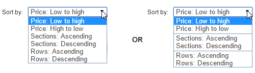
This design presentation is an industry standard for displaying sort attributes and order. It is based on an expectation that users desire to sort on few attributes. Users can quickly select for both the attribute and sort order in a single mouse or keyboard gesture. Sort order values are conveniently matched to sort attributes in a conversational tone that is more approachable (for example, "Low to High" for Price, instead of "Descending" or "Ascending" for Price).
Multiple Selection of Rows
If multiple row selection is enabled for a data grid in the Oracle Alta UI, we recommend setting a single column for the row headers as a way to create a visual cue to the user that multiple row selection is enabled.
- Users select one or more rows by clicking in the row header, enabling an optional checkbox that appears in the row header, or by using a meta-key combination, such as <CTRL>+<click> on each row.
- To select all rows, including those that are not visible in the data grid viewport, the user may click in the column header for the row headers to enable a checkbox that appears there.
The first of the following images for multiple row selection shows the row headers, which indicates that multiple row selection is available. In the subsequent image, multiple row selection support is implicitly shown with color as the rows are selected using a <CTRL>+<click>meta-key combination.
Scroll Policy
The flowing page layout of the Oracle Alta UI presents the user with one vertical scrollbar, with few exceptions. When the total number of records that a data grid can display exceeds the data grid viewport height, then the user is presented with an option to "scroll" the data grid.
Scroll policy refers to use of the following optional methods of viewing rows that are beyond the height of the data grid viewport:
- Pagination
- High water mark (load more)
- Scrollbar
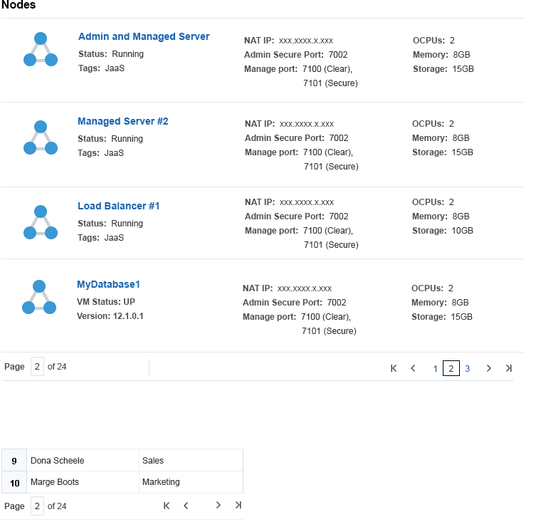
Pagination Controls
One option for "scrolling" is pagination (for example, Previous and Next controls).
- Any number of page links can exist between the Previous and Next controls.
- In addition to those controls, First and Last controls may also appear.
- The pagination controls appear at the foot of the data grid. They may appear in a few different configurations.
Height Selection Controls
The data grid height selection is a dropdown that allows users to select the number of rows they want to see in the data grid. This establishes the height of the data grid viewport. Any increment is available, but increments of either 10 or 25 are recommended (for example, page selection ranges from 10 - 100, or from 25 - 100), to a maximum data grid height of 100 rows.
- The height selection control is right-aligned at the foot of the data grid.
Give users the flexibility to set the data grid height when there are no other form elements beneath the data grid in the layout other than the page footer.
- When other form elements exist beneath a data grid, then it is not advisable to offer the option to set data grid height. This prevents the user from
inadvertently hiding form elements from the browser view by selecting a
particularly large data grid viewport height. (See Master-Detail for examples).
The following image shows an example of a data grid's right-aligned height selection control.

High Water Mark Scrolling
When more rows exist in a data grid than are visible on the page, scrolling can be accomplished using auto-load to load more rows automatically as the user scrolls, or using high water mark or "load more" scrolling. High water mark scrolling is a scroll policy that adds a set number of rows to the overall data grid height when explicitly requested by the user. This scroll policy is most appropriate when no other UI content exists beneath the data grid and the content of the data grid is the prevailing context for the page. As a rule, "load more" scrolling is a single control appearing at the foot of the data grid, as illustrated below.
Use the Browser Vertical Scrollbar
In the Oracle Alta UI, use the browser's vertical scrollbar when needed. For example, the browser vertical scrollbar is used in conjunction with a high water mark scroll policy. Using data grid scrollbars (horizontal, vertical) is discouraged.
Horizontal scrolling is highly discouraged for data grids because it isn't mobile-friendly or conducive to responsive design.
- The most common way to avoid needing horizontal scrollbars is to use a list view, especially when there are more than a few data elements pertinent to the user.
Column, List, and Grid Layouts
There are three common data grid formats:
- Columnated
- List view
- Grid or matrix
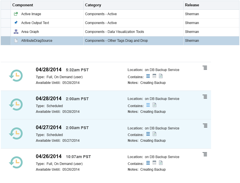
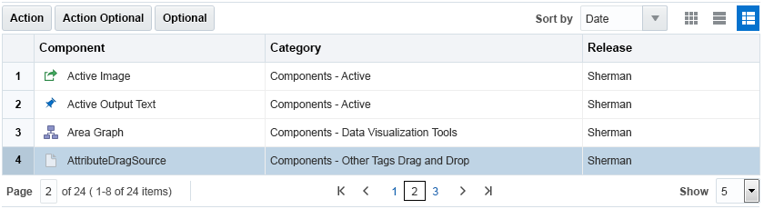
The columnated format is the most common. It is used to display data in a tabular format of rows and columns. The following image illustrates a typical, columnated table.
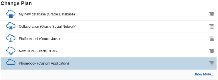
The list view is one of the most versatile data grid formats. It is essentially a table of iterated form layouts.
- Like a form, the list view can have any number of layouts (such as a single column layout, double column layout), and various form elements.
The following image shows a simple, three-column list view.
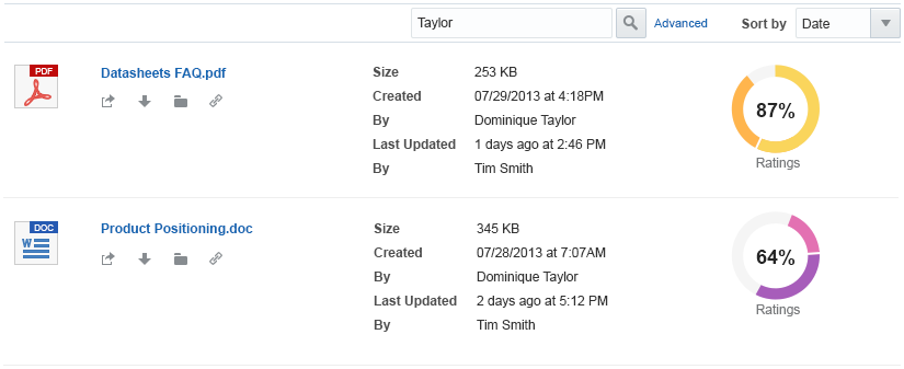
This format is a favorite to present search results. It can easily handle a number of attributes and UI controls (such as images, links, and text) within a limited, horizontal page width. Following is an example of a five-column list view.
The grid or matrix layout is a popular format used for its efficient layout.
- A grid layout can take on a number of rows and columns, but the norm is two to four grid columns per grid view.
- Grid columns do not have column headers.
The following is an example of a typical grid layout.

Additional Resources
Demos: