Select
amx:selectOneChoice
The Select component is the mobile equivalent to the traditional desktop pull-down menu, where the user may select an option from a list. It allows the user to select one from a set of Selects. The component consists of the following elements:
- Label: An optional label for the component.
- Container: A long container with a border.
- Text: This is the text of the selected item.
- Arrow: This is the downward pointing arrow at the end of the container.
- Picker: The picker is where the user selects a single item. When the picker closes the saved item is displayed on the trigger.
Appearance
Appearance characteristics for this component.
- Label: An optional label may be displayed.
- State: Supports enabled, pressed, disabled and read-only.
- Selection: Supports selected and unselected.
- Read-Only: The selected item is bold text.
- Rendered: This component can be shown or hidden.
- Picker: In iOS a native picker is displayed. In Android a custom picker is displayed.
Behavior
Common behaviors for this component.
- Open: Tap the component to open the list with selects. The list is a native component.
- Select: The user can select one, and only one, item from a set of mutually exclusive options.
- View: The page should scroll up to keep the component in view when the list with choices pops up. The page may scroll back once the user selects a choice.
- Close: Tap outside the component to dismiss it.
Usage
Usage guidelines for this component.
- It may be used within various other components: Header, Footer, Form, Table, etc... or as a standalone component.
- It can be organized with the contents of the Select in a special sort order, group separators, or even a hierarchy.
- It should be used only when a single value is accepted.
- In a Select: Product teams can add a blank value as an option. This is different than a "None" choice.
- If the Select list is a required field and the user leaves it blank, then an error message should be displayed when the user attempts to apply changes to the page, just as with any other required field.
- Do not use it for simple "Yes" and "No" choices, use the Switch or Checkbox instead.
Sample
AMX sample code for this component.
 <amx:selectOneChoice label="Enabled" id="soc1">
 <amx:selectItem label="Select one"/>
 </amx:selectOneChoice>

 <amx:selectOneChoice label="Disabled" id="soc2" disabled="true">
 <amx:selectItem label="Select one"/>
 </amx:selectOneChoice>

 <amx:selectOneChoice label="Read-Only" id="soc3" readOnly="true">
 <amx:selectItem label="Select one"/>
 </amx:selectOneChoice>
Related
- Used On: Phone, Tablet
- Also Called: Dropdown, List of Values, Pulldown
- Related Components: Select Many, Date & Time
- Resources: None

Fig 1. iOS Select
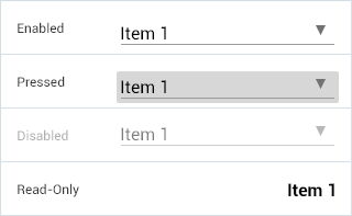
Fig 2. Android Select