Select Many
amx:selectManyChoice
The Select Many component is the mobile equivalent to the traditional desktop pull-down menu with check boxes, where the user may select many options from a list. It allows the user to select one or more items from a set of choices. The component has the following elements:
- Label: An optional label for the component.
- Container: A long container with a border.
- Text: This is the text of the selected item.
- Dots: This is the dots at the end of the container indicating multiple selection.
- Picker: The picker is where the user selects a one or more items. When the picker closes the saved items are displayed on the trigger.
Appearance
Appearance characteristics for this component.
- Label: An optional label may be displayed.
- State: Supports enabled, pressed, disabled and read-only.
- Selection: Supports selected and unselected.
- Read-Only: The selected item is bold text.
- Rendered: This component can be shown or hidden.
- Picker: In iOS a native picker is displayed. In Android a custom picker is displayed.
Behavior
Common behaviors for this component.
- Open: Tap the component to open the list with choices. The list is a native component.
- Select: Tap to select one or multiple choices.
- View: The page should scroll up to keep the component in view when the list with choices pops up. The page may scroll back once the user selects a choice.
- Close: Tap outside the component to dismiss it.
- Consistency: Select and Select Many lists function similarly, except that a Select Many:
- Can have check marks next to each list option to enable multiple selection.
- May contain the option "All" to select all or none of the options in the list.
Usage
Usage guidelines for this component.
- A Select Many component should be used only when a field can contain multiple values. For example, a database administrator may need to specify multiple problem conditions that trigger notification. The administrator would select those conditions from a Select-Many choice list.
- It may be used within various other components: Toolbars, Tables, Forms... A Select Many component may also be used as a stand-alone component.
- It can be organized with the contents of the Select Many in a special sort order, group separators, or even a hierarchy.
- If the select list is a required field and the user leaves it blank, then an error message should be displayed when the user attempts to apply changes to the page, just as with any other required field.
- Long labels in a picker make it difficult to display these values in the trigger. Consider abbreviations or X Number Selected.
Sample
AMX sample code for this component.
 <amx:selectManyChoice label="Enabled" id="smc1">
 <amx:selectItem label="Select one"/>
 </amx:selectManyChoice>

 <amx:selectManyChoice label="Disabled" id="smc2" disabled="true">
 <amx:selectItem label="Select one"/>
 </amx:selectManyeChoice>

 <amx:selectManyChoice label="Read-Only" id="smc3" readOnly="true">
 <amx:selectItem label="Select one"/>
 </amx:selectManyChoice>
Related
- Used On: Phone, Tablet
- Also Called: Dropdown, List of Values, Pulldown
- Related Components: Select, Date & Time
- Resources: None
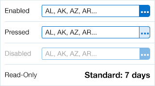
Fig 1. iOS Select Many
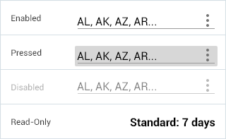
Fig 2. Android Select Many