Overlay
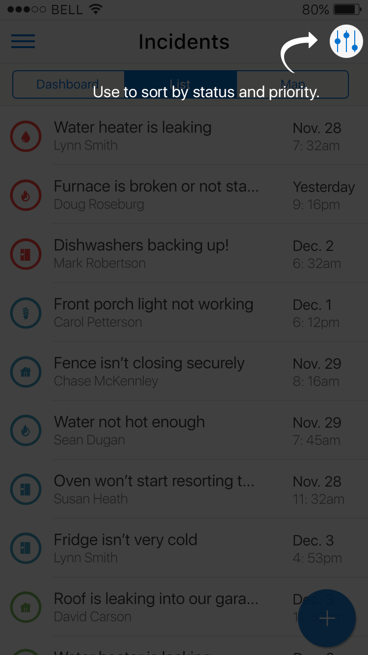
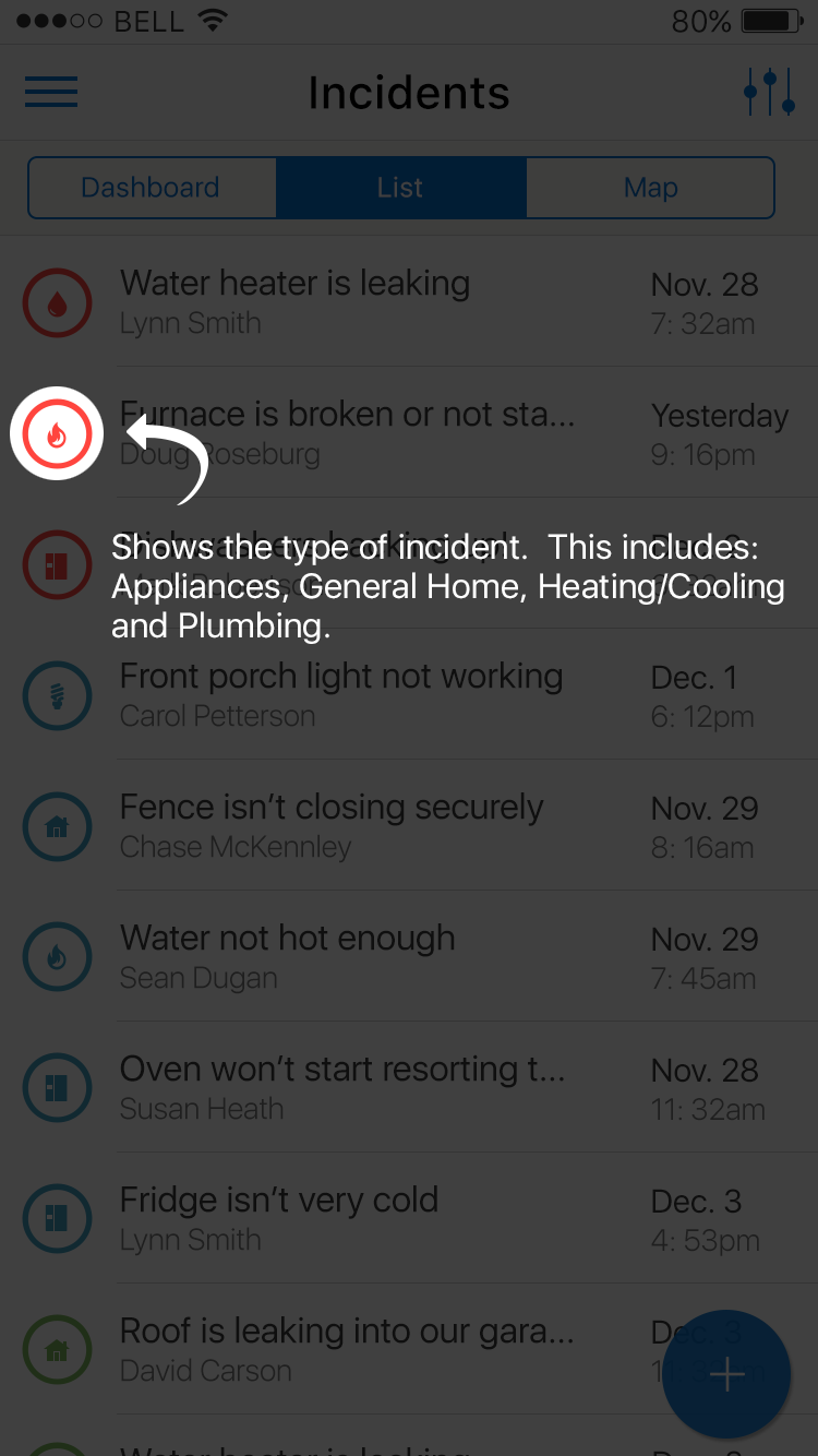
The Overlay pattern provides user assistance to learn about new or updated features of an application. Overlays are typically used in first-use, but can be used for day-to-day assistance. During first-use this pattern introduces the most relevant features of your product, while day-to-day use can call attention to new or upgraded features. An overlay is transparent, semi-transparent or a non-transparent layer. Overlays typically show notes, images, pointers and other information.
There are three common types of overlays:
- Static: A static overlay displays a mix of objects of interest on a page. A white spotlight can highlight elements and text can provide instructions.
- Animated: An animated overlay displays objects of interest on a page. The overlay animates through a set of call-out instructions.
- Tour: The user taps or swipes through the tour to view objects of interest, similar to a Walkthrough. See Walkthrough pattern.
Appearance
Appearance characteristics for this pattern.
- Arrow: Optionally an arrow may point to the object of interest. Often that arrow has a tail.
- Close: Provide a prominent close button or icon on the overlay. The close label could read Got It!, Close, Done, or OK. An explicit closing X in the upper-right corner of the screen may also be used.
- Dimming: The are various opacities that might be used to dim the page.
- Spotlight: An ellipse is highlights the object of being described with the message. These are usually fully transparent.
- Message: The message is displayed near or over the object of interest.
- Image: An image or icon maybe used on the overlay.
Behavior
Common behaviors for this pattern.
- First Use: Displays once for each user. After a user dismisses an overlay, the product should not display it again in the next session. A reset to state to first-time use may appear in the Settings page.
- Open Overlay: A variety of methods maybe use to enter the overlay (i.e. Button, Link, Image, Load, etc...).
- Close Overlay: Tapping a 'Close' or 'Done' button will close it. Sometimes icons can be used to close the overlay. Users must explicitly dismiss the overlay to resume work in the application.
- Coverage: The overlay usually covers the entire page, but sometimes only a portion of the page is covered.
- Animation: An animation maybe used to open or close the overlay. Commonly these are fades and cover/reveals.
- Swipe: A user may swipe the steps of the overlay tour.
Usage
Usage guidelines for this pattern.
- Overlays can display when a user starts using the application, to get them started. Also they can appear when a new functionality is introduced or when an application is completely redesigned.
- Showcase only the actual user data and interface controls that the user is seeing on the page when the overlay is presented.
- Teams should consider carefully before providing the reset option. It could confuse the user if the actual state or data on the page differs from the reinitialized overlay, or is misaligned with the overlay.
- Overlays are often associated with the 'Help' or Assistance area of an application. Getting back to a overlay is found in Help area (i.e. Settings page in iOS or Overflow menu/Help menu item in Android).
- Avoid using marketing type of voice when creating overlays, these are more for user assistance.
- Overlays should not document everything the users is supposed to do on a screen. They are more to provide assistance with learning the application.
- This is a difficult pattern to use when there are different overlays based on the type of user group.
- When writing the overlay, keep the messaging to a minimum.
- Avoid long, step by step tutorials. If you need a long tutorial, think about design, layout, and flow in your app. Is your app really intuitive when you need to display such a long tutorials?
- If you really need a long tutorial, it might be better to present users with a video rather than a big number of steps they need to go through.
Related
- Used On: Phone, Tablet
- Also Called: Coachmark, Chalkmark, Tutorial
- Related Components: Button, Image, Popup, Text
- Related Patterns: Modal View, Message, Walkthrough
- Resources: None

Fig 1. Overlay

Fig 2. Overlay 2