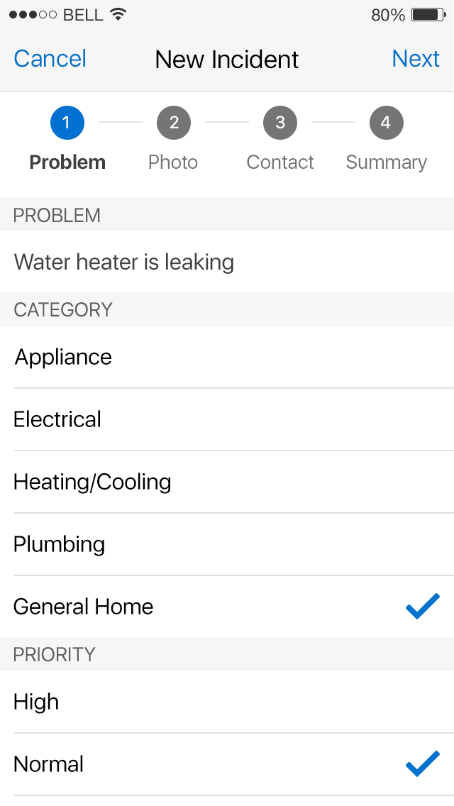
Wizard
Wizards divide simple and complex tasks into a series of steps, with the goal of reducing the probability of user error. They function to reduce the skill level required to complete a task. A distinctive feature of the wizard is the "train" at the top of the UI. It is a series of labeled stops, with a line connecting one stop to another.
The train has several purposes within a wizard:
- Provides an overview of the task
- Lists the number of steps to complete the task
- Provides the user with progress status
- Allows the user to navigate the wizard either sequentially or non-sequentially.
Wizards can support a number of use cases. A wizard may comprise the entirety of a single function application (such as to tax withholdings, or request personal leave); or it may form part of a larger application. This flexibility allows for multiple layouts and presentations.
Appearance
Appearance characteristics for this pattern.
- Layout: On phones, the wizard usually displays on the entire page. On tablets, the wizard displays on the entire page or in a popup.
- Orientation: Horizontal orientation, where the user swipes left and/or right, is the most common.
- Dots: Pagination dots are centered below the content of the wizard. The selected dot shows what step of the wizard the user is on.
- Train: Explicit labels on a train component provide context for the user and prepare them for the next step.
- Skip/Cancel: Optionally, a Skip or Cancel button/link is used to dismiss the wizard. 'Skip' is often used on phones, while 'Cancel' is used in a popup on tablets.
- Navigation: Instead of using a swipe gesture, 'Next' and 'Back' buttons or labels can be used to navigate the wizard.
Behavior
Common behaviors for this pattern.
- There are two general wizard types: as a dialog or as a page. Both types share virtually all the same UI attributes. For example, they are both modal.
- It may require the user to pan and zoom the UI when presented on a mobile device
- Vertically scrolling a wizard as a dialog may feel clumsy to the user
- Finding that a dialog has a scroll bar in a mobile browser is not always apparent.
- Acquiring a dialog scroll bar in a mobile browser is not always easy for the user
- In either wizard type, the user is free to complete the task or abandon the wizard before completion.
- The user abandons a dialog wizard by clicking the close icon (the X in the upper right-hand corner), which returns the user to the calling page.
- The user abandons a page wizard by either the Cancel button or an optional close icon (the X in the upper right-hand corner). In either case, the user returns to the calling page.
- If the wizard is the primary UI for a single feature application, then the user abandons the wizard through the User Menu, (for example, signs out).
Usage
Usage guidelines for this pattern.
- The wizard generally has 3-5 steps for the user to complete. More than 5 is cumbersome and opens the door for user abandonment.
- Choices/options for each wizard step should be digestible and manageable for the user.
- A means to skip or cancel the wizard should be offered throughout the wizard.
- A wizard usually progresses in a sequential order either backward or forward. Users don't usually jump ahead on the steps, unless there is a Skip button or link.
Related
- Used On: Phone, Tablet
- Also Called: Progress Bar, Stepped Wizard, Stepper, Train
- Related Components: Train
- Related Patterns: Activity & Progress, Modal View, Walkthrough
- Resources: JET FixItFast Demo

Fig 1. Wizard Screen