Contents
Overview
Contextual Help on Demand presents a snippet of Help text in response to a finger tap or mouse hover on a specific element of the page (a Help icon).
- It offers targeted help in a note window.
- Users dismiss the note window by moving the pointer or making a tap away from the note window.
- Note windows which appear when the user hovers over a dedicated Help icon are examples of Contextual Help on Demand.
- Contextual Help on Demand differs from First Item Help in that Contextual Help on Demand is an Everyday User Assistance pattern, whereas, First Item Help is not.
- Use this pattern when most users will not need more prominent Everyday User Assistance or for a product expected to have occasional users.
Elements and Appearance
Contextual Help on Demand is not visible until the user requests it. Consider these main attributes when using Contextual Help on Demand:
- The content style
- Character length
- The popup trigger
Content Style
Content presented in a Contextual Help on Demand note window is either simple or is visually rich. Both can feature a See more or Learn more link that either expands the note window to show more information, or opens a link directly into the Oracle Help Center.
Simple content is text-only and may include an inline image or icon. Following are simply-styled content examples.


Use an inline image in the note window only to help the user understand the help text, and not for aesthetic reasons.
- The presence or size of the image shouldn't dominate the Help text.
- Don't embed images that are too complex or too small to see clearly, such as an entire UI page screenshot.
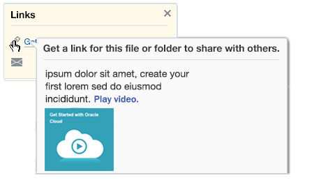
Video and animation are examples of visually-rich content in a Contextual Help on Demand note window.
- Note windows for visually-rich content can include a Learn more link.
- When video is used as rich content, it can appear with or without a video image link.
- Once triggered, videos and animations can display either inline or in a separate browser window, such as in the Oracle Help Center.
The following image shows examples of visually rich note windows that contain a video or animation.


Character Length in Note Windows
Content for Contextual Help on Demand should be concise. Visually-rich content should require less text, because the "help" is primarily offered in the video or animation.
| Content Style | Recommended Length including spaces |
|---|---|
| Simple | Up to 400 characters |
| Visually rich | Up to 200 characters |
Popup Triggers
- Hover is ideal for a simple note window, but doesn't work well for mobile devices. An alternative is a click or tap on an accompanying Help icon (
 ).
). - Try to limit the number of Help icons displayed on a page to three or fewer. There are rare events where more than three could appear, for example, in dialog wizards containing complex information.
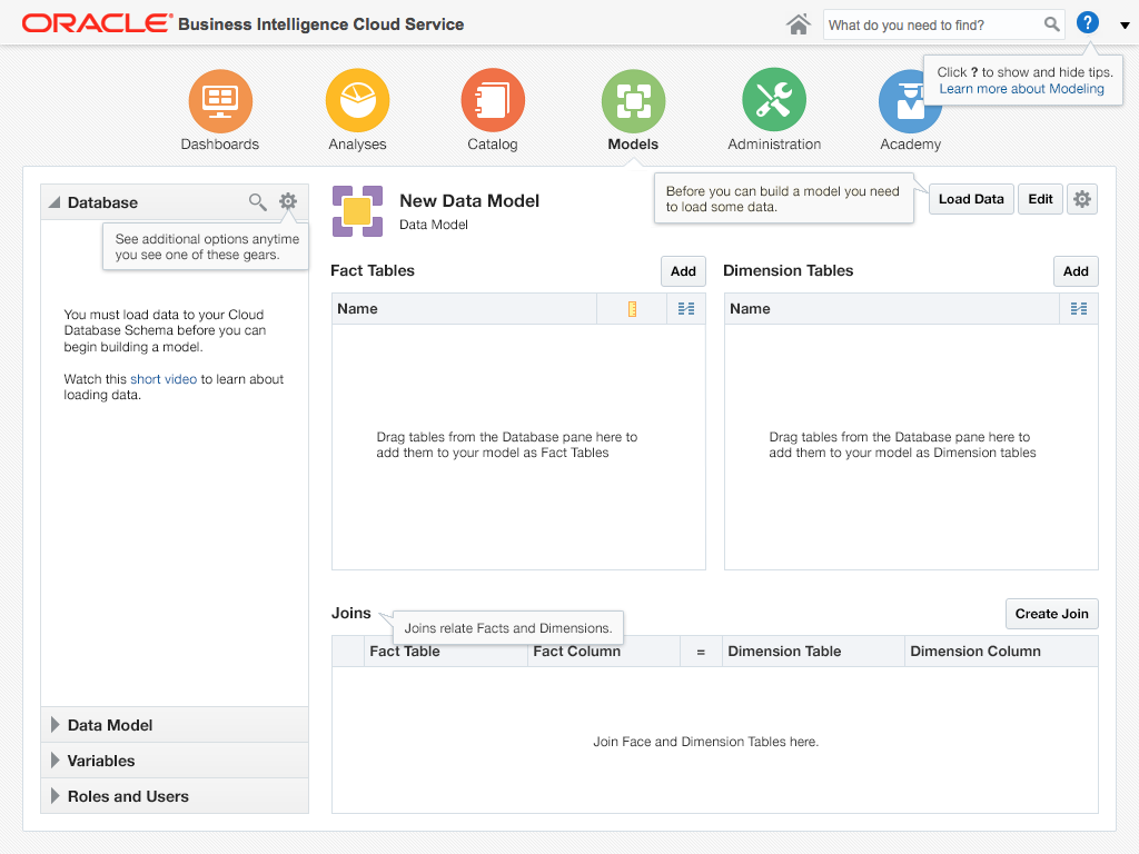
- When there are more than three places on the page where Contextual Help on Demand is needed, display all note windows simultaneously with a single Help icon (
 ) positioned in the Branding area to the left of the User Menu at the top right of the page. It will toggle all the Contextual Help on Demand note windows on and off on the page.
 - When the page is displayed in a mobile browser, consider the use of inline Help content rather than a note window. Note windows may require inconvenient panning, whereas, inline Help text would not, and would feel more "natural" to the user.
- When Contextual Help on Demand is offered in a UI component that can accept selection focus, such as input text fields or dropdowns, consider that focus to be the trigger for a note window rather than a Help icon (
 ) .
) . - The colors used in this pattern's images are for illustration purposes.
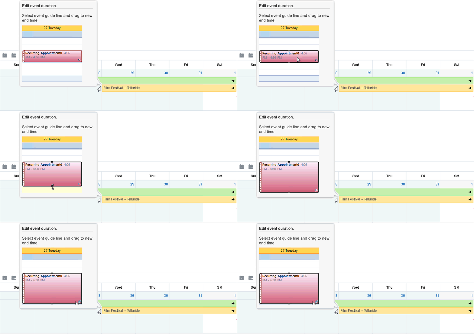
In the next image, Help appears in a small note window when the mouse pointer hovers over a UI component.

In the following image, Help appears in a small note window when a component gains selection focus.

In the following image, multiple Contextual Help on Demand note windows display after the Help icon at top right of the page is toggled.

Additional Resources
Demos: