Table Interaction Methods Usage Guideline 

RCUI Document Version 5.0.2 for Oracle® Fusion Middleware 11g Release 1 Patch Set 1 (11.1.1.2.0)
Last Updated 17-Jun-2011
Tables are the principal method for displaying and interacting with data in FusionFX applications. This guideline describes the models for common table interaction methods, including selection, drill down navigation, use of functional icons to perform actions on objects.
- General Principles
- Row and Column Selection
- Selection/Deselection of a Single Row or Column
- Selection/Deselection of Multiple Rows or Columns
- Select All
- Editing Within Tables
- Links in Tables
- Functional Icons in an Action Column
Related Guidelines
| Guideline | Section | For Information About |
|---|---|---|
| Table Overview | All | Introduction to table design and interaction. |
| Table Information Design | All | Range of layout options, include grid lines and banding, row and column span, totals, and alignment of cell contents. |
| Table Elements | All | Range of possible controls and other components in each area of a table, such as menus, toolbars, rows, columns, and status bar. |
| Table Display Manipulation | All | Describes range of options for users to modify the display of a table, including sorting, filtering, resizing columns, and other configuration options. |
| Common Table Actions | All | Describes common data-specific actions, such as Create, Delete, and Duplicate. |
| PivotTable | All | Pivot Tables share much of the same design and behaviors as tables. |
| Gauge | All | Displaying gauges in table cells. |
| Graph | All | Tabular data display is a common alternative to graphical data display. |
Related ADF Elements
Refer to the ADF Faces Rich Client demos page to find demos and tag documentation for the ADF elements related to this component:
| ADF Element | Notes |
|---|---|
| af:column | |
| af:panelCollection | |
| af:table |
General Principles

Tables frequently allow both navigation and/or action on objects. There are multiple interaction methods to accomplish this. Some methods require row or column selection for certain commands:
- Menus: See Table Menus in the Table Elements guideline and the Menus guideline. Certain commands are selection dependent.
- Toolbars: See Toolbars in the Table Elements guideline and the Toolbars guideline. Certain commands are selection dependent.
- Keyboard shortcuts: See the Keyboard Framework guideline. Certain commands are selection dependent.
- Direct manipulation: See the Table Display Manipulation guideline.
- Context menus: See Context Menus in the Table Elements guideline.
- Links: Use of links on object names to drill down to detail pages, and use of links to perform certain types of actions. See Links in Tables below for details.
- Functional icons: See Functional Icons in an Action Column below for details.

Table Interaction Methods (not all shown)
Row and Column Selection
Purpose:
Row and column selection specifies the objects or object attributes on which to perform an action.
Description:
- The action may be performed using a menu, toolbar, or keyboard shortcut. See the Common Table Actions guideline for commonly used actions that affect table data, and the Table Display Manipulation guideline for actions that affect the display of data in a table.
- Rows and columns cannot be selected at the same time, except when selecting the entire table.
- In general, menu and toolbar actions should be enabled, except when the action can be applied to any rows within a multi-select table, but only by one row at a time. In those cases, the action should be disabled if multiple rows are selected.
Selection/Deselection of a Single Row or Column
Purpose:
Specifies a single object (row) or a single attribute (column) for all objects in the data set on which to perform an action.
Description:
- Selecting a row selects an object and its attributes. Selecting a column selects a single type of attribute across all rows/objects in the data set.
- In a read-only table, users select a row or column by clicking the row or column header or performing the equivalent keyboard action. See the Keyboard Framework guideline for a list of accelerator and access keys.
- Pressing Shift+Spacebar, Spacebar, or Shift+Click selects an unselected row
- Pressing Ctrl+Spacebar or Ctrl+Click toggles row selection/deselection
- Pressing Esc deselects an entire read-only table while any row, cell or column has focus.
- See the Cick-to-Edit Tables section for selecting/deselecting rows and columns in a click-to-edit table.
- If a table contains read-only cells, the user may click either the row header or any read-only cell in the row to select the row. Note that columns can only be selected using the column header.
- Product teams may implement column selection regardless of whether a table supports single or multiple selection.
- Selecting a parent row or column header in a row or column group selects all child columns as well. Selection of a child column only selects the parent column when the user presses Shift+Spacebar to select the entire group.
Usage:
- Row selection is recommended when either:
- Object menu and equivalent toolbar commands are valid for more than 50 percent of the rows in the data set, or
- There is not enough space to add one or more columns of functional icons.
- Column selection is recommended for intermediate to advanced users of tables with any of the following characteristics:
- With four or more columns, where users may need to freeze, resize, or reorder columns.
- With one or more columns of editable web widgets, so users can Clear Contents.
Selection/Deselection of Multiple Rows or Columns
Purpose:
Specifies the objects (rows) or attributes (columns) on which to perform an action.
Description:
- Both Shift+Click contiguous selection and Ctrl+Click non-contiguous selection are supported.
- Keyboard equivalents are available when a row or column header is selected:
- Contiguous: Shift+Spacebar or Shift+arrow keys (up/down for rows and left/right for columns)
- Non-contiguous: Arrow keys move focus to additional targets and Ctrl+Spacebar selects them (up/down for rows and left/right for columns)
- Note: When a row or column group header has focus, Shift+Spacebar selects the entire group.
- For multiple-selection: pressing Shift+Spacebar or Shift+Click has no effect on a currently selected row, and selects an unselected row to perform contiguous selection.
- See Cick-to-Edit Tables for information about selection/deselection of multiple rows in a click-to-edit table.
- Row and column selection only affects visible columns. If the user un-hides a column that is part of a contiguous selection the column revealed is NOT selected.
- As in single selection, if the table contains read-only cells, the user may Shift+Click and Ctrl+Click either the row header or any read-only cell in the row to select the row.
- Pressing Ctrl+Spacebar or Ctrl+Click toggles selection/deselection of rows.
- If focus is in a text field within a table, pressing Spacebar, Ctrl+Spacebar or Shift+Spacebar does not select/deselect a row, but rather inserts a space in the text field.
- The status bar lists the number of rows or columns selected. See Status Bar in the Table Elements guideline for details.

Table with Non-Contiguous Rows Selected
Usage:
- Contiguous and non-contiguous row selection are recommended:
- When at least one action is valid for most objects, and
- For intermediate to advanced users who need to perform actions on multiple rows concurrently.
- Contiguous and non-contiguous column selection are recommended for intermediate to advanced users of tables with any of the following characteristics:
- When contiguous and non-contiguous row selection are enabled, or
- With two or more columns of editable web widgets, so users can Clear Contents.
Select All
Purpose:
Selects all rows in the entire data set.
Description:
- When both row and column selection are implemented, clicking the intersection of the row and column headers selects all rows in the table's entire data set, regardless of whether they are in view or not.
- The keyboard equivalents are Ctrl+Shift+End and Ctrl+A.
- Select All is a toggle. Once all rows are selected, clicking the intersection of row and column headers deselects all.
- Esc deselects the entire table while any cell, row, or column has focus.
- When all rows are selected, the status bar includes the statement, "Rows Selected: All".
Usage:
Select All is recommended when all of the following conditions are true:
- Multiple row selection is supported.
- Users may need to perform a single operation on most or all objects in the data set, such as a batch edit of a single attribute, or selection to add to another table.
- The number of rows or columns is not so great as to cause performance problems.
Editing Within Tables
Purpose:
Displays a list of objects for users to modify directly within table cells, without requiring the user to navigate away from the page.
Description:
- An editable table includes web widgets (such as choice lists, text fields, and so on) to edit cell content.
- Editable tables support many common actions and table manipulation methods. See the Common Table Actions and Table Display Manipulation guidelines for details.
- Editable tables support sorting. If a user edits content in a sorted column, the table re-sorts after the page is saved.
Usage:
- An editable table may contain both cells with read-only data and cells with web widgets.
- At least one column should contain editable cells.
- The editable columns should be placed in view, if possible, so that the user can find them without scrolling the table horizontally.
- It is recommended to place no more than one editable web widget in each cell. Cells can contain multiple editable web widgets, but this can cause presentation and translation problems when rendering their data in read-only mode. If multiple widgets are needed, ensure that they collectively represent a single data type and that the order of the widgets does not need to change in read-only mode.
- If a column has required fields, the required field indicator should be placed before its column header. In the uncommon case where specific cells in the column are required, the required field indicator should be placed before the editable field in each affected cell. See Required Field Indicator in the Table Elements guideline for details.
- Editable tables can be implemented as a direct-edit table or as a click-to-edit table, as described in the following sections.
Direct-Edit Tables
Purpose: Edit multiple rows at the same time.

Direct-Edit Table with Web Widgets in Cells
Description:
Direct-edit tables display all editable cells in editable mode on page load, allowing users to edit data directly, without performing another action first.
Usage:
- Direct-edit tables are recommended where the user is expected to:
- Perform a significant amount of editing in the table.
- Jump from row to row in random order to make edits, including copying data from a cell in one row to another.
- Edit multiple rows at the same time and submit changes at once.
Click-To-Edit Tables
Purpose: Edit one row at a time within the context of the page.
Description:
Click-to-edit tables display all table cells in read-only mode on page load. When the user double-clicks a row, or selects a row and presses F2, all editable cells in that row switch to editable mode.
- For single selection of rows and columns in a click-to-edit table: pressing Shift+Spacebar or Shift+Click selects an unselected row and enables editing, and restores the previously-selected row to read-only.
- For multiple selection of rows and columns, pressing Shift+Spacebar or Shift+Click has no effect on the currently-selected row, and selects an unselected row to perform contiguous selection.
- Pressing Ctrl+Spacebar or Ctrl+Click toggles row selection/deselection for rows other than the current one, and selects an unselected row to perform incontiguous selection.
- When a row becomes editable, the first field in the first editable cell is in focus, with its content selected.
- All other rows remain in read-only mode, providing context for editing.
- The user exits editing mode by double-clicking on another row or by pressing the Esc key.
- Data is validated on exit, and the edited row returns to read-only mode.
- Data is not saved until the user clicks a Save button or uses an equivalent command.
- Pressing Spacebar replaces with or adds a space character to existing editable cell content.

Click-To-Edit Table with Row in Edit Mode
Usage:
- Like direct-edit tables, click-to-edit tables provide a more efficient method of editing than read-only tables, which use toolbars, menus, links, or functional icons to make changes—each requiring additional steps to edit data.
- Click-to-edit tables provide better overall context than direct-edit tables, because data in other rows is easier to read in read-only format, and users see the results of their edits on completion of a row. However, click-to-edit tables require additional steps to edit multiple rows, so they are not as efficient for extensive editing.
- Click-to-edit tables are recommended where the user is expected to:
- Make occasional quick edits to the table.
- Edit rows sequentially, one at a time.
- Edit data inline within the context of other data on the same page.
- In certain cases, product teams may need to turn on required field indicators within individual click-to-edit table cells. See Required Field Indicator in the Table Elements guideline for details.

Click-To-Edit Table with Required Field Indicator in Cell
Switching Between Edit-All and Click-to-Edit Modes in a Table
Purpose: Allows users to switch between click-to-edit and edit-all modes within a table by clicking an iconic "Edit All" button on the toolbar or by selecting the "Edit All" option in the View Menu.

Table Showing "Edit All" View Menu Option and Toolbar Icon
Usage:
- Use an edit-all table with no toggle button when it is expected that the majority of users of the table will be doing heavy editing of many rows.
- Include a toggle when a mix of users is expected to use the table, where some of them will edit only a small number of rows at a time, while other users will wish to edit many rows during a session.
- Only include the toggle when you are anticipating that most users will be editing many rows during a given session.
Links in Tables
Purpose:
Links are generally reserved for navigation in tables but they may also be used to manipulate display of table data.
Usage:
Valid uses of links in tables include:
- Drill down for more information.
- 'Go to Task' in a checklist context (optional: iconic button or link).
- Aggregate numerical values in tables that support drill-down.
- Open objects from a Results list.
Functional Icons in an Action Column
Purpose:
Perform an action on an object or navigate to another page to view or edit object details.
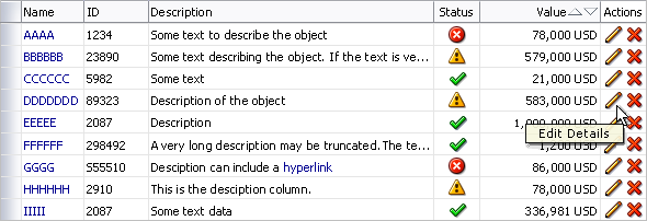
Table with Functional Icons in Action Column
Usage:
- Actions columns are not provided as part of the ADF table component, and must instead be implemented by development teams. See the ADF documentation for more details.
- Action columns should not scroll out of view on page load. See Placement of Action Columns below for details.
- Column headers must specify object types to distinguish the navigation points, such as "View Order" or "Edit Account". If multiple functional icons appear within the same column, the column header is "Actions".
- Functional icons are similar to toolbar buttons, except that they do not require the user to select a row before performing the action. They also indicate whether or not an action is possible for each object. Nevertheless, Action columns take up horizontal space that could otherwise be used for data, so should be reserved for certain contexts. See Contexts for Use of Action Columns for details.
Placement of Action Columns
Strong consideration is necessary when placing Action columns:
- If placed too far to the right (to the left in right-to-left applications), Action columns may be horizontally scrolled out of view in small browser window sizes or low screen resolutions.
- When translated, column width may increase, causing horizontal scrolling where none was present in English.
- Unless description columns are needed, it is recommended to place Action columns directly after object name columns.
- Avoid placing columns of status icons adjacent to action columns if the icons have similar forms and colors.
Contexts for Use of Action Columns
Contexts where Action columns may be appropriate include:
- When the action is only available for a relatively small number of objects in the table-no more than 50 percent.
- When the action is not valid for more than one object a time.
- In checklists, where functional icons can be enabled and disabled to show available and unavailable steps at a glance. In this case, menus and toolbars are not recommended, because the user must first select an object to see whether it is available or not.
- In self-service applications that provide less than three actions per object.
- To call attention to a specific command in an application that also has selection-based menu or toolbar actions.
- When objects are frequently in different states, causing some objects to be editable, and others not. In this case, enabled and disabled functional icons indicate availability.
- When status icons can also perform functions, providing both status information and a method to perform an action.
- For complex objects, when the action only applies to a subcomponent of the object, and this is obvious to the user. In this case, a functional icon saves the user from drilling down before performing the action.
- To view objects when different objects have the same name, thus avoiding a set of identical links.
- To "View More Details" or "Edit More Details" in an editable table.

Action Column in a Checklist

Action Column in a Self Service Application

Action Column to Call Attention to a Command

Action Column with Objects in Different States