Comment
The Comments pattern is a UI piece that allows users to comment on someone else's post or post their own status updates, such as what they are up to, comment on their mood, location, etc... Users usually have to tap a button in the app to be able to comment or post status updates. In some cases, Comments and Posts may also allow users to share everything on social networks, such as Facebook, Twitter, Google+.
- Inline: Comments consist of an input text and button that posts users' comments. This button is situated on right of the input text. On left of the input text, there might be another button that allows users to attach pictures to their comments.
- Popup: Posts consist of an input text and two buttons. Other UI elements, such as a user's profile picture or buttons for attaching pictures, adding friends, emoticons, etc. my also accompany the posts and are optional.
Appearance
Appearance characteristics for this component.
Inline
- Placement: Usually appears at the end of a list that shows all comments.
- Input Text: May show a prompt.
- Buttons: The button that is positioned on left of the input text is optional. It allows users to attach picture(s) to their comments. If this functionality is not supported, a user's profile picture might be there instead. The button that is on right of the input text allows users to post their comments. Its label is short and logical; usually reads as Send.
Popup
- Dimming: Background of the app is dimmed.
- Title: Identifies the task and fits in a single line. Avoid using a title that would be same as label of a button.
- Buttons: Short, logical labels. One of them is always called Cancel (usually on left for LTR). The default action might be more prominent, e.g. bold, and usually reads as Post.
- Input Text: May show a prompt.
- Other: (Optional) Posts may also be accompanied by a profile image, or other buttons that allow users to e.g. attach pictures, location, etc. to their status updates.
Behavior
Common behaviors for this component.
Inline
- Open Comments: Tap the corresponding button.
- Type Comments: Tap the input text to trigger the virtual keyboard.
- Close Comments: Tap the "back" button to navigate back to the previous screen.
- Post Comment: Tap the commit button to post the comment.
- Remove: There can be an option to remove a post, photo, video or location.
Popup
- Open Posts: Tap the corresponding button.
- Type Posts: Tap the input text to trigger the virtual keyboard.
- Close Posts: Tap the cancel button to navigate back to the previous screen.
- Post Posts: Tap the commit button to post the status update.
- Remove: There can be an option to remove a post, photo, video or location.
Usage
Usage guidelines for this component.
Inline
- Place the Comments at the end of a list that displays comments.
- Keep the Comments always in view when the virtual keyboard pops-up.
- If number of characters per comment is limited, consider displaying a counter somewhere in the UI.
- If multiple steps are needed for posting a comment (e.g. selecting different types of audience, entering an mail address, typing a title, recording the location, etc.), you may consider using Posts pattern instead.
Popup
- Show the Posts in a modal view. Dim background of the app.
- Consider showing the Posts on a new screen on phones.
- If number of characters per post is limited, consider displaying a counter somewhere in the UI.
Related
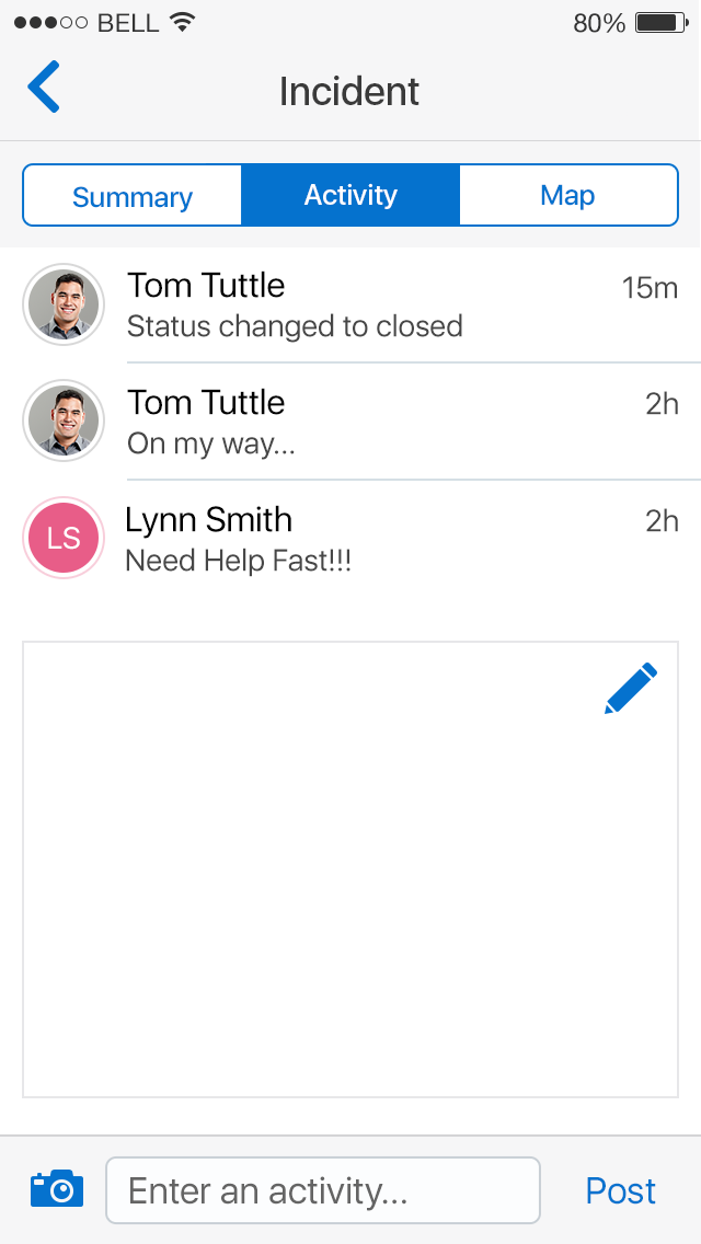
Fig 1. Inline Comment

Fig 2. Popup Comment