Share
The Share pattern is a set of UI elements that allows users to share various objects (e.g. messages, URLs, pictures) through various channels, such as social networks, e-mails, text messages, etc. The UI of each channel may differ significantly.
There are at least two possible use cases how users share things:
- Users tap the Share button to share a single object.
- The Share button is usually placed right next to the object or in Contextual Actions that are associated with that object. Note that you may want buttons that represent channels to be included in Contextual Actions. In such case, you do not want to include the Share button in your UI.
- Once users tap the Share button, they are presented with a popup allowing them to choose the channel they want to use for sharing things or modal view that contains all the UI that is needed for sharing (may also include various channels) or full screen view in which case the share dialog is shown as a full screen.
- Users tap the Share button to share multiple objects
- The Share button/icon is in a position that clearly communicates that the button belongs to a group of objects or all objects that appear on the screen.
- Upon tapping the Share button/icon, users may choose which objects they want to share. Note that selecting multiple objects may limit number of available channels. The user can also share something directly.
- After that they are presented with a popup allowing them to choose the channel they want to use for sharing things or modal view that contains all the UI that is needed for sharing (may also include various channels) or full screen view in which case the share dialog is shown as a full screen.
As described above, in order to share things users must tap the Share button/icon. The Share button/icon will look differently on each platform and in each app - it can be an icon or button called Share. In Mobile Application Framework, it is recommended to use the "curved right" icon on IOS and Three Connected Dots on Android. This icon can stand alone or be coupled with "Share" label.
Appearance
Appearance characteristics for this pattern.
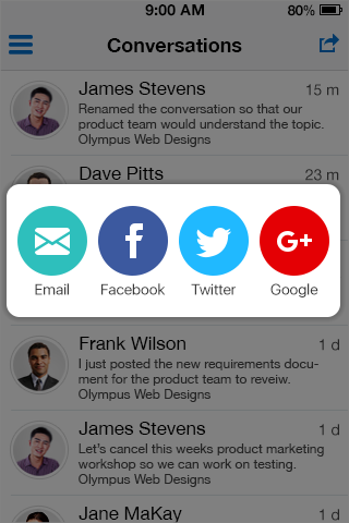
Popup
- Dimming: Background of the app dims.
- May contain:
- Icons only, or
- Icons with titles, or
- List of items (may also contain icons as shown).
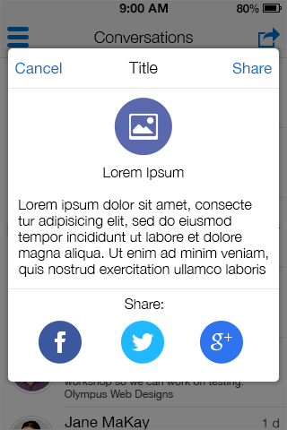
Modal View
- Title: Identifies the task and fits in a single line. Avoid using a title that would be same as label of a button.
- Dimming: Background of the app dims.
- Buttons: Short, logical labels. One of them is always called Cancel (usually on left for LTR). The default action might be more prominent, e.g. bold, and usually reads as Share.
- Input Text: May show a prompt or predefined message that appears when shared.
- Other:
- All controls that are needed for sharing are available in the modal view. May also include buttons for attaching pictures, emoticons, location, etc.
- (Optional) Include a preview of things that are being shared. E.g. when sharing an URL, the preview may show an image, title, and a paragraph of text.
- In addition to all of above, it also contains buttons that allow users to choose the channels their message will be shared through.
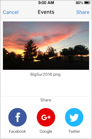
Full Screen View
- View replaces any existing content with a full screen share dialog.
- May contain:
- Title
- Share/Action Button
- Cancel
- Share Icons
- Text Area for Comments
- May contain:
Behavior
Common behaviors for this pattern.
Popup
- Open the popup: Tap the "share" button/icon .
- Choose how to share: Tap the corresponding button/icon .
- Close the popup: Tap outside the popup.
Modal View
- Open the modal view: Tap the "share" button or choose a social network in the popup.
- Type Message: Tap the input text to trigger the virtual keyboard.
- Choose how to share: If not preceded by the popup, tap corresponding buttons.
- Close the modal view: Tap the "cancel" button.
- Share: Tap the commit button.
Full Screen View
- Open the full screen view: Tap the "share" button or choose a social network in the popup.
- Type Message: Tap the input text to trigger the virtual keyboard.
- Choose how to share: If not preceded by the popup, tap corresponding buttons.
- Close the modal view: Tap the "cancel" button.
- Share: Tap the commit button.
Usage
Usage guidelines for this pattern.
- Dim background of the app when the popup or modal view appear. On phones, consider opening a new screen instead of using a modal view.
- Include preview of what is being shared, if possible.
- Consider displaying a counter somewhere in the UI, if number of characters per message is limited.
- If your application allows for sharing on one or two social networks, consider skipping the popup.
- If your application allows for sharing on many social networks, use the popup so your application does not look too busy/cluttered.
Related
- Used On: Phone, Tablet
- Also Called: None
- Related Components: Button, Text, Textbox,
- Related Patterns:Contextual Actions, Comment, Modal View, Navigation Menu
- Resources: None

Fig 1. Actions Icon - iOS
Fig 2. Share Icon - Android

Fig 3. Share - Popup

Fig 4. Share - Larger Popup

Fig 5. Share - Full Screen